File: 1728768179691.jpg (202.79 KB, 1080x1080, 284532.jpg)
No. 423499
File: 1728769795409.jpeg (64.07 KB, 640x429, dinosaurs.jpeg)
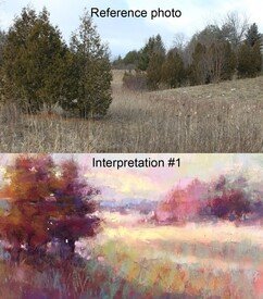
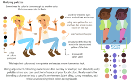
>>/m/373122AYRT, I really recommend looking at traditional paintings and seeing what techniques your favourite artists use! It can be super helpful to see painting being broken down like that. I'd recommend you start off with photo studies and zoom in a lot to see all the different colours that you wouldn't notice, you can colour pick at this stage but eventually you would want to replicate those colours without needing to do so. Studying forms while doing this is also incredibly helpful especially as you progress and become less dependent on the reference photo.
Not everyone likes to do this but if you learn better by reading and researching the thing you're doing, I'd highly recommend reading books like the Art of Colour by Johannes Itten, which is a fantastic book about colour theory that you can find free pdfs online of, and looking into a favourite art movement or one that interests you and learn why the artists decided to make art in that way. You could also look at speedpaints in the digital painting styles you like and just observe and copy for a faster shortcut (which has its inherent cons)
>>423490Because infighting is annoying and even more retarded?
No. 423517
File: 1728771614970.jpg (703.29 KB, 1079x1522, Screenshot_20241013-091813_Chr…)
>>423505Wow, and such great criticism was in the last thread after anons had a little tard rage. Look in prior rate threads, the criticism was harsh but you didn't see anything like the last quarter of the last thread.
No. 423526
File: 1728773091976.jpg (288.88 KB, 820x1086, 1000050554.jpg)
>getting this assblasted because you think anons are being too nice
What are you so mad for tardchan? Did anons make fun of or ignore something you posted? Cause you still haven't posted anything, I wonder why. If you're all about harsh criticism then share something.
No. 423539
File: 1728774320361.jpeg (14.16 KB, 540x540, woowkwkks.jpeg)

>>423531That's exactly is happening and what some bad actors have been trying to make happen for the last six or so months. Just report. Saying PYW isn't helpful either, you know they don't know shit by the way they're "critiquing" things so pay them no mind.
>>423526If that's your work then that's some lovely rendering on the arms and legs, the abs are a bit muddy and need extra defining but I'll assume it's because it's unfinished as far as I can tell, this is a overall well done study.
No. 423543
>>423520I'm the OP, and making the thread into a hugbox was not my intention at all. I just wanted to try and minimize infighting. Note that I said
>be honestbecause I believe that unnecessarily flattering someone when their work sucks
is being dishonest.
No. 423544
>>423527Her work is
not shit, c'mon. You can disagree with someone and acknowledge that their art is good. I get that it feels good to trash someone's work when you're arguing with them, but it's transparently motivated by your emotions rather than objectivity.
No. 423559
File: 1728777912789.png (20.14 KB, 193x313, Screenshot_293.png)
drew what i think the average farmer looks like a while ago
No. 423603
File: 1728785266254.jpg (460.41 KB, 1900x1200, fanart.jpg)
drew the average day itt(personalityfag derailing)
No. 423609
File: 1728787326374.png (16.38 KB, 1039x771, ugly rat.png)
>>423603drew you drawing this. note your receded hairline, your beady black eyes, your witch nose, your unappealing body, your rat tail, your huge forehead, and the poor grip on your pen as well as your nasolabial folds
(infighting) No. 423612
File: 1728788923033.png (6.14 KB, 508x483, obese.png)
>>423609drew you drawing this drawing this. your features have been abstracted as legend had it you are too hideous to capture on canvas without the artist suffering a heart attack. i drew you skinnier because i can’t draw you actual size since your size exceeds the maximum hard drive capacity of 32 tb.
(infighting) No. 423671
File: 1728799180763.jpg (411.54 KB, 2048x3072, 1000050564.jpg)
>>423539>>423542Thanks snons
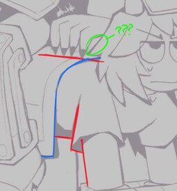
>>423540>butt>hip boneswell this is the reference pic. I can see I made the thigh too skinny but I don't wanna mess with this forever.
No. 423674
File: 1728799888792.png (Spoiler Image,49.49 KB, 191x267, sketch1728799815794.png)

>>423472tysm nona
>The fact that deep down he doesn't even enjoy it but must be hypersexual makes it even betterhnnnnnnnnnnnggggggg seriously the most perfect tragic whore I've ever come across, and I love how he's a character that could only exist in bl. he wouldn't hit as hard in any other medium.
(derailing) No. 423687
File: 1728801968620.jpg (3.23 MB, 2727x3397, 1000005466.jpg)
Do you guys think my art style and aesthetic is too dated? I really love working with oil paints and fantasy themes, but I don't get a lot of engagement online.
No. 423718
File: 1728807602518.png (46.05 KB, 2406x1644, love wins.png)
>>423612>>423609drew you two putting aside your differencies and making out passionately
(encouraging personalityfags) No. 423747
>>423720Nta but that's not pillow shading anon… and it's pretty similar to the reference she used in
>>423671. Her drawing is actually lighter and maybe lacks a bit of a gradient down his legs and arm but it's still far from pillow shading.
No. 423769
File: 1728824298623.png (6.84 KB, 602x264, PbL6ZBg.png)
>>423749Nope. Please anons, learn what things mean and don't blindly follow advice in this thread.
No. 423821
File: 1728832202932.jpg (40.57 KB, 1015x699, gs.JPG)
>>423749>>423720Actually not wrong but it's difficult to see with the original red tones
No. 423844
File: 1728837696941.jpeg (151.84 KB, 1064x1200, IMG_2789.jpeg)
>>423843Lolcow the only place where well articulated sentences get still get misinterpreted
(bait) No. 423864
File: 1728842096846.jpg (42.56 KB, 690x500, 26ab5052a7c9fa84ac615c8a8f04de…)
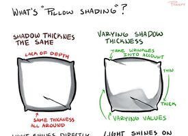
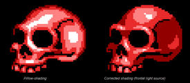
>>423849Pillow shading is when someone only places uniform-thickness shadows next to the edge of an object (or next to the linework if there are lines), giving it the appearance of a pillow or a puffy sticker. The drawing needs middle values in many places, but it also has cast shadows. A drawing can have middle values and still be pillowshaded, and a drawing can lack them without being pillow shading. Pillow shading is a very specific thing.
I know it seems like semantics, but specificity is very important when it comes to critique, because you need to effectively communicate what the person needs to research to improve. This is also why blanket insults or blanket compliments aren't particularly useful. What is it that makes someone's drawing good, for instance? If you clarify that their strongest attribute is their ability to draw gestures, choose color compositions, etc, that tells them what they're doing right so they know to move on to honing a different skill for the time being. Same logic applies to things you think the person sucks at: pick the most pressing problems and give detailed criticism instead of just going "it's shit lel."
No. 423873
>>423821>>423836It's silly to keep discussing whether it technically fits under the words "pillow shading" or not and getting hung up over terminology. The point is that nonna has to practice her values and do some greyscale studies or grisailles.
>>423671Did you check how your study and the reference looked in greyscale before or after finishing it? Because it's more noticeable in greyscale that the original light source is a bit higher whereas in yours it looks more frontal (except for the stronger shadows on the back thigh and arm) because you didn't make the shading dark enough (eg: almost no midtones on the chest and stomach, the thigh in particular only has a small bit of shading below and above). Almost all your highlights are way too strong as well. Also, the forearm itself doesn't look bad, but it looks a bit strange for it to be so rendered compared to what's around it, and you can tell in the greyscale that the veins don't have as much contrast as you gave them because the whole forearm is leaning on darker values in the original
but if you just really like drawing arm veins that's more power to you kek, follow your passionTL;DR: you need to push the shading harder
Anatomical note: you messed up the shape of the thigh a bit and it looks too thin above the knee
No. 423880
File: 1728844916584.png (Spoiler Image,30.02 KB, 829x829, IMG_20241013_213847.png)
I drew it with one finger(/m/ rule 4)
No. 423897
>>423873Thanks anon, I didn't know to check the values like that, I wasn't finished yet anyways so I will try to fix it. And yes yes I know, the thigh!!
>>423879I try to acknowledge you bitter brainlets as little as possible, I haven't sperged about any criticism I've gotten idk what posts you think are mine. I can't imagine what a huge letdown your entire life must be to seethe in this thread constantly. I feel bad for your family and hope you find help for whatever is wrong with you.
No. 423910
File: 1728850408375.png (1.17 MB, 1500x1275, stupid jesus study.png)
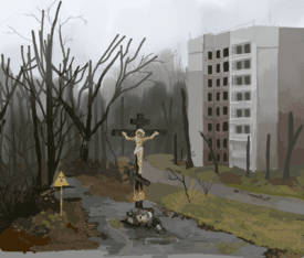
How can I (or should I) save this? I want to finish this photo study that I abandoned back in January but my skill level has jumped massively and there's so many noticable mistakes that I'd need to fix that I'm wondering if it's worth it or if I should just start again and compare. I'm hesitant on the last option because I put a stupid amount of time into this (15< hours) and I feel like it's a waste that I didn't even finish it.
>it's shit!! (in chorus)
I know it is, glad we got that out of the way. I'm going to ignore any anons that go on like that without actual criticism because you're not telling me anything new.
No. 423925
>>423914Alright, I think I will, thank you! I'll report back with the new rendition so you guys can tear me a new one (in a good way.)
>>423921On and off since early last year when I went full autistic research mode for art. I have been drawing for longer but I never really wanted to improve or study until then so I don't count it as serious study, as you put it. I posted tips earlier for study (>>423499) but yeah, observation and breaking stuff down with research were really invaluable to me.
No. 423946
File: 1728858432921.jpg (156.54 KB, 736x835, b2ef80c3dee7a7e601f174219794ff…)
>>423910I agree that you should start fresh. Don't worry about small details, I feel like the stuff you did on the left is already too much. It takes away from the focal point which is already blending into the surroundings. I don't know if that's because of your ref but don't follow it 1:1 if you can make your painting more readable or interesting by lightening the background to make the cross stand out more.
No. 423960
>>423954KEK but I’m not using chatGPT
nonny! I’m sprinkling in some actual helpful critiques and drowning out the infights because I actually care about art. As long as we have this thread we might as well make it useful.
No. 423963
>>423946Definitely agree that this attempt is way too much dark on dark in what is supposed to be a foggy environment. Thank you for your recommendations.
>>423948Thanks! I don't really like doing that with non-anatomy studies but you did give me an idea to collage some of this into something else I'm working so thanks for that! As for reference images go, I got a lot initially from Tumblr and Pinterest and do occasionally take from there but lolcow itself is such an amazing treasure trove of interesting images. I think the reference for this came from the Religious Art/Imagery thread here on /m/ (could be wrong about thread title)
No. 423992
>>423959Nta but
>I don't care about labia, she doesn't have holesounded kinda weird. Please draw her with one next time.
No. 423993
File: 1728867536071.jpg (387.69 KB, 1280x896, 1625672454193.jpg)

>>423981
Apart from the too dark foliage and incorrectly drawn trees, the site of a nuclear meltdown kinda does just look like that colourwise.
No. 424012
File: 1728875037004.png (32.89 KB, 635x420, ddlwhoknows.png)
does anyone ever do a bunch of scribbles and then work with what your brain sees inside of them to create a little doodle? I find it can create some unusual stylizations and it's a fun way to get yourself to draw when you have no ideas or no motivation. I used to do this in school on my notebook paper and some of my most interesting looking stylizations came from interpreting scribble lines.
Today it spawned a girl in a beanie. I'd love to see what other anon's scribble-divining doodles look like.
No. 424053
File: 1728883676908.png (Spoiler Image,1021.4 KB, 1211x807, the xiv elf dude.png)
How muddy are my values and how boring are my colors? It's a study loosely based on a photo, but the source served more as an inspiration. I always feel my colors and values are off like they are boring or they don't communicate anything. Can't tell if I'm overthinking it or what exactly am I missing. When I look up other artists, the ones I really like the colors and composition have weird values. I must be missing a key to understand it.
No. 424067
File: 1728886246555.png (Spoiler Image,1.47 MB, 1211x807, image.png)
>>424053my take on pushing the values. i think it just felt like his head was being overpowered by the dark background even with his striking backlighting. idk if i can explain it well enough but just posting how i would push the values. the colors look fine, just the values not giving enough focus. i made the focus his face.
No. 424117
>>424055Thanks, anon. I think regardless of skill level anyone can see when something is 'off' with an image.
>>424067This is a major improvement, thank you so much. I'll keep in mind to focus my values around the point of interest.
>>424094I like your color suggestions, do you have a color palette in mind before the coloring or do you pick them as you go?
No. 424278
>>424117I may have some favourite colors and palette then have a rough base to see how what I think would actually work, and pick accordingly keeping in mind the palette I chose (like I don't need to shift to the green yellow hue if I'm doing a red/blue theme and need a green)
Once you have the basic values of lighting and subject in focus you shouldn't worry too much about the them, see how perfect greyscales still have muddy colors, I always use the impressionist painting red sun as an example. The value is no different than the sky but it still pops out.
Colors also affect each other if you know about the seven contrast (quantity, simultaneous etc) so you can have more fun with the vibrancy of colors without putting a 100% saturated color.
No. 424287
File: 1728947319635.jpg (878.35 KB, 1200x2000, 1000001323.jpg)
Well I couldn't sleep so I just tried to do my own version since I like soft oranges and blue greens, plus a tone curve because they're your best friends.
No. 424301
>>424053NTA but
>actually decent art gets ignored >generic coomer porn gets applauded jesus fucking christ someone kill me i hate this world
No. 424316
>>424303no I’m not talking about anon’s good painting
>>424053 I’m talking about the degenerates who keep drawing disgusting bunny scrote porn and borderline loli
(infight bait) No. 424623
File: 1729058815557.png (213.58 KB, 586x601, Screenshot 2024-10-16 010437.p…)
Finally went back to color this wip 2 years later. What do you think nonnas
No. 424659
>>424287Thanks, I think your input made me realize my palettes tend to be analogous which probably makes them look more "boring", I should push for more complementary palettes.
>>424307KEK that's literally where I got the photo, I typed in shirtless model on pinterest and picked the first one.
No. 424710
File: 1729094330443.jpg (71.62 KB, 698x466, 683aac101e9652212d552e7e5bf032…)
>>424623I like the colors you chose, but like another anon said, you need more contrast in the shadows. I'd suggest making the shadows cooler than the local color, like in picrel. Notice how the house is white, but the shadows are blue and the highlights are yellow-orange.
No. 424817
File: 1729121488558.jpg (167.08 KB, 1200x900, nfiw3u432eqwñ.jpg)
Good Or bad first try?
No. 424844
>>424817If it's literally your first time drawing it's fine, but it's clear that you're a beginner that needs to study everything. This looks like those drawings a lot of day 1 beginners do where they try to copy random anime screenshots and they just start right into the lineart and don't even do a structural sketch.
You really should do line confidence exercises. The legs in particular are very hard to read because they're so chicken scratchy, and it feels like you don't have much control of the pressure you put on the pencil. The girl on the left looks better than the others because her lines are slightly more readable. You also don't seem to have a good sense of structure (or proportion/anatomy). Middle girl's legs and the arm pointing up are really tiny. You should do those studies where you draw people like mannequins with separate parts to figure out how the different parts attach to each other and proportions and etc.
Hopefully doesn't sound condescending to you, but there's a certain level of beginner where people really can't give much more input that "go study", and you just have to have patience and draw more until you gitgud
No. 424878
File: 1729142307450.png (203.22 KB, 630x767, loomis.PNG)
This is my Loomis-sona. I love Andrew Loomis. Without him my art wouldn't be good. In honor of Loomis I drew an OC based on a face in his heads and hands book. Please give me the criticism that Loomis would. Give me the loomis special.
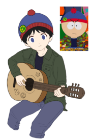
No. 425134
File: 1729228204317.png (191.43 KB, 542x1008, kenny.png)
I recently started binge watching south park again. I did a quick and dirty kenny sketch while i was waiting for the episode to draw, i always struggle coming up with poses so he ended up looking boring and stiff bleh.
No. 425649
File: 1729428406111.png (446.77 KB, 790x1213, sketch.png)
>>425513Thanks
nonny. Sadly, i don't know how to paint so i just sketch and add a base color at best. I wish i could learn how to render but i tried everything to no avail.
No. 425687
File: 1729442942645.png (Spoiler Image,1.3 MB, 1178x611, 3ddrum.png)
>>422730Here you are. Thanks again for your sketch of the bg, it was perfect. I played around with warm colors a lot, and at first I thought it would blend into itself making the overall piece muddy but the contrast of cyan blues and greys helped a ton to avoid that.
No. 425749
File: 1729463310778.png (1.39 MB, 1263x1823, stan.png)
I tried painting it to my best abilities. I tried to copy the painting style of one of my favourite artists who uses really funky colors but i dont think my color theory knowledge is up there to reach what i was envisioning.
>>425666wait you have to use those colors to shade? i feel so dumb now kek i have been using the same base colors to shade. I will try that next time!
>>425680aw thank you
nonny!!
No. 425753
File: 1729464324948.jpg (586.73 KB, 1750x1750, jdge example.jpg)
>>425751Tysm
nonny!! i tried copying JDGE which is the absolute master of vibrant eye bleeding colors. I should start doing studies of his art the way he balances desaturated colors and saturated ones without making the piece look weird is so cool
>>425752Literally who.
No. 425770
>>425712>>425703I don't think I'm allowed to post my work unspoilered. Thank you though.
>>425763Thank you I'm glad you were able to see it, and again, thanks for providing that base sketch to work off of. It was extremely helpful.
No. 425771
File: 1729468133569.png (338.06 KB, 1122x842, 78850337_p14.png)

>>425766How do so many of you know about lolicon magazines kekk. The only thing i used as inspiration was JDGE's art for painting and random south park fanart to help with the stylization.
No. 425789
Honestly now I have a craving to draw South Park fanart. It's kind of fun to draw more detailed fanart of source material with a really simple style.
>>425209>>425648By this logic, everyone who works on the show itself is a pedo.
No. 425792
>>425789>Honestly now I have a craving to draw South Park fanart. You should!! its so fun and i love all the different outfits the boys wear.
>>425791Thanks, thats a super cool idea.
No. 425877
File: 1729499718877.jpeg (839.17 KB, 2048x1938, GICvKdoa8AAkwmH.jpeg)

>>425749It looks nice but your values are really weak. If you squint at this you won't be able to make out the lightsource because everything sort of blends together. Good luck with your color studies, the way that artist you mentioned does it looks a bit difficult to get into. He doesn't really use local colors at all and strictly limits his palettes
No. 425935
>>425877Thanks
nonny, i will work on my values. For some reason even if i work with a layer over the drawing in color mode i always forget to push my values because i am scared it might look bad.
>He doesn't really use local colors what do you mean?
No. 425966
>>425965I didnt make that one sorry
nonny kek.
No. 425971
File: 1729534468105.jpg (54.63 KB, 563x411, b8368f4b3d20dcdeb52cd59e7ad866…)
>>425935Local colors are the actual colors of objects, in anons artwork the green of the shirt and blue of the pants for example. That JDGE piece you posted depicts a girl in a white dress but the used color isn't actually white, it's green. It only looks white in context. You should've used a gradient map or otherwise manipulated the colors before painting to get a similar result instead of simply adding yellow to green and purple to blue.
No. 425977
File: 1729535609657.png (230.68 KB, 1110x691, eskbl.PNG)
>>425973I'd recommend checking out iniro/eskbl's Color Tips pdfs. They don't cost much but you can easily find them on ic. Her style is simple and pleasing and reading through it makes picking nice colors seem so doable kek it's perfect for beginners
No. 426020
File: 1729544386739.jpg (139.34 KB, 736x1131, 4914fba47587ffc60bf66ba0c9db2c…)
>>425989I do regular colors and adjust from there. But I naturally tend to use very limited palettes because I don't like having too much going on. If a color doesn't quite match the rest I lower brush opacity and draw over the main one to pick it, basically picrel.
No. 426042
File: 1729548344588.png (718.72 KB, 952x1032, Screenshot_20241021-174638.png)
hi guys, this is my first time drawing board-tan, im in particular trying to work on improving drawing clothes and fabric, i know the flannel looks like shit but not sure how to improve. feel free to point any other glaring errors also. my sped handwriting is a non-negotiable
No. 426093
>>426091no its definitely just poorly drawn flannel but i appreciate your optimism
>>426092little rascals and alfred maxxing maybe you wouldnt get jt
No. 426230
>>425687Gorgeous colors!
>>426042I like this, the style feels like something you would see in a 90s cartoon
No. 426239
File: 1729618577210.png (1.17 MB, 901x1459, aalllice.png)
any tips on how i can make the hair not look like hay?
No. 426455
File: 1729665109168.jpg (252.55 KB, 591x686, 927e6e8whm.jpg)
seasonal paint.net doodle
No. 427703
File: 1730084362754.png (1.11 MB, 2828x2089, goth moids_20241027195652.png)
This was done free hand with a fountain pen. I’m trying to get better at free handing, some days I’m really good, some days it’s picrel. I know the ear is fucked, I’ve never been able to do ears free hand. Any tips would be appreciated.
No. 427733
File: 1730098737629.jpg (69.91 KB, 960x628, e3a33341.jpg)
>>427703Freehanding is all about measuring things in your mind and going slowly. If you watch videos of artists doing it they will sometimes put down dots instead of full guidelines and they never rush anything. Your style looks interesting though, good luck with your further studies
No. 427795
File: 1730133332756.jpg (1.97 MB, 2880x2880, pastel.jpg)
Used pastels and tried to draw this woman from "women you're ashamed to say you'd fuck" thread. Paper too small + pastels too fat to get more detail than this. Any suggestions?
No. 427810
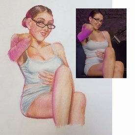
>>427795the lines and colors look nice but the arm on the left side of the picture looks off, as well as her face and hand. other than those 3 parts i think you did good, i like the contrast/colors/clothing folds and the textured look of the pastels.
i think your strength shows in the fact that you do well with light/shadows and contrast with colors. it does look nice but that arm on the left side of the drawing really confused me. it looks like the arm is somewhat deformed and the hand is morphing into the shoulder. the hand on her stomach, i think looks good but there's something strange, like maybe it's too big/alien like, though looking at the original image i can see why it was drawn like that. but, i do really think the shading on the hand looks great. her face looks off mostly from the jaw down, specifically the mouth. however, i love the way you drew her nose.
it looks really promising but just a few parts anatomically look really off/strange. i hope that helps in any way. keep it up! i always love seeing traditional work. would also love to see a re-draw in the future with the same materials and a larger paper. this is a challenging pose to draw and i think you did well. if i could suggest anything it would be making her mouth larger and hand on the stomach a bit smaller. and i do think your strengths show in the drawing. hope anything i said was helpful
No. 428692
File: 1730441890286.png (Spoiler Image,651.95 KB, 1322x1185, tt.png)
I drew something for Halloween. Does anyone have any advice for doing better hatching?
I forgot to unselect a layer within the image, sorry for double posting.
No. 428779
File: 1730481122705.png (4.31 MB, 3089x2184, Untitled23_20241101131019.png)
Getting back into art kind of. The one on the left is something more simple while the one on the right is something more closer and kind of has more detail? Anyways I feel like I accidentally twinkified a 40 year old man, I don’t draw that often but I really want to improve
No. 428791
File: 1730482263959.png (4.02 MB, 3089x2184, Untitled23_20241101132957.png)
>>428780>>428789Went back and removed all the images. It does look better but I think it’s just the random empty spaces bother me (which is on me because I just do whatever the fuck for canvas sizes)
No. 428794
File: 1730482418996.jpeg (44.22 KB, 400x400, IMG_0527.jpeg)
>>428793Jimmy from mouthwashing! (picrel for reference)
No. 428797
>>428703God, you're right. I suppose if I do something like that again, I need to be more consistent in terms of spacing of hatchlines. At the time, I thought wide hatchlines on the "BOOOO!" would have made it more cartoony and charming. However, with a fresh set of eyes it is jarring, isn't it?
>>428794Didn't he rape Anya? Otherwise, pretty nice art.
No. 428802
>>428779The first one doesn't look bad, but the level of chicken scratching is baffling. You really should practice line confidence. That type of simple basic anime style always looks a bit twinkified. If you want him to look less twinky you have to add more realistic (read: ugly) features, but he looks fine as is.
The way you drew the hair all the strands are at the same height, which is a bit visually boring. You should try to draw the strands of hair with more size and length bariation(I found vidrel to explain what I mean), and I personally would also make the back hair longer (like in the ref) to add more visual interest.
>>428781>>428787Sounds like you're using it as a crutch for not knowing what to do with the composition. The other nonna is right, it distracts from your art and doesn't make sense to do it on every drawing. Empty space isn't automatically bad on itself, it's strange that you're so opposed to it.
No. 428808
>>428806He’s a fictional character nona. I am a rape
victim myself. Take it to the fandom discourse thread
>>428802I was always told that having any form of blank space was bad for your art and you need to fill up the spaces so it doesn’t look “boring” and it’s just stuck with me. The chicken scratching was more of a style choice (sorry, don’t mean to sound like well it’s muh art style LOL) because I was told having “basic” line work was boring and visually unappealing, this was super helpful and i’m definitely taking it into account next time I draw him. Thank you nona!
No. 428821
>>428817>reading comprehension is still nullread my post again autist, no one gives a fuck over you drawing the rapeape but you thinking its fine to tell us youre a rape
victim in the RATE YOUR ART THREAD not the vent thread its just weird to share that here
No. 428831
>>428827No i’m just a autistic retard with a shitty fixation that will go away in like a month or two
>>428823Majority of art youtubers I watched as a kid always told me otherwise. so I felt like it was the norm for me
No. 428842
File: 1730488668323.jpg (123.19 KB, 1238x2048, F3QXqd9XMAA7c5-.jpg)

>>428831There is nothing wrong with blank space
nonny, it helps define the silhouette. You dont need to fill the blank space with random stuff, artists like pic rel draw simple sketches without clutter and it looks cute and nice.
No. 428851
>>428847> Critique is not just about technique, it also applies to subject matter, and the subject matter is unappealing.i agree i wouldnt mind if anon drew him just like how some anons like horror characters but its the
>bros a rapist!! laughing emojis!>quirky yaoi memes!>the weird whataboutism of "umm im a rape victim so please dont tell me whys its weird to draw a rapist with hearts over him"meanwhile the character in question has also raped a woman and the biggest thing youre posting in a thread where youre being critiqued so why are you surprised if some anons call out the subject matter?
No. 428873
>>428791Seconding the other anons to work on your line art. Practice drawing lines in one stroke. The anatomy is also off. His shoulders are too narrow and slanted, his arms are wonky, and his chest doesn't look like a 3d shape. If you want him to look less like a twink, I recommend finding artists who draw anime-style men and seeing how they stylize them. Currently, in your drawing style, he looks like a scroungy, sleep-deprived young adult. Basically, my advice is to just draw more.
>>428692Aww this is really adorable! I love how expressive the Waddle Dees are. Maybe you could play around with line weight more, but I think this looks really good
No. 428880
>>428808ATA
>I was always told that having any form of blank space was bad for your art and you need to fill up the spaces so it doesn’t look “boring”Sometimes you might see the advice that you should always draw background to give your characters a setting and give the viewer more information, and you might have misunderstood that advice
(because otherwise that just doesn't sound like good advice), but even that advice isn't very good if you take it super literally. The edited picture you used already adds interest to the background anyway, so the random shitposts weren't even necessary for that.
>The chicken scratching was more of a style choice because I was told having “basic” line work was boring and visually unappealingI get the impression that you're taking advice targeted at intermediate artists and running with it very literally on your beginner level art. It's good to experiment regardless of your level, but "basic" linework isn't really something you should be focusing on fixing that much unless you already have good linework. But if it helps, the face looks more passable than the body, having the body chicken scratch look much looser than the face's makes it look less intentional, and on the chin the chicken scratch looks better because it looks like it's implying the stubble texture.
The people that give art advice are also fallible humans, and there's many people out there giving different advice, so you really shouldn't take every piece of advice so much to heart and treat it like infallible dogma. Some advice is good, some is bad, and some is good in some situations but bad in other
including lolcow advice btw. If you're unsure, it's better to test different approaches to figure out what works better/what you prefer, and also keep studying fundamentals (but even studying fundamentals can have different approaches).
TL;DR: study more fundies, avoid sticking to one super specific confort zone method, and draw more
Also I'll add the advice to stop answering to nonnas reeeeing about the ethics of the character, you'll just be infighting the whole day kek No. 428926
>>428808>I was always told that having any form of blank space was bad for your art Whoever told you this should be tried in an art crime court. Blank spaces are important, handling rhythm between full and empty-looking areas is a good skill to have. You can practice this by drawing objects around you from the 'outside'. Instead of drawing a shape with lines and filling it in, try painting everything but the shape, like its background, or draw a scene like a park while intentionally leaving some elements blank, like a tree or part of the grass.
>>427795KEK nona this is cute. Aside from the foreshortening on the arm and her face, it's really solid, i like how supple and soft it looks. Her hand is my favorite detail
No. 428982
>>428781Have you ever heard of something called a "background"?
>>428806Why are you moralfagging over a fictional character on Lolcor of all places
No. 429126
File: 1730574758550.jpg (19.52 KB, 474x331, OIP (41).jpg)
>>429125>"nobody cares about the approval of some autistic nodraw online">is in post your art for nonas to rate threadheh
No. 429481
File: 1730688107443.jpeg (1.15 MB, 1124x1407, IMG_1987.jpeg)
wip but need perspective before I do any more damage
No. 429486
File: 1730688536038.png (229.1 KB, 532x837, planarhead.png)
>>429481Think more in terms of planes and less in terms of lines. You can use the side of the stick of charcoal to achieve larger areas of value, and don't worry about blending early on. Blending can happen later on the process when you've achieved a good range of value.
No. 429487
>>428781Why the hell is this a "thing" I see with younger artists online these days? Filling your image with as much shit as possible? I remember seeing this shit on Artfight, with people's character sheets. Not
every single fucking pixel needs to have something in it, christ. Idk if it's mental illness or just general ignorance but stop with this shit.
No. 429489
>>429486I’m not using charcoal I’m using 99 cent store mechanical pencils from 8th grade summer vacation. Which brands do you recommend for charcoal? I’ve always wanted to try it.
>>429487It’s a thing zoomers do to seem nonchalant. It’s the same as someone posting a meme in between selfies. Keeping things lighthearted and ironic, I guess.
No. 429503
File: 1730696189525.png (2.62 MB, 2601x3059, tfw I’ll never be leyendecker.…)
How to draw cute guys? I didn’t use loomis, I started from scratch with a skull and face muscles and got this. Not what I was going for. I didn’t have a reference but this dude ended up looking like a Brendon Urie goth Ken doll package art. I don’t want my mind to betray me like this, but it seems easier to draw cute guys with loomis method, however it’s less anatomically correct.
No. 429504
File: 1730696551218.jpg (36.01 KB, 345x250, unnamed.jpg)
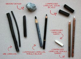
>>429489I never paid much attention to brands when I was in college (that's when I worked with it most often) bc I had so little money to work with kek. I just recommend that you get three of the following to choose from: vine charcoal, compressed charcoal, and charcoal pencil. The first is the softest, for laying down large shapes. The second is the more versatile, and the tool you'll use most often. The third is a finishing tool, for details towards the end; I prefer the peel-away charcoal pencils to the ones you have to sharpen. For long drawings, you'll want large paper with a medium tooth (texture) so it can hold onto the charcoal. I typically used the brown cube erasers because the have the sharp corners as well as the large facets (though erasing is something you want to do somewhat sparingly with charcoal) but you'll often see recommendations for kneaded erasers because the charcoal is light and can be dabbed away with a kneaded eraser. Hope all that helps.
No. 429505
File: 1730697190550.webp (957.31 KB, 2127x1574, 6fc0d6_9efd250d19e0476ab799a56…)
>>429503>file name>I didn't have a referenceWell, Leyendecker pretty much always used a reference: a live model, and it was often the same guy, Charles Beach (of whom basically no photos survive). In your case, I would just do a bunch of studies of Leyendecker's art, as well as studies of male models that appeal to you. He and his brother attended the Académie Julian, so you might also want to do some research on the French academic art style.
No. 429507
File: 1730697695592.jpg (33.88 KB, 499x337, 9c50af30a48c6f04ac8a74f54b6880…)
>>429503>no referencesReferences would be the best start, here's one for your Meter Purphy OC
No. 429530
File: 1730713695800.png (2.06 MB, 3128x2568, baconesque madotsuki.png)
Drawing from imagination for once, though inspired by the composition of Bacon's work (curved canvases, main subject on separate plane and axis, Van Gough-esque shadows) because this area really reminded me of his work, probably the hole faced people did it. This is more of an underpainting but I want nonna's opinion on composition and palette, and any other fatal flaws before I move on to scratching away at it.
Key points, yes I know building in top left is fucked, will fix that later (I'm going to bed right after posting this) and will put Madotsuki in more exaggerated shadow for more contrast, the purple on her is more for marking midtone placement.
also don't want to drag out that infight from before but as someone who will wk most art anons that "bro is a rapist" meme plastered on the art immediately put me off because its so incredibly unintergrated
No. 429556
>>429530like
>>429536 said make the top of the head more visible to make her more 3d in the perspective (unless making her look flat against the background is what you're going for? there's something rpg-ish about it that i sort of like actually) and yes either darken and saturate her palette and/or lighten and saturate the background more. The background swallows her and becomes the focus moreso than your character design because it is so much darker and more saturated than your character.
Also
>>429542 nona is completely right about light source, you'll either want to light your character from the back (shade the front and border light on her left as though it is coming from behind) or swap the position of the shadow and shade on her left - although I think that the former would look more interesting with the implication of the sun rising or setting from your background buildings.
I just wanted to expand on the
valid critiques that I saw and add a bit more detail in my own way on how you could achieve them. Unfortunately I am not great at composition so I can't help much there, I like the way that the ground is textured in almost a spiral. That part frames your character nicely. Also her design is very cute!
No. 429770
File: 1730821299721.png (2.38 MB, 1664x2292, stan kyle.png)
My resolution for 2025 is to draw more and finish more stuff, so i started to force myself to finish everything i start even if i know i wont like the result. It's easier to see my mistakes and work on them that way to be honest.
No. 429945
File: 1730856284757.jpeg (Spoiler Image,478.57 KB, 852x1636, 384255BE-BF74-47D8-B423-FF129F…)
trying to do some studies from pinterest and i don’t really feel like it’s going anywhere, should i just focus on hands or smth cause i know they look pretty bad (spoilered so no frontpage)
No. 429951
File: 1730856697813.jpeg (655.76 KB, 1170x2283, 79358BB1-0DE8-468D-9FAF-F7AF50…)

>>429947whats wrong with it specifically lol, here is the reference photo i used. didn't want it to be super detailed cause it is just sketchy practice
No. 429992
File: 1730863394388.webp (59.29 KB, 800x2000, Loomis-Vs-Reilly-Infographic-1…)
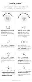
>>429990The reilly methos is just a more confusing loomis imo, but you dont lose anything by giving it a try.
No. 430771
>>428692Nonner, could you please give me some pointers on how to control my lines? I can never decide whether I want thick or thin linework, so all I ever end up doing that looks half-decent are sketches. My lines suck because I don't know how to control line weight.
>>428781Old but kek, what? The background was already fine as it was. The cringe TikTok memes are extremely distracting and some of them are literally on top of the character. This
>>428791 already has an interesting background to look at, I wouldn't even call it "empty space" since it's already begging for the viewer's attention even though it's a background. I hope you learn from the critique that was given in this thread and learn to use negative space better. Negative space is extremely important in art.
No. 432321
File: 1731627081995.jpeg (242.9 KB, 750x905, IMG_1181.jpeg)
Feel like the hair is starting to look wonky and not realistic. I tried taking some of the advice from some anons. Still feel like I haven’t improved at all
No. 432342
File: 1731629833766.png (91.06 KB, 541x393, 1731625206152762.png)
>>432339I see, and I think I found the right cantrip to banish it:
shu shu schizo, go finish your courses!!!
No. 432347
File: 1731630185501.jpg (568.61 KB, 1926x2149, IMG_3300.jpg)
>>432321I actually think the hair looks fine as it suits your current style. Having it be too realistic would make it off-putting. I think you should focus on studying anatomy more because the ears and face seem wonky.
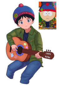
I tried recreating the drawing, I don't draw males often so if any anons want to critique please be gentle kek.
No. 432354
File: 1731631610577.png (3.99 MB, 3075x2685, WIPP.png)

I don't know how to make the texture of the skirt, anyone has tips? also, i know the anatomy is turbo fucked, i was trying to maintain the anatomy and the sillhouette of the origina. I feel like someone who's more talented would have achieved what i was trying to do.
No. 432359
>>432357>The thing about translating the original is that it's going to have fucked anatomy either wayYeah, its hard to translate it to a more realistic style. I have seen some people do it but they are professionals and i am still a begginer
> As for his boobies, make his left boobie less visible, I think it'll look more like pecs that way.sorry for sounding retarded but how? like making it an uni-boob?
No. 432377
>>432355hope you're being cheeky, they're clearly way too high
>>432356you gotta have his whole ribcage puffed out not just the pecs
No. 432503
File: 1731672847729.png (3.31 MB, 3075x2685, 1731631610577.png)
>>432354Maybe something like this?
>>432377 is right, you have to make his ribcage big too. As for the skirt I'd go for a scale-like pattern (it looks like that too in the original, it's just very small and blurry) and then fiddle around with some textured brushes, or just render each scale by adding shadows/reflections if you're the type to enjoy detailing. Mine suck of course but it was just to show how it would look like, to make it more similar to the reference you'd have to make the pattern smaller.
No. 432533
>>432511>>432515He really does have a juicy ass
>>432528Kek how the fuck should we know? You're so dramatic, if you really hate drawing then don't draw.
No. 432536
>>432503that's what I was talking about with the chest, yeah. I like your fix on the skirt pattern too, didn't even notice that.
>>432511he needs his back arched a little more and his glutes engaged so they pop a little but I think proportionally it's good.
No. 432613
File: 1731707124068.jpg (77.43 KB, 540x960, Screenshot_20230404-153636_Ins…)
>>432312
Try sculpting
No. 432615
>>432335Just enjoy the show
>>432503With the added muscle definition the body looks so freaky. The chest is bordering on rob liefeld levels of bad. I just don't think it will look good translated over to a more realistic style.
No. 432624
File: 1731710882702.png (5 MB, 3415x3334, Illustration8.png)
Dammit why do my guys always look so buff? i like buff guys but i honestly prefeer lean fit guys, however since they have a more normal body thats more squareish it becomes hard as fuck to translate it to drawing. I cannot find a single artist that draws nice lean fit bodies, most of the ones are follow draw super fit looking dudes.
>>432503This looks amazing! tysm i hope i can someday achieve your anatomy skills. I already finished my Minoan drawing but i will keep the info for the next one.
No. 432631
File: 1731712766863.jpeg (838.9 KB, 1063x1648, IMG_7108.jpeg)
>>432628If you looked at an actual human instead of kyoani dorito chins you would be able to tell why your anatomy looks so bad.
No. 432645
>>432636You can look at real moids, master the moid anatomy, and then alter the anatomy as you wish. But to break the boundaries you need to become familiar with the boundaries.
>>432644SHU SHU SCHIZO, GO FINISH YOUR COURSES!!! and yes that is real advice
No. 432677
File: 1731722868705.jpeg (985.59 KB, 1125x1581, IMG_7109.jpeg)
>>432670I don't know, it was in a folder of mixed pics and 90% of them are porny women. But even Scarlet Beriko made a reference photo book because she knows anatomy is important for yaoi
No. 432685
File: 1731724604784.jpg (95.41 KB, 771x555, scarlet beriko.jpg)
>>432683Yeah but those artists stylize them to make them look like bishes, that's the whole point. Scarlet Beriko is known for drawing very elongated bishies.
No. 432687
>>432647Heh okay I understand… try the attractive male body thread in /g/? I sometimes find decent references there.
>>432656No, surprisingly.
No. 432693
File: 1731725600234.png (3.6 MB, 3415x3334, improved.png)
>>432624I fixed it for you.
No. 432713
>>432655>Of course I lost my love for drawing, I never improved.Find a hobby you actually enjoy doing, then, because you clearly don't like drawing enough to stick with it. There are other kinds of art besides drawing, maybe try knitting or sculpture like
>>432613 said.
No. 432747
File: 1731742209013.jpg (270.39 KB, 843x592, retardcore (2).jpg)
>>432742
you inspired me to make this
No. 432755
File: 1731743799456.gif (148.91 KB, 236x260, meds.gif)

Can you faggots stop feeding the trolls? he's been doing this for literal fucking years. Here are some thread's he's made. He's known as 6 month schizo.
https://warosu.org/ic/thread/5190763#p5190774https://warosu.org/ic/thread/5227167#p5227933https://warosu.org/ic/thread/S5239563#p5240306 No. 433420
File: 1732015391005.jpg (4.22 MB, 3450x2331, monkeychan.jpg)
can nonas tell me what kind of outfit would suit monkey chan? i want it to reflect the same colours as the monkeys fur
No. 433433
File: 1732017908727.jpg (2.14 MB, 1715x2331, monkeychan1.jpg)
>>433426like this? you didnt specify what kind of shirt so..
No. 434439
File: 1732302184501.jpg (550.93 KB, 3523x2419, 1000011957.jpg)
I showed my husband and he stared at it silently for 30 seconds and then asked why don't they have knees, is he retarded or right
No. 434472
>>434446Alright I'll add something
>>434463Both
No. 434612
File: 1732342915177.png (Spoiler Image,584.81 KB, 1071x1165, MusicClub.png)
Decided to try something new and practice prop construction along with drawing without heavy reliance on a preliminary sketch (that's why it looks kind of messy.). Does anyone have any advice when it comes to making balanced compositions when using large props as focal point? I feel like this came out strangely unbalanced.
No. 434647
File: 1732359009257.png (324.48 KB, 1080x1163, 1000002258.png)
Scribbled out an idea for a magma shitpost in my notes app on my phone, but I can't tell if I still think it would be funny or if I'm just sleep deprived and have spent too much of my day here. Should I develop this into an actual drawing or delete in shame?
No. 434678
>>434439I always enjoy seeing your stuff. The art is stylized enough where knees aren't needed. Knees would probably look weird and out of place.
>>434612Dunno if anyone here could even give you advice since you're clearly a master here.
>>434647Go on…
No. 434856
File: 1732410493377.png (Spoiler Image,299.53 KB, 1447x1013, Screenshot 2024-11-23 170537.p…)
>>434647la creatura looking appropriately horrific so far. I'm new to digital painting and also bad at cloth + folds, so this should be fun.
No. 435073
File: 1732484613469.png (1.75 MB, 1771x2100, image.png)
>>434439i kiiinda see what he means but ultimately its up to you and how you like to stylize it. i tried to do how i think itd look if you tried to "give them knees" if that helps you decide. but its fine without knees if thats just how you like to draw it. they literally arent bending their knees in the drawing so its not like its wrong, just style preference.
No. 435076
File: 1732485613386.png (Spoiler Image,802.93 KB, 2152x1165, image.png)
>>434612looks fine to me but if the balance isnt satisfying to you i tried a version to spread them apart. idk if you were gonna color this or add a background like last time but i also added some generic background to show how the values might be able to help if the balance is bothering you. tips for checking this stuff yourself i suggest is of course thumbnailing your image beforehand and checking your image on the navigator of your art program or just making it very small. checking it very smell helps your brain see the issues you cant see when looking at a normal scale because your brain can ignore them when it can see everything. a thumbnail scale your brain focuses on the parts that look the most off and make them immediately apparent.
No. 435221
File: 1732552728667.png (5.79 MB, 2612x2615, asdafff.png)
Some stuff i finished during the week. I dont know how mossacannabis draws so much detail on his historical themed pieces, i wish i had the autism neccesary to render small details for hours, but rendering is my Achilles’ heel.
No. 435223
File: 1732553450954.jpg (64.49 KB, 735x791, b70e69cd25ef637abc8985d8b6070b…)
>>435221for the one on the right I think this pic could help you out
No. 435224
>>435223thanks
nonny, i feel like it would be too dramatic for a simple sketch though kek
No. 435229
File: 1732556006508.jpg (966.41 KB, 1771x2100, givekne.jpg)
>>434439considering your style is pretty angular and stylized i think its best to do subtle knees than jotting out the knee joint
No. 435342
File: 1732593553280.jpg (72.14 KB, 1174x895, 1676652690301733.jpg)
Would it be fine if i post my yearly progress so nonnies tell me what i should work on?
No. 435368
>>428808I think it's best not to take any art advice as an absolute. Any technique has its place and it's better to ask "what are you trying to accomplish".
Think, if you are trying to create a sense of solitude, and loneliness, a completely empty background with the character small, leaving mostly white space, it could help create that feeing.
If you keep adding images everywhere, it could create a sense of clutter, and noise. Is that what you want?
Chicken scratch can create a rough feel, or perhaps fragility depending on how you do it. Do you want to communicate those types of feelings? Would cleaner lineart add to whatever feeling you want to communicate in any particular drawing?
I think these can help you decern what advice is helpful to you and which is not. Art is a game of communication, so think, what about that character do you want people to feel when they look at your drawing?
>>428880>The people that give art advice are also fallible humans, and there's many people out there giving different advice, so you really shouldn't take every piece of advice so much to heart and treat it like infallible dogmaBasically
No. 435371
>>435076Thank you
nonnie. I had no plans to color it, I just wanted to do a sketch. Your version is amazing, You're definitely right, I should start adding simple values if even just for a background. I'm just too lazy to do even that most of the time kek. I've never thumbnailed before outside of comics, I think I can start doing that and I didn't know our brains worked in such a way. I'm looking at your edit and you're right, a background and a little space between the two help immensely. I made everything a little too closed in.
I didn't want to say anything but it's bothering me immensely, are those two ovals meant to be feet? Susie Haltmann has no feet at all she just floats. No. 435476
File: 1732640228954.png (5.93 MB, 3756x3600, 2024.png)
I picked up drawing again this year. I feel like i didnt improve much, although i understand improving in art is a slow process. I mostly just did super begginer friendly courses(350 cubes in perspective, all of loomis books, figure drawing, doing some ecorche for muscles) but i dont know where to go from there, i feel like all of the other courses are too advanced for my level. I am not going to have as much time to draw next year, so i want to work smarter. What should i focus on?
>>435356Sorry i wasn't sure if it counted as personalityfagging.
No. 435678
File: 1732674859649.png (162.4 KB, 600x785, Untitled1_20241126213257.png)
how the fuck do i shade
No. 435687
>>435678This highly stylized art style looks better without shading or with very minimal, equally stylized shading. It's too cartoony for something more detailed.
Better question would be "how do I draw this angle"? That's clearly what you should be focusing on right now, and anatomy.
No. 435691
>>435689i’m afraid to say the exact name because it’s a tif game that’s unfortunately a guilty pleasure of mine but it fits the character + boredom and i wanted to kind of practice with fluids
>>435687i don’t usually draw from top down angles like that. do you have any tips? wanted to try something new
No. 435747
File: 1732683720655.jpg (Spoiler Image,106.47 KB, 1068x1600, COLOURBOX48058770.jpg)
>>435695Nona, please, you don't need to be so self-loathing for liking some character that isn't a pretty bishie, fuck the haters kek.Anyway, you could take a selfie from that angle and compare, or search for reference pics online. We know he's supposed to be sitting and leaning back a little, but his arms aren't foreshortened, or at least they don't seem to be. Also, in my opinion, his hips and legs look flat in a bad, unnatural way. Like the legs don't connect correctly. They seem to be facing forwards like the torso and not slightly bent. Watch the curve of the waistband, it's too straight in your drawing and connects awkwardly on the left and right, making the pose look flat and off, so no, it's not the lack of shading that makes it look like that. Remember that the waistband goes around his body, so imagine that line like a half ellipse whose other half is obscured by the torso/shirt, at that angle the lower end of the shirt should be on top of the pants, not the other way around. The way you drew it, the pants look like a paper cutout on top of the shirt.
Also, looks like you couldn't decide whether to have the torso facing forward or foreshortened. Here, two examples I could find of photos in a similar angle, should be a good place to start. (Spoilered for those who don't want to see real moids.) Not sure which of the two photos looks closest to the torso angle you were trying to draw.
Remember to "think in 3D", as if you were handling a 3D model. The more you reference and study from photos or real-life, the better you'll get at it. And think of the whole pose, not just the part inside the frame. Sketch out the full body to have a better idea of how the pose works.
Sorry if my post sounds retarded, I'm shit at explaning and giving art advice but I tried. Hopefully someone more skilled can help us here, kek.
No. 435888
>>435678Do your parents know you're on the scary
terf board?
No. 436017
File: 1732756239070.jpg (142.85 KB, 936x720, 1615621357806.jpg)
>>436016ofcourse, those husbandos arent going to draw themselves
No. 436019
File: 1732756571020.jpeg (206.05 KB, 736x1195, IMG_3204.jpeg)
>>436014You simply lack style, sophistication, ability, skill, and did I say style?
fedora tip We used to call this “swag” back in the day kek, you simply lack swag, you need to develop a personality outside of your porn addiction to make your art look good. Even generic animu artists have some kind of “swag” to them, people who actually have a personality, have taste, have style definitely understand what I’m talking about. This isn’t pretentious because I’m explaining this pretty simply, this would require you to grow out of your childlike brain because your drawings kind of remind me of the quality of Sonichu or little children art where although they’re way more interesting than yours by miles, they all do the same floating weak poor confidencd lines and crayon like coloring because they don’t have a stable internal sense of self and ego yet, so tldr your brain has been destroyed by hypersexuality because your body craves something else you fulfill through an obsession and addiction to sex. Porn and romance obsession sets female artistic expression back, especially if you’re just drawing the same bishie crap over and over like a little child. I know art isn’t serious business but you can genuinely tell when an artist has a good ego and persona, even trannoids are able to develop good pieces of art once in awhile because they know how to absorb themselves into the art because of their years of developed interests and larping as the opposite sex has actually benefited their art, kind of like drag queens. So yeah pick up a good book and throw away that pesky ugly ass manga/animu/whatever that shit is because I don’t care what it is and for once and make something that you would actually like hanging up and looking at, not something you draw because you’re horny for dick every 24/7. People bitch about people not providing proper criticism in this thread and I gave my proper criticism in imageboard quality, you already clearly know your anatomy is bogged, style is important as well and I don’t care how much the /ot/ art spergs say it doesn’t, it really does and makes art more enjoyable and fun.
No. 436027
>>436022We’ve finally approached a point where people actually can’t handle effort posting anymore, it’s proving even more this website has been taken over by youngins and twitter/tiktokfags who can only handle small word limit captions and quick dopamine hits
>>436024I think it’s both
No. 436033
>>436031Praise what? They’re still trannies at the end of the day kek
>>436032It’s pretty much porn
No. 436042
>>436038K
>>436039No but it’s seriously hilarious how humans think putting on two squares on their boobs and a triangle around their pelvic area somehow makes them covered up, as if there’s no other body parts practically peaking out. I guess I’m just noticing unspoken rules of humanity
No. 436047
File: 1732759774587.jpg (53.22 KB, 499x659, Screenshot_20241127.jpg)
>>435476This guy's wrist and hand look really jank
No. 436053
File: 1732760877189.png (566.27 KB, 1566x916, Screenshot 2024-11-27 182546.p…)
just trying to practice my fundamentals, could I plz get some crit of my forms? something's off but not sure what…
thnx(bait)
No. 436106
>>436011>Grow a bigger pair of panties jfc kek, if my criticism is “misogyny” then what scrotes do daily must be saving lives when it isn’t. No part of this sentence makes sense. You lost me somewhere between the mixed idioms and whataboutism. There's no moral justification for shaming another woman over something so harmless and inane. You expect women to be so detached from their own sexuality that they can't even draw something as tame as shirtless men. There's no way to characterize that
but misogyny. I'd understand your reaction if she were drawing choking during sex or something of that nature, but she didn't. You're just being insane.
>>436033>shirtless men>pretty much pornAre you living in Sudan or something?
No. 436203
>>435476Keep drawing, nice colors, and also make sure you're using references of real people and drawing what you see.
>>436019What the fuck is this? PYW
>larping as the opposite sex benefits tranny artI can't see a world where this is true.
No. 436338
>>436203>>436106Right? Who cares what the motivation for learning to draw is, what matters is the results, and many successful and amazing female artists were motivated by their desire to draw attractive males, many amazing anime artists also started out drawing like this anon and improving over time, I've seen this happen countless times when I find gorgeous art on Pixiv and check the artists' old pieces and it's very shitty and childish looking but you can see how they improved over the years. This anon is still getting out of the beginner level, of course she's going to make lots of mistakes but that doesn't warrant shitting on her and ignoring what she did right. Nobody's saying she's the best artist ever.
I don't know what the other anons are talking about, the first replies to that
nonny praised her improvement but clearly pointed out her flaws, fucking crabs I swear. Also drawing cute anime boys isn't "trying to be like a moid" as if women didn't feel any attraction whatsoever, what a retarded thing to say
>>435476You clearly improved the way you draw hands but still can't quite get it right, so keep it up
No. 437095
>>436019Goddamn, I know this is lolcow and all but some of you are too mean and aggressive. You say you're effort posting and posting criticism but none of this is actually helpful to that anon. The picture you posted is of course nice looking (also not your own work, unless?) but that anon is clearly a beginner. Everyone has to start somewhere, you can't expect someone to go from 0 to 100. You're not giving any actual specific, constructive advice and far too many unnecessary insults.
>even trannoids are able to develop good pieces of art once in awhileSuch as?
>So yeah pick up a good book Such as?
I'd also like for you to post your own work but nine times out of ten whenever someone is very insulting to someone else's work they never post their own, wonder why.
No. 437343
File: 1733083643650.gif (495.59 KB, 500x282, tumblr_lu7sfdZaGC1qdhxyeo1_500…)
>>436019>lacks swagis the most brilliantly retarded feedback I've ever heard, I hope it becomes a meme.
No. 437356
File: 1733086439394.jpg (341.63 KB, 1941x1949, media_GbYkP-HbUAA9Cnq.jpg)
>>435678In your case maybe by doing really soft cel shading? Something like picrel (not my art), i shade similar to this and then i add soft gradients and blur to make it less boring
No. 437595
File: 1733172202212.jpg (620.67 KB, 1400x2409, 0XtYCOI.jpg)
>>436019Reading material for evey anon itt
No. 438897
File: 1733597042731.jpg (42.82 KB, 461x499, k1ZgU~2.jpg)
>>437595Someone should tell whoever drew this that rabbits don't have paw pads
No. 439009
>>438880I stole this from deviantart many years ago (I think pre-2015) and I agree but the image gets the point across.
>>438977Like other anon said it depends on the mood but in a white void environment I lean to using warm greens, I like the way it makes warm colours look warmer and cool colour cooler. Simultaneous contrast or whatever its called.
No. 440893
File: 1734312654122.png (2.06 MB, 2253x3017, IMG_9963.png)
Can someone tell me what I'm doing wrong with the shading on her hair? No matter what I try it just looks wrong. Also ignore how I completely gave up on her other hand.
No. 440954
File: 1734323539735.png (1.29 MB, 1924x2100, 139570157091570913709.png)
>>440893It could use some extra hair strands so it doesnt look like one solid mass
No. 440977
>>440893It's 'black' hair but not everything is an occluded shadow where there's no light filtrated. You have to be clear with the hair shapes, where the ambient light hits, where it curls and has less light and where it has no lights. It's always about 3D volumes if you made a cube with those colors you would know what's wrong.
Also there's a bright light source on the top right, so you either have details scattered from there or you leave it bright white there like it is and have the shadows with details (photo exposure)
No. 441029
File: 1734358388086.jpeg (264.96 KB, 1503x1503, IMG_9981.jpeg)
>>440954>>440977I'm probably going to tweak it a little more but I feel much better about it now. Thank you!
No. 441060
File: 1734371088918.jpg (969.1 KB, 2253x3017, hair.jpg)
>>440893did a repaint with the light source in mind
No. 441428
File: 1734487098965.jpg (437.02 KB, 1080x2340, 1000012393.jpg)
I want to draw characters interacting but it's difficult. I'm not good as poses… I am rusty too which isn't helping
>>441060The little gleam of light helps a lot, less is probably more, i feel like much more and it would look out of place compared to the rest
No. 441452
File: 1734495197216.jpeg (80.36 KB, 451x486, 825.jpeg)
>>441428Very nice, my only note is that it sort of looks like the top girl's lowered hand is either floating or resting on a bump on the lower girl's back. it's kind of hard to articulate what I'm saying, so I circled the area in green. The outline of the back is red, and the cloth (blue) wouldn't add enough height for the placement of the hand to make sense.
No. 441462
>>441452Thanks for the redline
nonny! that's the main issue I'm having with interactions, getting the poses to look like they're actually touching. I think i need to do more figure studies
No. 441686
File: 1734580503121.png (420.67 KB, 1002x1153, Screenshot 2024-12-18 194449.p…)
I can't draw weird/uncommon poses with tricky foreshortening, they never look right. I even had a reference for this one and it still looks off.
I don't know if the issue is my anatomy, or if I should be thinking about posing figures more like photography, i.e. focusing on "readability" and aesthetically pleasing angles rather than just accuracy and assuming it will look right as long as it's technically correct. Probably both, in this case
No. 441728
File: 1734605639680.png (Spoiler Image,383.67 KB, 930x1007, womenshealthmascotredraw.png)
I rarely, if ever, draw outside of my preferred subject matter. However, I saw that mascot that was making a joke out of women's health in the tumblr thread and was so disgusted that wanted to re-draw it. I wanted to make the designs as unabashedly on-the-nose as the original but appealing instead. Spoiling because of the allusion to vaginas in the two's designs.
No. 441742
>>441734Thank you
nonnie.
Yeah! I wanted it so that Val, being the vulva, has bangs and side bangs represent a clitoris and the labia minora respectively and with the way her bandana is tied, it gives off the illusion of a clitoral hood too. No. 441863
File: 1734660219338.png (193.64 KB, 569x1191, animu.png)
I character i am designing. What do anons think about the color palette? feel free to criticise anything else.
Some context about the character:
>he's a robot
>while not the main character, he's part of the 4 starter characters the player encounters
>his personality is kuudere
No. 441864
File: 1734660285651.png (523.69 KB, 2095x536, concept.png)
>>441863Here is some more context of what i am going for with it.
No. 441870
>>441863Your drawing is so cute anon! However I feel like the design is a bit lacking. If this is for a video game you're making I'd say to give the character a little bit more detail or complexity, as well as giving him more robotic traits. I also advise changing the white of his bag and shoes to something else or making his skin a more pinkish tone like the reference image in
>>441864 , as the colors of his skin and shoes are too similar and lack contrast. Good luck designing!
No. 441872
File: 1734663091035.png (1.33 MB, 2048x2048, a43fcdcf5ade3ec40293a29591a144…)
>>441870Thanks, what colors would you recommend? i was going for a futuristic approach, kinda like pic rel.
No. 441894
File: 1734668269692.png (721.66 KB, 3070x1552, kuudereguy.png)
>>441863small things i think that can help elevate a design, lemme know if this helps
No. 441957
File: 1734695751953.png (378.8 KB, 478x1127, color test.png)
>>441894Thanks anon, but he's already going to have the telescopic sight on one of his eyes and also on his armband(pic rel is the color test i made where it shows his armband), i feel like its too redundant to also add it to his hoodie lol. Also i understand the value critique but its not yet rendered, values are going to look more contrasting once i start rendering them. I like to use very greyish pale colors for the base because it makes it easier to transition to more saturated colors once i shade. But i really like the darker purple, i feel like it does look better than the pastel.
No. 441981
File: 1734704655880.png (65.47 KB, 252x204, robber shiroko.png)
>>441979She was my inspiration for the character, actually
>>441864 I love her.
No. 442195
>>441728This is so cute and detailed
>>441863Give him more fashionable clothing with accessories that tie into the futuristic robot feel. He looks too preppy. I was thinking a puffer jacket, but he is a kuudere so I understand the need for more subtlety. Maybe give him some sicker kicks?
No. 442704
File: 1735021774930.png (Spoiler Image,216.19 KB, 516x779, cccardpainted.png)
Hoping I can get some suggestions here regarding the composition. I'm happy with the method of coloring and rendering here, using the base Pastel brush that came with CSP and I'm happy that I was able to practice both speed and efficiency in using a limited color palette and layers. I'm just drawing blanks on how to make the card a little less blank and empty. I've never been good with backgrounds.
>>442093Likewise
nonnie. As someone who suffers from
reproductive issues and then suffered severe menstrual issues that were never taken seriously for a long time because of it, it seriously pisses me of when reproductive health is made fun of, even more so when the joke isn't even funny and clearly made out of someone's own malice and envy. It just disgusts me. Thanks, I might try drawing the two again to practice making an actual ref-sheet.
Sorry for the repost, I kept fucking up the post.
No. 443070
File: 1735245300973.png (620.42 KB, 873x762, Başlıksız59.png)
i made this at 2am when i couldn't sleep, can you give me suggestions for my next 2am finger on phone drawing?
No. 443096
File: 1735249981087.png (Spoiler Image,356.54 KB, 1054x779, 4nonnie.png)
>>442704some suggestions, agree with other nona about putting some kinda text on the bottom, maybe matching the ribbon? I also put a slighter darker green gradient on the text one. If you do or don't want text i think the snow floor one can work either way as well. Something simple but yeah I think the composition was just putting too much focus on the big blank space on the bottom, the white help draws the eye back up without cropping it.
No. 443204
File: 1735307115253.png (1.71 MB, 990x985, a0412674-0c86-41a1-a548-13149e…)
First time drawing a scenery. Will be uploading an update with my girlfriend drawn on top of it. What are your impressions?
No. 443207
>>443205What do you suggest? Should I use another color?
Also I kinda already put a spruce tree in front of the foreground trees and can hardly do modifications to those… I forgot to put the bigger tree on a separate layer and couldnt revert because I ran out of ctrlZs
No. 443209
File: 1735308021808.png (2.08 MB, 1060x890, image.png)
>>443208Thicker lines? I didn't use any lines there though. I might add some snow lines to the spruce trees to make them stand out even more alongside the darker color you suggested. I will also try to play with the light, though no idea what brush to use and how to do that. I will experiment
Also I am currently drawing the hair and tail of the heroine which will stand in the middle of all of this. Thoughts on the hair so far? Anything to fix?
No. 443244
>>443241> I might add some snow lines to the spruce trees to make them stand out even more alongside the darker color you suggested. I will also try to play with the light, though no idea what brush to use and how to do that. I will experiment>I will see what I can do with more distanced snow.I stated here that I will indeed follow the advice, as soon as I am done drawing the girl on top of the scenery.
>I honestly kinda like it as it is (at least on the tree branches that are at the edge of the painting which "frame" everything)The only thing that I like and want to keep from the criticized objects is the very near snow positioned on the branches in the edges of the canvas. The rest - I will change. You didn't even read the discussion, just butted in to argue???
No. 443257
File: 1735325208595.png (1.92 MB, 990x985, image.png)
>>443204a fundamental i suggest for you to work on that could really elevate this piece would be your values. Lighter values push the objects further into the distance and dark values bring things forward to help create a sense of depth. The mountains look incredible I love the texture. Whether you chose to work on the values of the background or not i also suggest atleast making the figures values darker than the background to bring her forward and not blend into the background. To check your values completely desat the picture and if your figure is lighter or too close in value to the background it will not read as well.
No. 443296
File: 1735337019016.jpg (692.97 KB, 1920x1278, winter-alpes.jpg)
>>443204What kind of reference images are you using? The green of the trees is too blue-ish or is too saturated, and not dark enough like in this photo. I pulled up pictures of the alps, there may be a better mountain range to reference.
The texture on your mountains is very good but the close up tree on the left and the dead tree with snow on the right look cartoonish. Look up Bob Ross paintings, you will get a lot of examples with trees with snow on them.
No. 443303
>>443296None. I created this entire thing like Bob Ross would. Randomly threw around things and it just worked.
I originally wanted to use some random place in Yatsugatake as a refference (as the painting takes place in a fictional world where Yatsugatake was never destroyed by the Goddess of Fujiyama - Konohana Sakuyahime, and the two heroines - POV heroine and heroine in the painting, are climbing to a settlement in the mountains), but in the end I decided that making things up on my own was easier than copying pictures of Yatsugatakeyama. After all I wanted to make a world of my own, rather than base the painting on the real world. It has to do with the project/novel I am working on.
I tried following Ross's videos but couldn't find a video of him painting a snow-covered tree or a dead one, so I just did it on my own. I know it looks cartoonish, I will try to fix that with the advice given by the two Nonyas above.
No. 443309
File: 1735340894978.jpg (1.95 MB, 3056x4732, Soneko_Nagaryuuketsu_base_kit.…)
>>443304Yeah, that is indeed Holo, or at least a resemblence of her. In reality the name of this character is Vivviana Farina D'Leoni. Why does she look like Miss Holo is a complicated and long story. The person I am drawing uses Miss Holo as her "representative", if I could call it like that. That has caused me to fall in love with Holo as they are pretty much the same person to me, by heart and mind. I am basing the second heroine in my novel (Vivviane) off of both Holo and the person in question, as that heroine is the partner of my main character (who is, in a similar way, a copy of me)
I could show you an old unfinished concept drawing of the aforementioned main heroine (me) if you wanted to see and maybe criticize it. I probably wont take criticism for it as I have given up entirely on that artpiece and want to redo it from scratch.
Sadly, because of my stupid decision to make this extremely high res, I will be showing you a JPEG export.
No. 443384
File: 1735362114025.png (2.46 MB, 1280x987, 463977a5-ef90-40bd-b210-54a6ae…)
>>443304Update
Finished the girl.
I spent the entire night trying to get the eye, hand and glove, fur color and fur physics right, clearing errors. It is now sunrise and I am going to bed.
I want to kms
Bring it on, tell me what you think of her. Nobody criticized her, only the background.
No. 443428
>>443384legs look kinda short and awkward
character looks out of place, apply shadows on the background and overlay/shading on the character to make it fit more
No. 443445
>>443309Everything that looks remotely good looks traced as fuck, the rest is a trainwreck (like her face) line weight is a mess too
>>443432Nta but that's a detail from the drawing, it's on the gun
>>443427Notice how Aoharu x Kikanjuu has a cast of mostly handsome boys with some girls sprinkled in and a reverse trap protagonist, not a cast focused on moe girls with guns
Not impossible for a woman to draw that kind of thing, but even more unlikely than you think
No. 443446
File: 1735386061036.jpg (62.45 KB, 620x744, EKcVOxdUYAAowhc.jpg)

>>443423>>443427I study armaments engineering…
>>443428I will… after January ends. I will return to this when I am free from studies and apply all the criticism you guys gave me to make it better
>>443432Safety sear joke which I made 2 years ago. Total dogshit, don't even look at it.
I even have something similar on my own rifle, where I have written "peace" on my bolt, "wrath" on the middle position and "judgement" on the lower position
>>443435>>443445Like I said, this is an artpiece which I want to rework from the 0 and up. I made it very long ago as a concept drawing of the main heroine of my novel. I only posted this if anyone was interested to see it, sorry.
No. 443447
File: 1735387589919.png (169.51 KB, 662x735, sdsadsadasd.png)
>>443445> but even more unlikely than you thinkanon, kodomo no jikan was written/drawn by a woman, that hideous asslet tit monster from fate was drawn by a woman, even the designer of madoka is a woman too. Its really not that uncommon for women to like bishoujo aesthetics because moids stole them from shoujo and coomerfied them. Like i said, i know several female gunfag autists like Minura Nakatawa who draw animu girls with guns, some even draw them pretty coomerfied like moids.
>>443446>I study armaments engineeringThat's really cool, please keep posting. I am a begginer at drawing guns myself, do you have any tips. Pic rel MP5SD i am battling to draw.
No. 443450
>>443447Tips for drawing weaponry?
I often see artists overlook very minor details in their weapons, such as coating wear and such. When drawing Kenrou with the AKS-74U and the SVD I would add little spots where the galvanization of the weapon is damaged. Additionally adding things that give character to the gun, such as modifications, tape, zipties, paracord/elastic band ties, writings with marker or engravings (i.e. the killcount on the SVD, or the ammunition type entitled to the magazine which I drew, picrelated) to give more "soul" to the weapon.
As for the shape of the weapon - if you are trying to go hyper accurate, it is inevitable not to try and trace/copy certain details of the gun, due to how precise you gotta make it, unless you are going for something more simplistic and cartoonish. On the pic you posted you certainly got perspective on your gun right, you are doing better than I would.
A thing thing that I see artists do as a mistake is the whole "worldbuilding" of the weapon - how did it end up in the character's arms, what purpose does it serve, how was it modified, where were the modifications acquired and how, do they apply by the purpose of the weapon, etc. Artists tend to just draw whatever gun they like the most, like how 2 years ago me drew an SR-3M rifle with ridiculously stupid modifications to it, just because. I jammed a fictional prism sight on a 9x39 rifle, when the absolute best choice would be a PSO-1M2 riflescope, due to the fact that it has a rangefinder and ranging arrows matching the ballistics of 9x39 fired from a VSS special sniper rifle (which ballistics would be similar to the SR-3 in suppressed configuration).
I like how you drew your girl with the finger out of the
trigger guard. Perhaps the entire gun should be juuuuust a tad bit bigger, judging by how big the hand of your character is. Experiment, see if you like it, I don't know.
No. 443452
>>443449We gather on image boards because we are bizarre weird social rejects with unique traits that often set us appart from society, nyo? I thought it was more common to see girls here who do not act like normal girls. Is that not the point of chan boards like this one, or?
I come here seeking to bond with people who have been treated the same way I am for the fact that they simply are "abnormal".
I think no sphere of interest is entitled to a certain gender, unless its something super specific that has to do with the physics of said gender. I get that moids overwhelm any sphere of interest such as gun anime stuff and moe and ruin it with their perverted fantasies, but should that make me distance myself from such interests and completely cut myself off of them? Just because moids dominate something, doesn't mean I shouldn't enjoy it. The case is similar with Touhou. Just ignore the fandom and enjoy the project itself.
No. 443453
>>443449Its really not unlikely. There are tons of women who draw cgldct and even loli slop. Its waaaay more common than their counterpart(men drawing hot bishies for women), for example. Hidekichi Matsumoto, the author of a manga about cute girls with guns, is a woman. I think a woman with those tastes is way more likely to be drawn to bishoujo illustrators than bishounens, because there is way more media featuring cute girls with guns than bishies with guns.
>>443450Thanks anon i will keep everything in mind. Also, its a boy
>>441863 not a girl. I feel like the details will be the hardest part, it is definetly very tiring to keep the perspective in mind but i dont like idea of tracing.
>>443451Aoki Ume knows how to design super cute and wide girls.
No. 443455
File: 1735389556538.jpeg (943.49 KB, 2004x1464, IMG_3207.jpeg)
>>443446>MantisShrimpphuh..?
No. 443456
>>443455What?
No I am not MantisShrimpp if thats what you mean. That picture is not my art, it is just a representation of how I felt when people criticized an artpiece which I had already given up on and left behind due to how shit it is.
No. 443475
>>443384I like it but keep playing with her eyeball placement, and maybe the textures on her hair and tail. The pose is okay, her legs look short. I like her outfit.
>>443423Who cares
>>443446Gib gun drawing tutorial please
No. 443480
>>443475I will do fixes in February after my exams end.
We can speak of guns in private, nya! Want to exchange matrix/discord or something like that?
Same goes for you
>>443447 ,btw. If you want to ask me about weapons, we can speak to me in private :D
(USER HAS BEEN PUT OUT TO PASTURE) No. 443508
File: 1735408582976.png (211.32 KB, 775x879, i sweaer i am a womnen not a t…)
hello nya guiz pls rate my animu gril! im totes not on a fbi watchlist nya pls femoi- i mean nonas contact me privately (AND ONLY PRIVATELY) i swear i wont send any moid dicks to you
No. 443550
This thread just keeps on giving, I love it kek.
>>443491I swear anons have never interacted with male autists online before (good for them) because the way anon kept on going about autistic gun details, oc catgirl girlfriends, nyas and his personal schedule when absolutely no one fucking asked screams male autist.
>where I have written "peace" on my bolt, "wrath" on the middle position and "judgement" on the lower positionLike omfg what is this and why would you share this cringy ass shit?
No. 443574
>>443309"The person I am drawing uses Miss Holo as her "representative", if I could call it like that. That has caused me to fall in love with Holo as they are pretty much the same person to me, by heart and mind"
tranny edating is so pathetic. its like being prison gay but with anime girls
No. 443625
File: 1735439358487.jpeg (751.17 KB, 3589x2752, IMG_7873.jpeg)
Surgeon warriors
Sorry for spamming thread, it is mostly dead anyway
No. 443847
File: 1735499514833.png (110.93 KB, 1549x1549, catch a bus nya.png)

>>443309When you inevitably try to kill yourself remember the old adage; go across for attention but go down for results!
As an aside, I've noticed that permabeg males tend to draw the mid face really long, this
>>443209 seems like overcompensation for the habit as he turned her into a chinlet. Just something to point out that can clock a male, with additional information of course. Anons could also do better at sniffing out male lexicon, the way he used the word "girl" should have tipped you off immediately. Very disappointed in you lot for entertaining him for so long.
>>443586Not sure how to explain this but her posts come off female despite her degeneracy, men have specific idiosyncrasies that she never used in any of the posts I've seen from her.
>>443557It only got so at the start of this year, it was fine before but then it got slightly more active so the retards came out of the woodwork.
>>441728Absolutely beautiful designs nonna. Leagues upon leagues better than the faggot from Artist Salt's stupid vagina gijinka.
>>443625I really like your construction! You've improved a lot from when you post in prior threads (or perhaps you're better than a poster with a similar style)
No. 443857
>>441728>Vix sleeps face down in her bed and likes doing yogathats so cute idk why
>>441686i was going to say incredible reference but turns out it's a tranny, damn it, glad he made himself useful tho
No. 443865
File: 1735505370215.jpg (30.5 KB, 567x561, 5qma1h.jpg)
>>443303This is the most retarded thing I've ever read in my life.
No. 443976
File: 1735546072940.jpeg (Spoiler Image,26.8 KB, 444x281, crushhim.jpeg)
>>443939sorry
nonnie, i didn't mean to be a killjoy, i just didn't want you to end up using a troon as a reference for female anatomy, i have picrel as a reference for a woman beating up an expired wurstie tho
No. 443977
File: 1735546192636.mp4 (4.56 MB, 854x480, zEOGJCf.mp4)
>>443976and just in case, the sight of a hideous scrote prevents you from drawing, i have vidrel of some Japanese female wrestler going crazy.
No. 444088
File: 1735578872502.png (459.58 KB, 736x1034, image-3.png)
How do i come up with a good color palette? I am struggling a lot coming up with colors for this piece. Its meant to be an abandoned mall. I want to keep it colorful though.
No. 444141
File: 1735592358712.jpg (52.35 KB, 1874x1344, 1000012733.jpg)
>>444088I am bad at color palette but I saw a helpful infographic, basically start with a color instead of white, then use that color as white and work your other colors based off it. Like start with purple as your "white". I tried green here, I've seen people pull off what I'm talking about better though, if i can find the infographic I'll post it
You can also just slap a light orange multiplier on the end, or mess with the gamma alpha color levels after until it looks good
No. 444162
I don't know if this is the right place to ask for help so excuse me first.
Nonnies, I need help. Someone, please, anyone, could give me exact pointers, an exact direction, towards being able to paint/draw like this? I don't mean it literally, it's just an example. I want to be able to use colors like this and stuff.
Whenever I try to start studying drawing I always get confused at the shade/light and color part of it, and everything seems so ambiguous. I just want very clear directions because like I'm a stupid bitch because I am. If I were to guess my level, I'd say I'm able to copy from reference realistically but not too detailed with a 2B pencil on paper, but for some reason everytime I try to draw I end up so frustrated.
Should I learn drawing (as in, only lines, no wide brush or blocking) before painting?
Do I have to only paint in black and white before trying colors? I can't learn two things at the same time so please be honest…
Does copying from reference will really help me? I mostly draw from imagination.
Should I stick with only one medium? Like, if it's trad, only pencil and paper; if it's digital, sticking with only some simple brush with pressure settings or something like that.
What materials do I study with? How much hours do I put on each exercise? Which order do I follow? I really wanted to start an art course recommended by a few friends but at the moment I'll only be able to afford it by 2026.
I'm losing my mind, HELP
No. 444163
File: 1735597026310.jpg (61.25 KB, 735x662, duckies.jpg)
>>444162shit i forgot the image
No. 444170
>>444162For the colors and studying you can literally open up the picture in any drawing program and color pick to understand how the colors really are and why they seem different in the context of the drawing. Then you can try to replicate it as accurately as possible, or you can apply some of those colors to a different drawing that you're making.
If you want to learn how to paint with colors, just start to paint with colors. References will be very useful to you anon, drawings using a reference always end up looking better.
No. 444186
File: 1735602609862.jpg (137.61 KB, 1100x945, Almost.April.jpg)
>>444177NTA but the pink thing is a pipe bomb, simplified they do look like a tampon kek.
>>444162>>444088Both of you should read the Art of Colour by Ittens, very easy to find free and he wrote some amazing breakdowns of colour theory.
For you, abandoned mall anon, look at your references and note how they're coloured (colour picking will be handy), usually for that environment more realistic shading looks better but if you want you could push the palette to be more green or warm- to cheese it you could adjust the colour of your references and colour pick what shades and values you like. I know it's just the beginning stages but your values so far seem weak and the blending is muddy, in future you may want to work on hard vs soft edges and maybe do some value studies. Angelina Gualdoni (picrel) has done some beautiful paintings of abandoned spaces if you want another reference point.
>>444141You also might benefit from value studies, the colours here are nice but would look better with more contrast so the character doesn't blend so hard into the background.
No. 444204
>>444165The thing is, my favorite artists use both painting and drawing for their pieces (I often watch speedpaint videos and they paint over and under the drawing and are able to do amazing things but I have no idea how, even by watching meticulously), and I want to be like that as well. But when I try only drawing, it looks decent at most. And when I try only painting, it looks shit. And when I try bot, it looks even shittier because I never know how to integrate the two like the pieces that I like the most.
>>444170That's what I don't fully grasp, I don't know if I'm just too autistic, but won't I just end up copying references forever and ever? When I try using different references to draw something from my imagination (like using a stock image to copy the pose and lighting but drawing my character's features on it), it never looks right somehow. I never know what the next step should be, and I always stop at the sketch and flat base colors. I keep copying, but it seems to never help me, that's why I desperately wish I had someone to guide me as if I were a 5 year old with brain injuries.
>>444180>>444186I'll look into those right now, thanks!!!
No. 445303
File: 1736001994124.png (Spoiler Image,2.53 MB, 1772x1080, sdsdafdsffdfdfgd.png)
How do you find the gesture line in pretty stiff poses like pic rel? they drive me nuts while i do timed fig drawing
No. 445304
File: 1736002093781.png (Spoiler Image,229.7 KB, 1077x612, 2min.png)
>>445303Here is my 2 minute attempt. It looks so flat and it pisses me off so badly. I dont know why most fig drawing books like hampton's fail to give advice on how to approach sitting/resting/stiff poses.
No. 445344
File: 1736010584631.jpg (57.74 KB, 736x767, 5863046831f2eed28a95e44970187a…)
>>445304It looks flat because you're just trying to copy what you see. The time limit should force you to only think about broader shapes and lines, maybe go for 30 seconds instead. It might help to use a big sketchbook (at least A4, one sheet per pose) and work without an eraser to get into the right mindset. And as the other anon said, a stiff pose will lead to a stiff-looking result if copied directly. With those and when drawing off of photos in general it's sometimes necessary to stylize or exaggerate shapes to convey movement.
No. 445347
>>445340The pose doesnt have a clear obvious gesture line like the images Hampton uses for his demostrations so its harder to apply his method.
>>445344Ok anon but you are comparing a picture with a very obvious gesture line to one thats stiff like the ref i used. Thats my problem, not the basics, but rather how to apply them on non conventional references that dont have a super obvious gesture line.
No. 446124
>>441745AYRT, thanks for your reply! I'll try using higher stabilizer settings. I see many better artists than me whose lines vary a lot in thickness in certain areas, while my line work is always so plain and samey and boring to look at. I never thought of using two layers for the same lineart, so I'll give that a try as well. You're right in that it takes patience, I'm very impatient and that's probably why I don't take the time to add more flair to my lines, lol.
Sometimes I also want to make artwork like Japanese artists, with very thin lines that make the whole drawing feel very light and pretty, but I can almost never get it right, I always seem to revert back to a thicker brush size or smaller canvas.
No. 447141
File: 1736481601146.png (251.03 KB, 1195x882, 9 january 2025.png)
I drew some skeletons.
No. 447783
File: 1736665808065.png (468.08 KB, 1056x1132, skelliess.png)
Does anyone have tips on how to draw the pelvis? i did these studies by referencing models and using refs and 3d models but i am still struggling a lot to understand its shape and form. I want to be able to rotate it on my mind flawlessly.
No. 447785
File: 1736666645658.gif (810.21 KB, 1760x1290, IMG_7136.gif)
>>447783it's a very complex shape. maybe check out a medical anatomy textbook? netter or gray's will have detailed views from multiple angles
No. 447791
File: 1736667621923.png (625.56 KB, 1200x927, IMG_7137.png)
>>447786ayrt, i recommend them because you've got images of bones (and organs) both alone and inside the body. here's a diagram of the hip bone seen isolated from both sides, even if you don't gaf about the terminology it's useful to see how it's structured.
i recomend netter's (just pirate it lol), it has the best illustrations (the guy trained both as an artist and as a surgeon)
No. 447800
File: 1736669357341.jpg (105.96 KB, 1136x984, rats hug.jpg)

>>447799tysm
nonny! my husbandos will thank you
No. 447804
File: 1736670291035.gif (3.8 MB, 500x500, IMG_7146.gif)
>>447800yw nona! go forth and skeletonize
No. 447905
File: 1736703393412.png (263.17 KB, 842x838, hgfdhfdhgf.png)
this angle is beating my ass nonas… how badly did i fuck up the foreshortening?
No. 447912
>>447910i did, i even took my own
the pose looks fine to me but that could be because i got used to it after looking at it for so long
No. 447915
File: 1736704409083.jpg (846.37 KB, 2500x1518, Untitled_Artwork-233.jpg)
>>447905did you freehand the foreshortening? try using guidlines next time, it looks like you were going for a fisheye perspective which can be especially difficult
No. 448021
File: 1736727905293.jpeg (549.28 KB, 2236x2399, IMG_7944.jpeg)
I tried to draw someone else’s drawing of sableye. I’m not sure if I should switch styles or just hope my competency improves?
No. 448026
File: 1736729357219.png (498.06 KB, 2236x2399, hfghfghfgjjf.png)
>>448021>>448025oh but if i had to nitpick something id say the original had a more dynamic pose and composition with the gemstone so thats something you could work on
No. 448284
>>448055>>448056Wtf lifefuel. Thank you nonnies
>>448190Dynamism is the main thing i gotta figure out, my poses are still stiff, I think i need to work on gesture
No. 448424
File: 1736814775935.png (2.42 MB, 1622x1060, yoshinari.png)

>>448256>I don't want to cause a big argument but this is one of the first things people say not to do in professional settings if you want to be recognizableyoh yoshinari does this and he's recognizable. Style is a stupid term anyways, if you have strong fundies you can draw in any ''style'' you want. The only people that care about style is people that dont want to put effort into actually studying art.
No. 448684
>>448021I hope this isn't rude to ask, but I've been following your art progress since the first few threads and have always wondered why you always have such samey values? You often colour in desaturated shades, but I feel as if your art would come across as more dynamic with a better contrast in colours (and maybe bolder line art - think 90s cartoons like PPG or Life of a Teenage Robot).
In the reference you posted, the artist exaggerates the reds to draw the eye to the most important elements of the character's design (gem, goggles). However, if it's personal preference, then go ahead. Your art is some of my favourites in these threads and I adore your shape language, you remind me of those older artists from Newgrounds or Oekaki boards, and I wish I had your eye for it!
No. 449117
File: 1737047914524.png (Spoiler Image,82.97 KB, 987x909, image-4.png)
>do a bunch of studies
>ok time to reward myself and draw something self indulgent
>it sucks
>go back to doing studies
How do i stop this nightmare. I wont be satisfied until i become kjg level of good. I wish i had money for a teacher to guide me to become better faster.
No. 449121
>>449119Kek
>>449117Draw more and quicker. At least you won't feel like you wasted time. Do you jump into drawing from imagination straight after studying or are there hours/days between those sessions?
No. 449288
>>449119No.
>>449121I normally do studies and then draw something from imagination.
No. 449302
File: 1737084532188.png (78.31 KB, 723x560, 13 january 2025.png)
>>449299Aw
nonny thank you. Still makes me laugh so many people see them as sexy, it never crossed my mind. They are fun and helpful to do, but very time consuming.
No. 449398
>>449117This looks super symbol drawn, do you do a loose sketch before getting to this stage because whether you do or don't you really need to learn construction. Also, apologies for medfagging and I mean this kindly, but your skeletons reveal you don't know much about anatomy, the scapula is floating on some of them when it should be connected to the clavicle, the lower arm bone on the skeleton looking back here
>>447783 should be in pronation etc. and that's not even getting into the thoracic cage or your poor proportions. I highly recommend you study George Bridgman's Constructive Anatomy and Stonehouse Anatomy.
No. 449405
File: 1737112879190.jpg (322.75 KB, 929x1271, mmm.jpg)

>>449302I feel like you should look into Morpho instead. The drawings aren't too detailed so it's much easier to follow and copy. Your stuff looks stiff and if drawing one of these takes more than 30 minutes you need to shift your focus. It seems to me like you're prioritizing the wrong things. Bones don't need to be accurate if you're looking to draw bodies but you should be able to get the overall shapes right. If you went through Morpho first you'd have an easier time with Stonehouse because you'd already have a good basis.
No. 449826
>>449117>>449433This
nonnie got it. IMO your drawing is fine but it is clear that some lines were drawn without understanding why they'd be there which makes the drawing look more flat, and small details are focused on while the larger structure of the body (the arms and where they connect to the torso is lacking) aren't given the attention they need. If you've been focusing on skeletons maybe it's time to move your focus to breaking the body and its muscles down into larger sections? I know it's frustrating to be told to just practice but when you've got the right idea but just aren't there yet, it's the only thing you can do to improve.
No. 451401
File: 1737516998232.jpg (147.17 KB, 1280x772, photo_2025-01-22.jpg)
I wanted to study Leyendecker's rendering a bit… accuracy isn't the best but I'm gonna draw a few more and see if I can learn how to push my values
Also nonas, how do you go about drawing detailed pieces? I know 3d is the best route but I always get demotivated when it comes to planning anything involving a lot of props etc, maybe I should just use more refs
No. 452833
File: 1737787722835.png (713.9 KB, 2744x3000, figdraw.png)
anyone here does fig drawing? how do you main the figures proportionate?
No. 454412
File: 1738064195254.png (221 KB, 656x728, hair.png)

How the fuck do you paint hair.
No. 454455
File: 1738076558189.jpg (59.53 KB, 735x941, .jpg)
>>454412I think you're off to a good start anon! I would darken the shadows and add a bit more texture, it seems like you're struggling with it looking a bit too flat. Hopefully picrel could be a good reference?
No. 454507
File: 1738088418096.png (4.78 MB, 1200x1600, her.png)
did a monochrome study , how do the values look?
No. 455138
File: 1738253196413.jpg (41.77 KB, 640x652, 4943153f041e8951150e82b83fe63d…)
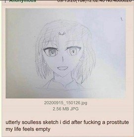
nonnas who draw anime, how do you draw anime eyes (or anime faces in general tbh) that dont look completely soulless? for some reason i can't draw anime with the same amount life as my regular style. it always looks like picrel
No. 455369
>>455138Some problems in your picrel that might apply to you:
>General unevenness in shapes and shading>Pupils are either too small or the iris lacks enough depth in shading to blend them in, making them look too contracted/cold>Gaze is basically dead-straight, adding even a subtle bit of direction to your character's eyes will help to add life (and as a bonus imply something beyond the white void of a typical sketch kek)>Similarly, the amount of iris or sclera showing at the top and bottom of the eye greatly effects expression, so play around with that>Highlight size and placement– they tend to look better if placed in the upper/darker half of the iris/eye in neutral lighting situations>General symbol drawing and poor structure for everything else, and the rest of the face is divorced from the expression it's trying to conveyNone of that is a hard rule or anything, and I have no idea what would specifically apply to your art, but yeah the other anon is also right, take notes from anime/manga that have the look and liveliness you're after
No. 457919
File: 1738966020164.png (Spoiler Image,3.76 MB, 3243x4000, s.png)
Can someone give me critiques and tips on these? I think I have issues with shortening the torso/limbs and stiffness but other problems pointed out and specifics will help a lot. Disregard the missing heads and hands/feet for now, thanks kek. Spoilered because I don't want it on front page.
No. 457946
File: 1738971723170.png (169.93 KB, 1079x576, lineofaction.png)
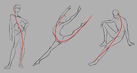
>>457919I think in relation to the references, some of the poses could be pushed more. For example:
Top left, man on chair: His back is arched more on the reference picture, making a more pronounced C shape.
Middle left, baseball player throwing a ball: his left (our right) leg is turned inwards more strongly in the reference photo. His left wrist is tucked farther in. his right arm is just a little more turned inwards. Notice how his left leg and right arm cross over each other in a more pronounced way in the photo.
Middle right, dancer: his butt is tilted backwards more strongly, and his ribs stick out more.
Bottom left, woman statue: Her torso leans into her left arm more. Her right breast is higher up.
I think making a line of action, then sketching on top of it, could help. Your proportions are good already, so you could try to focus more on making the movement of your drawings loose and exaggerated.
No. 457948
File: 1738972006316.png (4.74 MB, 3242x4000, 1738966020164.png)
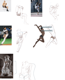
>>457919Jumping dude's head seems a bit too big, the woman's hip has a protruding hip bone on one side but not the other. Since she's sitting and tilting her body, I think it makes sense for the bone to be visible due to the pelvis tilting. Her arm is the wrong length, too. And the statue has more details on the thighs, while your drawing looks a bit cartoony, unless you want it that way ofcourse. I'm not an artist though, so sorry if I made any mistakes in my suggestions.
No. 457951
File: 1738972530972.jpg (67.8 KB, 735x721, aef3f2edba504ec511c7000913375e…)
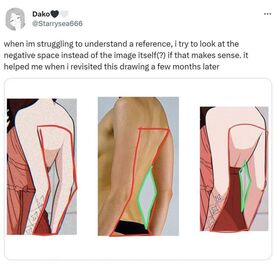
>>457919Why don't you just lower opacity on the photos so you can directly compare and see exactly where you messed up? You're drawing digitally, use the advantages that has. Also keep picrel in mind, it'll make finding the correct placement easier
No. 457954
>>457946>>457948>>457951Thanks anons, all of this is helpful. Will keep in mind everything next time.
>Why don't you just lower opacity on the photos so you can directly compareI haven't been doing this because I wanted to train myself on drawing solely by eye and getting it on the first attempt (retarded, I know) but I'll start doing that.
No. 458021
File: 1738985584919.png (675.31 KB, 1629x1085, 1000060200.png)
Still a very rough WIP. Trying out a new style
No. 458924
>>457919I know you said to disregard the missing heads but really, you shouldn't skip on drawing them. Even just knowing where to put the eye line and simplifying the features can help you a lot even if you want to draw more anime style.
Also pay attention to the inclination of the shoulders line, hip line and the back etc etc
No. 459043
>>458021applejack looks like elsie.
very cute
No. 459238
File: 1739304872431.png (370.4 KB, 1173x1965, sdafafsa.png)
How do non NEET nonnies find time to draw? ever since i started college i havent been able to draw for more than a few hours. It pisses me off because i just want to draw, i only go to college so in the future i can have a stable job that allows me to draw. I have a sketchbook i carry to school where i draw cars, clothes, people around me, and other non horny weeb things i like. But i just want to stay cozy at home drawing husbandos.
No. 459289
>>459238You're already drawing during your classes, no? What more could you want?
>>459265Release the nips
No. 459295
File: 1739318405723.jpeg (426.82 KB, 750x832, IMG_0560.jpeg)
I think I posted this before but I just saw it in my old gallery and it made me so nostalgic. It reminds me of the time when I actually had time and effort to stick to drawing. I had another one of this with another girl but I lost it unfortunately. Oh well
No. 459333
File: 1739323091723.jpeg (122.11 KB, 1200x1600, 24A0121C-B6D8-4E6B-861B-6EA02A…)
>>459307there are a lot of artists that manage to make this style work, she just needs to bee studying. I always thought that Daigo Ikeno does the idea really well, although sometimes for older male characters their faces are more detailed.
No. 459338
File: 1739323710071.png (326.14 KB, 1000x508, ab0305c40533d8fe18eb928dd6b2e3…)

>>459333sorry
nonny but i dont like this style. I am aiming to have a very stylized anime style that allows for expressive faces. As much as i like LADS and other husbando media, i am super bored of all husbandos having serious expressions. Something like picrel wouldnt work in a more realistic style i think.
No. 459345
File: 1739325490903.jpeg (584.32 KB, 1966x1718, C96D60FE-309D-42AB-8186-C47388…)
>>459338nonna i'm on your side, using that shit anime as an example of how you want to draw… His art can be pretty expressive, but maybe try looking at @6798Ty52, who draws pretty expressive faces and realistically muscled bodies.
No. 459349
>>459338>serious expressionsThe solution is to make them a bit more expressive, not straight up turn them into caricatures for autistic children like your pic. This
>>459238 looks fine to me (the expression) but using Nagatoro as an example is too much. I see what you're trying to do, though. You just want less realistic faces, not "less serious" ones, that's why you don't like
>>459345.
No. 459351
File: 1739328255699.webp (166.55 KB, 1000x1340, Savanaclaw_chara_leona_detail_…)

>>459349I used nagatoro because i personally like the how the artist draws expressions(both for nagatoro and senpai), the anime is shit and the manga is worse, specially since they got rid of senpai's glasses, but if nagatoro was a tall tanned guy instead of waifuslop she would be my husbando. What i mean is, i want to aim towards something like waifuslop but with husbandos. Also, i do like
>>459345 its just that my drawing and that artist's drawing have different goals. Mine is meant to be a smug slutty husbando i drew in an hour to practice, while the joshua graham esque guy is meant to be a serious character design for a manga(i think). The exaggerated expression on my drawing is meant to be sexually appealing, while the exaggerated expressions on the art anon posted seem more geared towards gag/funny. I want to aim towards faces like yana toboso, i think they have the perfect mix of cute, expressive and manly. But its hard to draw faces, bleh.
No. 459355
File: 1739328731829.jpeg (229.69 KB, 799x1129, B071329D-09D4-4539-A617-41A3B5…)
>>459351since you used twisted wonderland as an example, is the artist @akiseizon a little closer to what you want? She's a doujin artist that mainly does a lot of NSFW, but she does do very detailed muscular bodies with animu faces really well imo (kinda reminds me of clamp at times). Sorry to keep recommending artist, idk if it bothers you. Another fanartist but @nhukioeqDWFA321 might have some interesting stuff to look at too, she does kinda cool muscular bodies and animu faces. Warning for NSFW there too though.
No. 459357
File: 1739329383722.jpg (40.52 KB, 500x431, tumblr_c87d27a0b2bab72d08dd586…)
>>459355>Sorry to keep recommending artist, idk if it bothers you.No, its perfect! thank you, i like those two artists a lot. Thank you for taking the time to rec me artists to study from even if i am nitpicky. I only draw for myself so, while i appreciate the critique that my drawings are uncanny (and i totally get it, since i mostly take inspiration from moidslop like girls frontline/blue archive) i only draw for myself, so i am always going to be biased towards my personal opinion and what i personally like. Some anons get personally offended when i dont take their advice over subjective things like the faces i draw kek, so thank you for having patience with my autism.
No. 459364
>>459357NTA but I really like your art
nonnie, I'm aiming for similar stuff with my own and we have similar taste so it's good to see you drawing what you want to unapologetically. Ganbatte
No. 459367
>>459364Thanks
nonny! would love to see your art. Drawing for oneself is great, i wish i could spend all day drawing. Fuck being poor.
No. 459370
File: 1739331140527.jpg (Spoiler Image,251.47 KB, 1736x1965, 1648190973257.jpg)
>>459365Thanks! i am not trying to make them super muscular tho. I am aiming for leaner bodies like pic rel. But its hard to draw bodies like this for some reason.
No. 459379
>>459351Yeah I know, in other words you want to translate cute/slutty moeshit expressions onto male characters, and that's something I fully support.
Alright then. Keep experimenting, maybe you'll find a combination you're satisfied with. I don't think there's a lot of (really well drawn) male reference for this specific thing you're trying to do, so you'll have to be the one that starts the trend.
No. 459395
File: 1739336251682.gif (3.71 MB, 640x464, gachi-gachi-hugs.gif)
>>459379Thank you for understanding.
> I don't think there's a lot of (really well drawn) male reference for this specific thing you're trying to do, so you'll have to be the one that starts the trend.yeah its really frustrating, but someone's gotta do it. I am working on a game and i hoping i can become good enough at art to fulfill my vision.
No. 459401
File: 1739337851232.jpg (58.93 KB, 256x300, Ichijou Mitsuki from Yu-no 435…)
>>459395I'm also working on a game, and my goal isn't to make the guys extremely moe, but rather more like those old-school mature women in galge from the PC-98 era, only male. The art style is going to be very hard to replicate, especially since I intend to make all the art pixel art, but I hope I can pull it off.
I wish you luck.
No. 459402
File: 1739338126415.png (17.57 KB, 512x424, 55913.png)
>>459401Based. Good luck to you too.
No. 459530
>>459370Hawt. Best of luck in your journey. Those bodies are hard, I keep drawing mine too skinny.
>>459395I will play your game
>>459401I will also play your game
>>459431I will also play your game
What genre(s) are your games?
No. 461478
File: 1739859476744.jpg (3.55 MB, 4080x3060, 1000072013.jpg)
picrel is a drawing i made for a friend, how do i make my femboys look more boy then female? kek
No. 461500
>>461490>>461498sorry nonnies, its just what my friend calls them, id rather call them pretty boys but the word femboy generates a very specific image that conveys exactly what she wanted kek, but she liked it and im happy!
>>461493oh thank goodness, ill keep practicing then, i think im on the
right path
No. 461689
File: 1739924676329.jpg (312.32 KB, 1683x1240, crapdogs.jpg)
I am trying to draw more of what I'm actually looking at and attempting to do construction drawings based off of photographic references. Need more practice drawing animals, harsh criticism is welcomed.
All of these are essentially attempts at 1/1 reproduction from reference but nor traced. (as if that makes a difference)
No. 461724
File: 1739937132378.jpg (189.71 KB, 1668x2388, 1000013558.jpg)
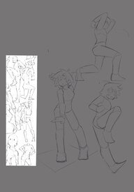
I'm trying to do figures for once
>>461478It reads male. His hair is reading kinda femanine to me though, maybe shorter?
No. 461725
File: 1739937392407.png (192.81 KB, 480x1040, d5in1th-170b8746-0888-4da6-b11…)
>>461689>from reference but nor tracedIf you want to draw animals, you might need to trace the anatomy to learn a bit more. The first dog almost have "human shoulders", something not common in quadrupedal animals.
No. 461737
>>461689Gonna rec some books for you anon that helped me with animal drawing:
>Animal Anatomy for Artists by Eliot GoldfingerGreat book for anatomical breakdowns and diagrams like you'd see in detailed human anatomy books. Lots of comparative anatomy, cross-sections, and isolated musculature to learn from.
>The Art of Animal Drawing by Ken HultgrenThis one's by a Disney animator and has solid advice for construction, movement, and stylisation. Not necessarily the best for learning anatomy/realism, but still one I found helpful early on.
>Force Animal Drawing by Michael D MattesiSimilar to the above, this one is very helpful for giving your animal drawings more life and gesture, as well as giving anatomical pointers.
(This was actually my first drawing book lmao and imo gave me a good base to move on to humans later on)
>Morpho: Mammals by Michel LauricellaIf you like the style of Morpho books for human subjects, this one might be of use for drawing other mammals. Has some pretty easy to understand discussion of morphology and comparative anatomy, with a fun bonus of including some unusual subjects
Understanding the underlying structure of animals is key, as well as their differences in morphology across species and ecological niche. You don't have to try and cover
all animals, but understanding your chosen subject's quirks and adaptations will help a lot and save you from common mistakes such as 'every animal looks like a dog' or broken wrists (eg not all animals can pronate them) and mistaking ungulate (or even digitigrade) limb structure as being 'double-knee'/'reverse knee' and then giving them the wrong joints. Lastly, there's loads of anatomical tutorials/breakdowns out there online for different animal groups that either go into more specific information or are simply more recent/up-to-date for some species, so be sure to look outside of the books I've suggested (especially if you want to draw anything outside of mammals, which are usually the focus if not the only group covered in many animal anatomy books, from my experience). Try applying whatever you're learning over the top of photo refs too, écorchés are extremely helpful to do.
Most importantly though, have fun and keep practising!
No. 462136
File: 1740077218222.png (Spoiler Image,2.13 MB, 3508x2480, dumbshit.png)
These are from a year or more ago. I stopped drawing for some reason, just lost interest but today I started feeling like it again. It's probably gonna be a slog to get back to where I was before but wtv I'm gonna try to have some fun with it.
No. 462416
File: 1740166011487.jpeg (486.17 KB, 2419x1598, IMG_7100.jpeg)
Tried to make fanart for the game clinical trial but I gave up on the body and background
No. 462533
>>462418Thank,
nonnie I appreciate it
>>462487Urgh I need to work on that… I should probably go outside of my comfort zone more.
>>462509Mfw.. it's not that gendie is it? I was going more more newgroundsy vibes..
No. 463560
File: 1740433263243.jpeg (3.16 MB, 3001x3259, IMG_2961.jpeg)
my first attempt at a portrait. i want to draw early 2000s looking cartoons but i am at git gud jail until i feel better about my own work. what should i work on first?
No. 463568
>>459621I would play the fuck out of that.
>>459555Why must we kill the pretty boys?
No. 463574
>>463567thanks a lot nona! you say you're not an artist but your advice is on point.
>I'd say work on your anatomy first before trying to stylize your art stylei'm gonna study the loomis method later tonight, i've been also reading his figure drawing book.
No. 463664
>>462136please don't ever stop drawing nonna you have a lot of talent. we need you.
seriously though does any other nonna consider art good for their health? i think it staves off dementia so i consider it essential for brain health long term.
No. 466207
File: 1741023628810.jpeg (Spoiler Image,281.22 KB, 1801x1047, image0.jpeg)
I want to use this to practice colouring but I'm losing my mind trying to capture his likeness before I start. How can I make it actually look like him!? What am I missing?
Spoiler because I'm embarrassed to have this on front page.
No. 466371
File: 1741068700522.jpg (Spoiler Image,1.55 MB, 2688x4080, 1000072725.jpg)
Something I'm making for a friend, she asked for a hot muscular body with a cute face in a tuxedo(I'll add that in but like a paper drawn with the tux that she can take on and off for fun bc I'll give him sexy underwear but only if I figure out how to do it because she's fine with a sexified tux too) and he's meant to be a squirrel boy(hence the lightly drawn ears and tail), and that's crazy to me because I've never heard or seen that, DOL had lizardboys and dolphinboys, even plantboys but not this, damn, but it's what she wants so I'll make it.
No. 466380
>>466207Maybe not the answer you were looking for, but I noticed that the right ala of the nose is a little too big in your sketch
>>466371>and that's crazy to me because I've never heard or seen thatEver heard of Squirrel Girl? Well, it's that but male and cute lol
No. 467179
File: 1741280842337.png (Spoiler Image,269.88 KB, 550x906, afafasdadads.png)
How do you keep going until the end i always get bored and give up.
No. 467219
>>467204No.
>>467211I had a hunch you lurked here.
No. 467296
File: 1741297835552.jpeg (695.7 KB, 3000x2381, IMG_7214.jpeg)
Is there a way I can improve character design
No. 467357
>>467344After I was done the ears reminded me of elekid and I was not a fan either… tbh the design overall I am lukewarm on but also don't know enough about char design to figure out how to fix it
>>467351It is sort of meant to be… I kind of imagined the rebar to be a hellish and uncomfortable but i don't think it's reading as intentional, or at least the exection is off
No. 467370
>>467296I like the ankle part, and the walking on blades could be creepy. She seems like a crazy person kek. My only issue is I don't know what the blocks are. If they're metal, you could try adding details that look like they're welded at parts, instead of holes on every piece. I'm not fond of the one on her face/neck either, maybe even changing the shape, or make it wrap around her lower face. The ears and tail are cute, but I think if you want to keep them in the final design, you could execute it a little better. Overall, I think maybe giving her design a purpose, or think more about her personality/why she is like that, could help with designing. Like if she was created/reborn using scraps of metal or stuff found in a junkyard, maybe you could give her different types/shapes of metal, instead of all the same blocks. Also if she walks with her blades, adding in something to stabilize her better, but the one on the left does have a better blade shape for walking on imo. Or if you made her tail part bigger, like how a kangaroo uses its tail. (I imagine her lifting her legs and using just her arms to walk.) I'm no character designer though, just some thoughts that come to mind. I remember watching a video that talked about adding personality, motives, etc to a character to help with designing and thought that made a lot of sense, so maybe that will help you come up with ideas as well.
No. 467558
File: 1741359870012.png (4.94 MB, 2822x1909, RocksMarker4234final1.png)
I'm a year into drawing on the computer, and I've gotten this far. But I'm struggling to make it look like the brown rocks are under water. any tips?
You can see a shitty attempt at trying it with those lighter lines over the rocks, I can easily take those out, as yeah looking at em, they don't help.
No. 467575
Anonymous now No. 467571
>>467558It needs bright spots where the light is hitting the water, i thought these were just muddy rocks at first. Once you said it was underwater I could see it though, so you're halfway there. I think it's a lighting issue, it sort of looks like the rocks above and below the water recieve the same lighting one is just darker than the other
No. 467627
File: 1741373362515.png (898.98 KB, 999x745, Screenshot 2025-03-07 133733.p…)
>>467575>>467558>>467561I thank you both! A lot. I think I just might give up on this one.
I changed the brush from a very blunt marker to a flat brush and then a watercolor brush to soften the edges of the rocks. Instead of adding highlights to the rocks I just darkened them and created 'ripples' with a darker color.
I know I'm capable of better. like every piece it was a learning experience. I'll use new brushes when I get more skill.
No. 467649
File: 1741377290690.png (Spoiler Image,239.6 KB, 561x1164, 7 march 2025.png)
Goddam how do you nonnies manage time between working/college and drawing? i want to get better but i gotta study and i cant dedicate more time than maybe an hour to two a day to drawing. I did this in my 60min break before i had to go back to reading crap for school. I just feel so demotivated, i am never going to improve at this peace.
No. 467652
>>467642Thank you so much!
It's encouraging.
Yes, I see it too about the rocks at the top being more defined, which makes them more pleasing to the eye. I did get too muddy in the cluster of rocks. Again, thank you so much!
>>467649The fact you are trying means something. Even an hour or 30 minutes is great. Keep going with the intention of improving. Might not always go well, but the fact you wanna get better says a lot!
No. 468206
File: 1741474737031.png (606.8 KB, 1004x723, Screenshot 2025-03-08 175456.p…)
>>467627This anon here
New piece in progress
I'm worried it looks too boring. Yes, it is just a pear so of course, it's not that exciting but I believe that anything can look 'engaging' or dynamic' with enough skill.
Any tips?
No. 468207
>>467649Sorry I have no advice but this is extremely cute
>>468206I love the gloomy color palette
No. 468208
File: 1741475138997.jpeg (213.19 KB, 1387x582, image0.jpeg)
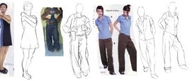
Why can't I get the "flow" of my clothes (especially jeans) to look natural? I've tried to loosely follow the lines of the bodies but it still looks like random squiggles.
No. 468224
>>468206Like the other
nonny said the color palette is really nice. I’d suggest trying to add a little texture to the pear because it looks smooth from the brush that was used.
>>468208Try adding more line weight
No. 468233
File: 1741477237004.png (Spoiler Image,1.65 MB, 1320x1007, cowgirlsusiedone.png)
Does anyone have some critique on how to better stylize cell-shaded illustrations? I attempted doing another color cel-shaded illustration without overusing white highlights and I think that improves it but there's still this feeling that it looks bland.
No. 468239
File: 1741477895672.png (617.67 KB, 1001x721, Screenshot 2025-03-08 184742.p…)
>>468207thank you so much!
>>468224thank you and is this better? I used a custom brush and flat brush this time. I used an oil paint brush first and usually it can do good textures but yes, it did turn very smooth this time.
I'm mulling over the pear spots.
No. 468267
File: 1741483802407.jpg (467.66 KB, 1200x1271, 1000013812.jpg)
>>468233I think you're not playing with the shapes of the color enough. One of my favorite artists does cell shading, but he uses blocks color in a way that keeps it from looking flat. Also your shadows are really not dark enough, and i don't think they take up enough room. Maybe start by overlaying a darker tint then carve out the light.
No. 468399
File: 1741521830503.jpeg (222.55 KB, 1433x1166, image0.jpeg)
>>468224I wasn't sure what you meant by adjusting the weight but I tried to guess. I also messed around with shadows, I like the middle best but more practice will tell. Maybe I need to try a different brush, this one always looks messy.
No. 468401
>>467649I don't have any time to draw and I hate it
But I like your work and I'd be proud of myself if I drew like that
No. 468474
File: 1741544613579.png (2.4 MB, 984x2131, pearinthreestages.png)
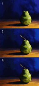
>>468206>>468239>>468224Thanks for the tips! this was great practice.
No. 469226
File: 1741675326373.png (1.07 MB, 1117x1524, ratemyartpls.png)
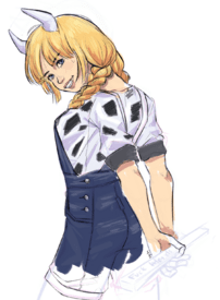
I usually do anime/game art style mimicry and haven't evolved much on my own style. I wanna do more of whatever this is considered.
No. 469381
>>461516thank you
nonnie, sorry for the late response i didn't realize i'd gotten more replies, i do wish i'd done the nose better tho like
>>461880 said kek
>>461724maybe it does resemble the kind of hair girls with a boycut have than the short hair men tend to have
>>461941ok ok kek
>>466377because it's just WEIRD, i'm baffled because how the fuck is a common critter kemonomimi the first to come to mind kek
>>466380i'm happy that you think he's cute
>>466382>Mayhem show off his tail a little bit more? It's mostly hidden behind him.will do, maybe i'll change the position of his arms too maybe because it's awkward how its right where his tail should come out but then putting his arms anywhere else would cover his tail again so i don't know
>I like how you draw facesthank you, i really wish drawing faces could come naturally to me though, i thought i wanted to develop an anime artstyle because it's just more popular right now and likeable but everytime i try it i just can't get behind certain traits like a tiny line for a nose or pointy chins, but my way of drawing eyes is still animu and it bothers me
No. 469837
>>468486Thank you a lot! I am glad there is a visual improvement on it and I am happy I asked for help.
>>468526From a reference image.
No. 470637
File: 1742074841231.png (1.67 MB, 2539x1959, IMG_7269.png)
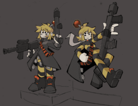
Redesigning old OC, need to draw male counterpart still
No. 470643
File: 1742076300749.jpg (397.63 KB, 2539x1959, 1000013921.jpg)
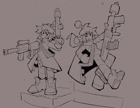
>>470639I guess in the second one the shoes so look orange… I'll change it to match her sashes. Honestly I am bad with color, i always think it looks better uncolored but I can't tell if its the palette or rendering or if the color is too dark and obscuring the line weight, idk
No. 470855
File: 1742136998376.jpeg (192.31 KB, 828x1107, IMG_0908.jpeg)
Does anyone have tips on rendering hair and clothes? I haven’t drawn in a while and decided to take studying more seriously
No. 471529
File: 1742260791137.png (76 KB, 668x906, awdesrdfghjlgdgs2.png)
zombie girl who will never ever ever eat your brain (she promises)
i'm too shy to post this on my socials idk
No. 471570
File: 1742268888755.jpg (90.72 KB, 512x512, augustam025c.jpg)
>>470855I'd recommend practicing by drawing from life or photos. You can take your own photos, or find some on sites like posespace. Change the photo to grey scale and just draw from observation, starting out with large, general blocks of value and then adding more detail as you progress.
No. 473698
File: 1742737979326.jpg (67.62 KB, 742x720, 1 - Copy.jpg)
Childrenswear illustrations I made for a class, how can i further improve upon them? Things that I was criticized on were the negative space because the focus should be on the children and their clothing the plain background isn't pleasant to look at and the poses, my professor asks me to try more dynamic poses since most of my work has them in kind of boring poses.
No. 474237
File: 1742831006779.png (1.42 MB, 1363x2102, MARCH 24 2025.png)
I have been really into the work of Eizin Suzuki, Eguchi Hisashi and Dink Siegel lately. I envy artists that can make very colorful pieces with little to no shading. I suck at rendering, so seeing artists add depth to their art with just one value is pretty mind blowing to me. I tried to replicate that a little with this piece. I also really like the fashion brand I.N EXPRESS, so i took that as inspiration for the clothes, thats why they are bit funky. I wish i could buy some second hand I.N EXPRESS, but it goes for up to a 100 usd per used piece, sigh. His whole fit would cost like 300 bucks today.
No. 474243
File: 1742832684403.png (Spoiler Image,1.21 MB, 1774x2549, finishedacard.png)
Yesterday was his birthday so I drew something again. Thoughts? Oh, and does anyone have any tips for staying on an isometric grid when working with smaller objects that aren't blocky?
No. 474255
File: 1742834540030.jpg (58.6 KB, 443x640, 603761.jpg)
>>474249>This looks crisp as hell! I love the hard shadows and color choices. Good job carving out those shadow shapes.thanks
nonny! the pants were a pain in the ass.
>Maybe adding a third, darker shadow value on the hair and face could add more dimension to those areasThanks , i will try that next time. I leaned hard onto Hisashi's simple 2-value style for this one. But i will try to play more with values next time or go flat-only.
>Also kinda nitpicky but his hand looks a little stiff.nah its not nitpicky the hand is also incredibly small, so it looks a bit goofy. Same for the ear i think.
No. 475297
File: 1743048358098.png (2.87 MB, 2603x1707, intothenightverse.png)
petition for nightcrawler to get a spiderverse 3 cameo since he had a recent run larping as spidey. tried copying the art style of the movies
No. 477560
File: 1743536053406.png (22.09 KB, 151x176, Screenshot 2025-04-01 123006.p…)

mods lmao
No. 477739
File: 1743571354570.png (Spoiler Image,132.26 KB, 670x587, weirdassdream.png)
Here is something I drew because of a dream I had.
>>477307Thanks! It's nice to know there are other farmers into the franchise.
>>477633This is exactly what I've been looking for, I'll definitely use those resources to practice with. Thank you so much. I never thought to apply methods used in pixel art to rasterized art.
No. 478077
>>477739Yeah, I recommended pixel art tutorials because isometric is practically its own genre within that medium, so pixel artists are very familiar with it and there's a lot of tutorials and tips in those communities.
I've found that the basics of pixel art in general can improve your regular art in many areas, such as color theory.
No. 478546
File: 1743725037108.png (2.58 MB, 2048x2048, 1000000744.png)
Dont be harsh please
No. 478663
File: 1743761518672.png (651.31 KB, 877x936, taiyaki.png)
rate my uguu
>>4785466/10 uguu. Needs more anatomy practice
No. 478671
>>478546i like how you drew the faces
>>478663i love the coloring!
No. 478753
>>478666To smell the breeze
>>478669>>478671>>478734Ty!
>>478718To clarify I'm not
>>478747. I fixed the yellow eyes but I'm probably keeping the rest as a stylistic choice. Thanks for the crit
No. 478758
>>478753No problem.
>>478747Majority of the art audience are non-artists. Deal with it. We have eyes even if we can't draw, and can tell when something looks off.
No. 478763
File: 1743780931574.jpeg (236.44 KB, 1500x1001, IMG_8103.jpeg)
>>478747Rolling this out just for you
No. 478842
>>478546cute and soulful
>>478799pyw
No. 478908
>>4786639/10, I think the nose is a bit too low.
>>478718>it feels a bit washed outThat's the point. It's a stylistic choice and the colors are well balanced.
No. 479002
File: 1743815785288.jpeg (462.21 KB, 1125x760, IMG_8153.jpeg)
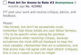
>>478799Spent so much time studying the bla- er,
pencil that you can't read either
No. 479042
Be wary of crabs ITT.
>>478663I feel like you should deepen the values of the eyes, as other aspects of the drawing takes away it's focus. It lacks visual hierarchy, and the darkness of the hair shading along with the detail of the snack she's holding is competing for my attention. I like the colors you chose though, it makes me wonder if you were studying from chinese render tutorials lol. I'd also take a look at the reflective light on the snack, the light pink does not make a lot of sense to me personally, maybe having it be brown would also help with clarification.
>>478546Try to think a bit deeper with your color choices anon! If you're beginning with art it can seem a bit daunting to choose all your colors carefully but it's very important. I'd say if you want a darker nighttime vibe to your drawing I'd make the background dark blue instead of dark brown, and change the color of the clothes, sheets, etc; to go along with it. Good luck!
No. 479043
>>479002Nta, but I
did write the OP. Ayrt is being melodramatic and ridiculous, but I generally agree with the idea that critique from another artist is going to be more helpful than someone who isn't. I mean, that's just common sense, isn't it? A person who does a thing is more qualified to give advice than a person who doesn't do it.
No. 479045
>>479043I agree. A comment from a non-artist (who announces they're a non-artist) may or may not be valuable, but that's no reason to sperg out. The artist can choose to just ignore that comment if she doesn't feel like it's contributing anything.
I admit that I found the non-artist's critique to be kind of ignorant too.
No. 479046
>>478663The colours are very appealing and rendering is pretty. I'm appaled at how yall manage to pick colours so well. The skin… The strawberry… Ahhh….. Very beautiful nona
Don't listen to those landlubbers. Maybe they're just jealous. This legit looks like something I'd see have thousands of likes on twitter. As for criticisms I agree with what this anon
>>479042 said. Maybe make her second eye sclera white, too. But aside from that very nice work!
No. 479688
>>479043nta I feel as though it's important to allow nonartists critique are as well? Because from the eyes of a normie, they might pick up on something we're a bit less focused on. Where we see the scratchiness of lineart, a normie could just go "damn, she looks like she has downsyndrome". Both takes are valuable to appealing to both crowds imo.
I keep nondraw friends around for this very reason.
No. 480556
>>479687I use ibis paint. Im not really into anime or digital art. Just doodling in my free time when im craving love swh
>>478781>>478842Thanks
>>47904Thanks for the feedback
No. 481233
File: 1744324400758.jpeg (149.54 KB, 672x800, fl.jpeg)
Flaky. Saw art of her in a different thread and got nostalgic.
No. 482581
File: 1744619287496.jpg (148.02 KB, 674x728, h1744619126411.jpg)
>>478663It does look a bit washed out. You should make the eyes of equal values as the hair. I edited it a bit to show what I mean
No. 482600
File: 1744627855071.jpg (64.36 KB, 736x980, efc75ba1dcf7bf345e5fcd698e29b0…)
>>478663Unsure about the people telling you it's washed out, I think that's an intentional stylistic choice
It's cute but the shading throws me off a bit. I could be wrong but shouldn't the section underneath her pigtails be darker since it's obstructed from the light source on the right?
No. 482602
File: 1744628356227.webp (103 KB, 600x785, 98995259_p0_master1200.webp)
>>482581Nta but some anime artists intentionally draw eyes like these like ccroquette, maccha and yeej Chan
No. 483953
>>482581Agree with
nonny. It looks a lot better like that
No. 489066
File: 1746068752761.png (221.88 KB, 855x864, Captureee.PNG)
What am I doing wrong
No. 490035
File: 1746390360124.png (2.97 MB, 1944x2507, backgrounds.png)
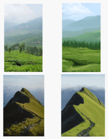
I am trying to learn how to paint backgrounds. Any tips? I have been doing lots of value studies, this is my first time trying with colors and not greyscale
No. 492715
File: 1746907300911.png (464.69 KB, 552x769, Screenshot 2025-05-10 135218.p…)
I can see faults with the wood floor
So any tips there would be helpful
Also, if you have anything else to add, that would be awesome!
>>490035Are you trying to get it as close as possible to the picture you are referencing, or more of a close rendition? I love it so far. It's amazing that this is your first time using colors instead of just grey. Don't be scared of trying new brushes that can add texture.
No. 493052
>>493017Well it's from a reference.so if the perspective of the pancakes and plate, that's just how it is.
Are the colours not dark enough? Should the right side be worked on to be darker?
Is it the perspective of the wood?
No. 495024
File: 1747247676772.jpeg (Spoiler Image,327.98 KB, 1507x2298, image0.jpeg)
I can get the lines close enough to reference but never likes likeness or expression. Why does this keep happening? I do try to draw "what I see" but I still can't replicate properly
No. 495075
File: 1747254866170.jpeg (185.4 KB, 924x1047, EVA7oDTUUAERR3g.jpeg)
>>495068Our brains fill in the gaps for us. Its why the rough sketch almost always looks better than the finished lineart. I think full lips look the best when painted. Drawn they just look too detailed.
No. 495102
File: 1747256637352.jpg (647.9 KB, 1400x2125, 04kpn5mviac81.jpg)
>>495093araki is really good at drawing masculine men even if they have feminine-coded parts of their designs and you can see that he does the thing anons said where he makes the lower lip more pronounced and uses shading to imply the upper lip which is smaller
No. 495103
File: 1747256759855.png (1.43 MB, 905x862, Jolyne-Cujoh-and-Jotaro-Kujo-a…)
strong and defined jawlines also help for males, you can see he draws smaller and rounder jawlines for women
No. 495144
File: 1747262622941.jpeg (Spoiler Image,324.73 KB, 1507x2298, image0.jpeg)
He looks less ugly but he still doesn't look like Al Pacino. Any advice for total beginners with values? I tried to use a black and white filter and copy off that by eye but it turned him Indian.
No. 495343
File: 1747306917388.png (Spoiler Image,2.7 MB, 1984x2048, Untitled130_0000-24-43.png)
I know the art is amateurish from a distance but I really dont have the eye to see how. Nonas please help
No. 495351
>>495024You're not drawing what you see, you're drawing what you think should go there. Proof of this is the way you drew the lips. We cannot see the exact line between the lower lip and the chin in the photo; the shadow under the mouth is much more prominent.
>>495068It's because in real life, the lip "line" is blurry compared to a very defined and clear line in a drawing. The closer this "line" is to the corners of the mouth, the more "faded" it looks. The difference in color/value between lips and surrounding skin isn't always big enough to warrant depicting this "border" with clearly defined lines. It's better to define the mouth in the coloring phase like in this drawing
>>495075 which looks much closer to reality than if the lips were fully drawn with harsh black lines.
Not even Araki "connects" the lower lip line with the mouth corners.
>>495103 Here, he also makes sure to shade the concave area between the lip and the chin.
>>495102I believe if you do that with the top sketch in
>>495144 it'll look a lot more like the reference.
No. 495370
File: 1747312153667.jpg (510.3 KB, 2148x2223, 17472626212941.jpg)
>>495144>>495311I tried to edit it a little to be how i would do it, i'm pretty bad at getting likenesses too but hopefully you get what i mean.
No. 495467
File: 1747328824989.png (711.43 KB, 1262x656, fwerf.png)
tried to draw a study
No. 495797
File: 1747390818796.png (828.7 KB, 1262x656, fwerf1.png)
>>495518added more jaw and tried to make the shadows darker
No. 495868
File: 1747404494032.png (1023.74 KB, 1262x656, fwerf2.png)
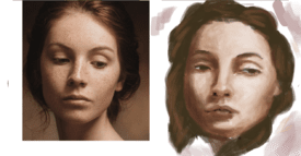
>>495797a friend said it was too patchy and i should blend more, do not know if i did a great job on it or it ended up looking to muddy
No. 495923
File: 1747412799162.jpg (76.52 KB, 736x800, ef3145122c13c365d617fbdbe1299f…)
>>495467>>495797>>495868You need to measure and keep facial proportions in mind. The reference has very angular features, but she looks like the moon emoji in your drawing because you made her eyes too large and too far apart, while also making the head to large in general.
No. 495981
>>495953Okay, those proportions are a little better, but now you want to integrate in the range of value you had in
>>495868 You have the darkest values you need, now you want to add the highlight values.
No. 496466
File: 1747507818326.jpeg (Spoiler Image,343.05 KB, 1687x1063, image0.jpeg)
It looks more like him but it looks shit why can't I make this look nice
No. 496855
File: 1747532033592.jpg (317.93 KB, 1920x767, planar head.jpg)
>>496466Pretty good, but it's important to view the mouth as planes, rather than as a single shape with an outline. You have an inward bevel with the top lip, casting it in shadow, and an outward bevel with the bottom, illuminating it. Then, that series of bevels is bent around a cylinder. Try to ignore that the lips have a different pigment from the rest of the skin, and just focus on what shape they are.
No. 496924
>>496466the eyes and mouth don't lie flat on top of the skull, they follow its shape. skin wraps aroumd the bone like fabric.
also think of what his most recognisable features are (eg. large eyes) and concentrate that. you din't have to faithfully recreate every fild of the skin, the most important part is to get his most identifiable features right imho
No. 496942
>>496851I don't want to continue without figuring out how to make the actual lines look good. I don't know how people seem to do this. Compare what I've posted with
>>495370, the lines I've drawn are very ugly. How do I make them look nicer?
No. 497214
>>496960Thank you, I tried this earlier but never posted because it's not really working so far. Will try again later.
>>497080I mean the strokes themselves
>>497171No I meant the other anon did a much better job than I have
No. 499763
File: 1748125487265.jpeg (Spoiler Image,408.67 KB, 1931x719, image0.jpeg)
>>497214Here's a new try. It looks better than previous attempts but still looks in-cohesive?
No. 499832
File: 1748139247240.jpeg (138.84 KB, 640x640, BE4772BE-A378-4588-AC53-FA320B…)
>>499763Anon I think you’re doing fine and It’ll be more worth your time if you instead work on other things. Many skilled artists struggle with getting the exact features down accurately, it’s normal. Unless you’re trying to become a skilled portrait painter or something, you’re really bashing your head in trying to get something down perfectly, and you’re already doing pretty good in my opinion. Maybe try to do other portraits and make it as best as possible, compare, and revise on your own. Don’t get stuck trying to achieve perfection.
No. 501669
File: 1748471346426.jpeg (Spoiler Image,279.61 KB, 2048x1768, image0.jpeg)
>>499832>>500574Aww you're both so sweet thank you, made me smile a lot.
I've tried to go off a painting I found on pinterest. I thought it looked nice so it'd be worth replicating. It's going well so far but I am at a loss with hair. I know it should be done in sections but I don't know what to do with those sections.
No. 501819
File: 1748509614007.jpeg (173.49 KB, 1125x1116, IMG_3203.jpeg)
>>501669The rendering looks fantastic, I also struggle with hair, I feel like the hardest part is not over-rendering it, I found this was a good reference for shading, you wanna make the mid tones lighter and increase the contrast between the darker tones, YMMV depending on your style though
No. 501832
>>501685Thank you.
>>501819Yeah I've just colourpicked so far, would I need to make a palette or something for this method? I'm not sure how to approach it but I appreciate you sharing. Maybe it's best to test on a smaller scale? Idk.
No. 501954
File: 1748537451261.jpeg (Spoiler Image,88.37 KB, 817x726, image0.jpeg)
I shaded in highlights and eventually stroked over them with black which gives a good illusion. It works for now, but I'll have to do studies on hair in future.
No. 503415
File: 1748965597522.jpeg (Spoiler Image,455.69 KB, 2974x2236, image0.jpeg)
I've taken a break from portraits for now. I'm trying to emulate pencil drawings but it's really not working. I know it's going to be hard to do it digitally but surely there's a technique? Any advice to make this look more natural? I will start over happily.
No. 503418
>>503415I personally think that it looks like pencil (the first time i looked at it i thought it really was pencil for some motive), maybe try avoiding to layer the strokes? Since you can't layer pencil very well. I wonder also if it's too full of colors to be like real pencil drawings? As i said, pencil can't be layered so i wonder if the colors inside colors (especially lighter colors inside darker colors) would even be possible.
Another thing, try lowering the opacity of the brush and see if it looks a bit better, i believe layers of strokes look much more pencil-ish than dark, decisive and clean strokes. I'm not exactly a professional but i hope this helps you.
No. 503432
>>503415sorry if this isnt useful but have you tried with blocking the shapes with a base color and adding all the details with the pencil?
also what
>>503418 said about the opacity and it might just be me but the pencil strokes in your drawing seem kind of big
No. 503505
File: 1748985686120.jpeg (Spoiler Image,308.73 KB, 980x1311, IMG_0690.jpeg)
trying to get out of solid 2 going on 3 year old art block. doodled this strange lady before bed. not sure if i’ll finish this but drawing repetitive patterns was relaxing, i should do it more
what kind of composition or situation or environment do i put her in? i want to make her hold something but i’m not sure what. my creative thinking has athrophied
No. 503513
>>503505I like it! I hope you're having fun and you should keep it up.
>what kind of composition or situation or environment do i put her in?A few ideas: she looks like a priestess to me, maybe have her lifting an wooden or stone idol over her head either behind or on top of an altar for some kind of ceremony.
If you like darker theming, maybe have her about to plunge a ceremonial dagger into some unfortunate human or animal sacrifice trussed up to a stake or monolith. Liberally decorate the background with spooky spirits or barely seen horror.
Holding a clawed or chewed up voodoo doll and scolding a large forest cat or wolf.
Finally, I could see her rooting around some primeval forest, picking and inspecting exotic flora for medicinal or ritual use.
No. 503557
>>503505i love your linework
nonnie! i see her in kind of like a jungle-forest environment surrounded by glowing mushrooms.
No. 505575
File: 1749366520182.png (14.22 KB, 858x847, imark.png)
WIP, the anatomy is broken. Salvagable from here, or shelve this to redraw at a later date?
No. 508280
File: 1749995208605.jpeg (Spoiler Image,402.95 KB, 1847x1536, image0.jpeg)
Generally thinner strokes, lower opacity and blocking all as advised. It looks fine but I mostly credit contrasts for that. How can I improve before going further?
No. 511772
File: 1750896940695.jpeg (403.83 KB, 1809x1313, IMG_8106.jpeg)
I tried studying some drawing I found and I can’t draw wrinkles for shit
>Inb4 I have bad taste in males
I know
No. 511789
File: 1750900714337.png (353.83 KB, 605x639, foldshelp.png)
>>511772this is cute nona! i love wasabiladys art also. i think the main thing is just understanding the form behind the wrinkles, like WHY the wrinkles are wrinkling. Like in this example, the arm is being bent, which causes the fabric to move up and compress itself. The backside of the arm isnt as compressed BUT is still influenced from the wrinkles of the bend if that makes sense? IDK im bad at explaining, heres a diagram.
No. 511990
File: 1750963718392.jpg (178.41 KB, 1922x1765, 1000020228.jpg)
>>511789>>511831Thanks, thinking of it as the structure of the wrinkles kind of helped, but Im still having trouble wrapping my brain around it. Its hard to imagine the cloth. I think i got it nominally better but the wrinkles are still kinda… nonsensical
>>511795>study from li-Shut your whore mouth. I dont want to, although theres probably some truth to that.
No. 524538
File: 1753372199542.png (Spoiler Image,1.3 MB, 1120x1610, scribbling.png)
Image spoilered for cartoon violence and ape nips.
I haven't just barfed out a couple of quick illustrations without using any reference or a script in some time, all advice, nitpicks and personal insults are welcome. I still feel a bit of shame for drawing like this and think the top image could be used as a "Don't Do This!" example in a discussion about readability but I think I mostly succeeded at the assignment of making adventure art that would appeal to a ten year old boy.
No. 524594
>>524546Presumably the monkeys are protecting their treasures and territory from interlopers and treasure hunters and the robbers and trespassers understandably are not cooperating.
>>524551Sorry I have no plan to color either of these. I am happy to know you liked the drawing though.