File: 1728189361102.jpg (265.5 KB, 1920x648, 1726555004440.jpg)
No. 421143
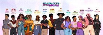
Post the worst of the worst character designs you can find. From the uncannily realistic to terrible reboots to oversexualized. It doesn't matter if it's from movies, TV, video games, comics, just has to be awful.
Previous threads
>>>/m/299904>>>/m/189168>>>/m/124171 No. 421184
File: 1728204126021.jpg (45.55 KB, 500x370, 2311954956_23d802562e.jpg)
No. 421185
File: 1728205017445.jpg (930.57 KB, 2928x2506, MV5BODJiYjcwZWItM2YwMC00NzQ5LW…)
No. 421200
>>421190>>421198wait do they actually state that this character's
mother is Qatari and
father Black South African or did the first anon just assume it to be si
No. 421257
File: 1728238352835.jpeg (642.2 KB, 2048x1593, GFBj7UQWwAAtHoI.jpeg)
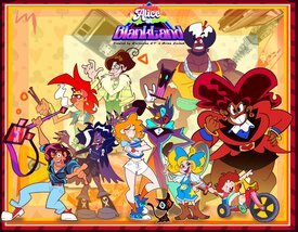
This is an upcoming indie animation pilot but this is just so ugly I don't know where to start.it even has some furry Tumblr sexyman in a suit.
No. 421268
>>421257"we're so inclusive!"
>the fattest character and biggest muscle brute are both black>the most conventionally attractive characters are whiteevery time
No. 421289
>>421278>>421257Now it makes sense
>guy with afro is garterbelt>purple girl is amethyst >red woman is a mix of garnet and the ugly fat fuck gem>cat is cat from coraline >guy with guitar is a mix of those two retro guys from gravity falls and Steven universe's dad>Tumblr sexy man is a mix of black hat, hazbin hotel sexy man and that one guy of the shitty videogame where his purified version whitewashes him>redhead girl is some sort of Panty and Brief's lovechildThe other two ugly guys look like a colorful and skinny mole from atlantis and simultaneusly the two beavers from angry beavers.
No. 421293
>>421257The blonde girl is basically just Goldilocks
And the cat furry is a mix of Baron from The Cat Returns and Black hat from Villainous.
No. 421299
File: 1728249627450.jpg (30.66 KB, 500x374, 82b42bf76149b93e141ce878287c66…)
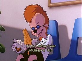
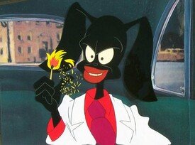
>>421257>>421289the redheaded guy just looks like this character from a goofy movie.
>>421279there was a pretty popular kf thread about it, but it's slowed down since there haven't been a lot of updates for a while
No. 421300
File: 1728249685674.jpg (163.9 KB, 1280x720, maxresdefault (1).jpg)
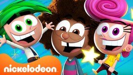
I don't why this gets so much praise when the art style and animation became 10x uglier and worse.some things should never become 3D.
No. 421304
File: 1728251788484.png (217.71 KB, 687x387, Image_1.png)
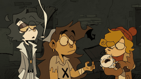
>Post the worst of the worst character designs you can find.
This was not worth almost 100k
No. 421305
>>421257The redhead is literally
the most boring, safely designed coom character I have ever seen in my life kek
No. 421306
>>421189Lol I remember this: they gave all the
POC characters the 'positive, woke' traits (e.g. obesity, scars, oversized glasses, bad fashion sense, stupid hairstyles, gender clownery, etc), and then they were furious that everyone was simping for the conventionally attractive white guy LOL.
No. 421307
>>421304It irrationally bothers me when people who clearly just want to draw anime
don't draw anime and do this ugly mishmash of styles instead.
>>421306Woah there, anon, there was also Malik (the black guy who looks like a normie compared to everyone else) who was CLEARLY supposed to viewed as troonphobic garbage for convoluted plot reasons and had such character traits as,
I shit you not, being a deadbeat dad who worked at Popeye's and was constantly trying to sell mixtapes. I still clearly remember his route because I was so shocked kek
No. 421311
>>421189he has the same ugly face as the rest of them. you just like emo boys
>>421155I feel like I’ve known at least 3 people IRL who look like Isabelle
No. 421328
>>421199No the artist did a terrible job on drawing black/
POC characters. They should be forced to go to a Russian art school and actually learn perspective, anatomy and color theory.
No. 421372
>>421304This looks like that Welcome To Hell animatic that went viral like a decade ago. I wish I lived in the timeline where
that got made into a show instead of Hazbin Hotel (although they're both cringe).
No. 421418
>>421257Every gendie artist in the world needs to realize that they are
not Vivziepop and that their OC is
not the next Angel Dust.
No. 421560
>>421300They're
still milking this dead, dry cow?
No. 421632
File: 1728331102756.png (217.89 KB, 640x621, 640px-Crazy_Frog_Standing.png)
No. 421672
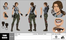
File: 1728338403852.jpg (478.76 KB, 1546x935, modele-sheet-lara-adventure01-…)
No. 421675
File: 1728338532204.png (98.22 KB, 250x243, Peri_Fairywinkle-Cosma_2D_desi…)
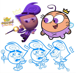
>>421300It's purely because Poof grew up into a Tumblr Sexyman
No. 421677
File: 1728338718984.png (877.32 KB, 1231x1442, Screenshot_6.png)
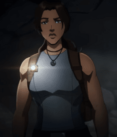
>>421676Okay support female erasure in media by ignoring how they masculinesed her. Her breasts look literally like a buff male chest from the side.
No. 421690
File: 1728339644842.jpg (446.73 KB, 1109x1226, Untitled.jpg)
>>421689you're a moid or the dumbest pickme alive and i hope you don't end up saddled with some balding loser's children
No. 421699
>>421695I guess, but it just seems quite bland and I wouldn't be surprised if it ends up as a "huh, that was a show?" and "Laura Croft had a cartoon? When? Wait, was that meant to be her?"
It's not like there's just either "sexist bimbo or stoic mom", there should be a scale of character between that, something unique to
the Tomb Raider.
That being said, Eh it's not like tomb raider had that much going. And tomb raiding in of itself is probably too inmapropriate to show as a "2cool4scool" thing nowadays.
No. 421731
>>421672The design is nice because she's sexy without being overly objectified.
>>421686Smells like 3-in-1 shampoo in here
No. 422265
>>421672>>421677>this is supposed to be Lara CroftAdd it to the large chest erasure pile. Women can't just exist with big tits because it's sexist to themlets.
Also the shadows make her just look like a man's chest ew.
No. 422266
File: 1728500686520.png (410.73 KB, 887x2000, 1000015271.png)
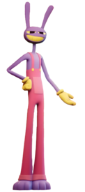
Fuck this annoying bastard
No. 422271
File: 1728501548757.png (129.94 KB, 250x431, CaineTransparent.png)
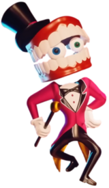
Gosh this ugly shit is so painful to look at,I hate everything about him.
No. 422476
File: 1728535172202.jpg (244 KB, 717x624, be3.jpg)
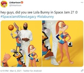
Bad redesign fanart. Basically make her coombait again and it just doesn't fit with the rest of the characters. Moids and furshitters can cry all they want but I'm glad the producers didn't sexualize her in the second movie.
No. 422850
File: 1728612053097.jpg (1.88 MB, 1080x1920, sf6-lily-01-1080x1920-1.jpg)
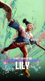
Uncanny valley and over sexualized I also hate how they gave her such a creepy babyface too.
No. 422851
File: 1728612314486.jpg (213.38 KB, 1200x1600, Tekken_8_-_Lili_Render.jpg)
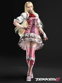
It's not that bad but this outfit is just a lame,lazily made rehash of her white Lolita dress.the pink doesn't even suit her and the bows on the boots are just tacky.the modern Tekken designs suck.
No. 422954
>>422265The original reason Lara had big boobs was because they accidentally made them like 500% bigger than intended and it made scrotes' dicks hard so they kept them
> Women can't just exist with big tits because it's sexist to themlets.Nice strawman, but unfortunately themlets think women should always have big breasts and that those who don't probably aren't women, so your insult isn't even aimed at the right people, scrote
Let me fix that for you:
>Women can't just exist with average tits because it's not fap fodder for moids
>the shadows make her just look like a man's chest ew.you're right, a woman's chest should always be emphasized and the breasts should always look huge and bouncy and sexy for moids or else she looks like a man amirite
No. 422962
>>422850Her mouth looks friggin grotesque in this artwork lmfao
>>421933I always thought the characters in anime-esque shows looked off-model a lot of the time.
No. 423212
File: 1728720019768.jpg (689.04 KB, 1980x1080, 1700494067329.jpg)
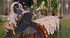
can we just talk about furries on the whole and how they create these hideously overdesigned characters and get tons of porn of them
how is this thing sexy
No. 423226
File: 1728721870484.jpg (387.66 KB, 1056x1360, genshin impact.JPG)
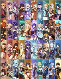
They are the epitome of slop to me
No. 423901
File: 1728848777180.png (133.89 KB, 421x548, Df164wo-f38bfd6b-b355-45b0-9dd…)
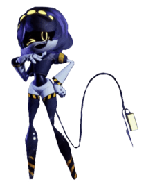
Honestly glad this trash ended.The designs from this show were way too overcluttered making them a total eyesore.
No. 423909
File: 1728850026936.jpg (40.57 KB, 500x500, thisbih.jpg)
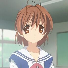
I hate moeblob and everytime I look at this stupid character I can't help but think about her being the anime version of a cockroach
No. 424219
File: 1728928586835.png (38.62 KB, 216x348, 1728916185299.png)
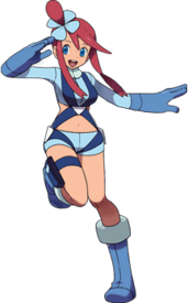
I don't care what anyone says this is a shit, over sexualized design that doesn't even make sense in a kids game like Pokemon.
No. 424239
>>421672Her outfits in the "anime" were so awful idk what they were thinking.
I wish they'd reduce her boobs and make them look normal; those shadows look unnatural and weird.
No. 424265
File: 1728941749349.jpg (584.8 KB, 1100x1438, ugly bitch.jpg)

>>423909Key stuff in general has always looked disgusting to me.
>>424045to be fair that type of artstyle has kind of died out (aside from in eroge where they're still over 15 years behind)
No. 424268
File: 1728942473625.jpg (16.09 KB, 200x275, 1000027978.jpg)

Pic shamelessly stolen from the characters you hate thread because it's an example of this design trope. It drives me absolutely insane when anime catpeople have 2 sets of ears, one being human. It's so off-putting and extremely lazy.
No. 424275
>>422850Oh his yeah,that face is creepily baby-like
Fucking hate however designed and decided this was alright ew
No. 424364
File: 1728979370030.jpg (745.28 KB, 1920x2296, Alisa_TK8_Render.jpg)
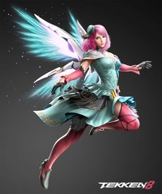
>>422851I swear they fired their old character designer and replaced them with a colourblind moid. i hate the combination of pink, purple, magenta and red for lili's dress and her silly uneven hem. I could write an essay on everything wrong with the character designs in 7 and 8. Alisa's 8 design is especially horrible, the teal and blue looks terrible with the salmon, and using both black and white just muddies the colours and then they go ahead and add yellow and purple for one random bow.
No. 424752
File: 1729106699760.jpg (305.13 KB, 1920x1080, ss_73dc5799a8496cdfe782f081b6d…)
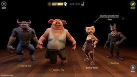
No. 425177
File: 1729253307115.png (3.85 MB, 1756x1440, 1000038753.png)
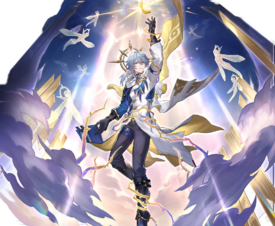
Who even thought that military looking pants would look good with a supposedly angel themed design? The colour scheme is atrocious - plastic pepsi cola blue plus piss yellow looks like shit. Does he really need that many arm/tight/waist straps? And of course the fucking eyes everywhere so the brains of illiterate twitterinos would blow with that "bIbLiCaLLy AccURaTe AnGeL" (it's not accurate at all, unless you are a retard) reference.
Really hate how retarded zoomer culture (=gachashit) and taste in men are. They think this garbage is peak design.
No. 425211
Stop reeing at average animu pretty boys that because of your personal vendetta against gacha. This isn't vent or things you hate thread. Post some actual anatomy failures (
>>424265 ), fugly faces (
>>421257 ) or coomshit (
>>424871 ) etc that actually are relevant to the thread.
(minimod) No. 425212
File: 1729266051110.jpg (181.06 KB, 1872x2000, F7sRkb4bEAInteL.jpg)
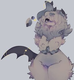
this is supposed to be a fucking pokemon
No. 425214
>>424871The one good thing about this game is that the wolf's ability is
triggered by going "AWOOOO" kek
No. 425215
File: 1729266277544.png (1.56 MB, 1200x1200, Honkai-Star-Rail-Robin-materia…)
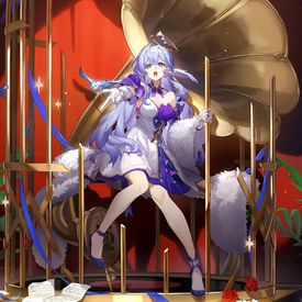
>>425177People just like angels and male characters in general. Of course his sister has a much more visually interesting outfit in comparison.
No. 425218
File: 1729266652697.jpg (51.5 KB, 1351x702, 1000028091.jpg)
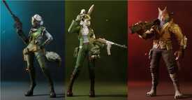
>>424871The other female characters look marginally, MARGINALLY better (though of course they still belong in this thread) and it makes it incredibly obvious that the fox was specifically designed by a waifufag kek
No. 425235
>>425233Agreed, it just looks like all the female animals are wearing cheap wigs kek. The fox in
>>424871 is atrocious because the blonde shade clashes horribly with her fur kek
No. 425245
File: 1729276333285.webp (15.09 KB, 648x365, IMG_3905.webp)
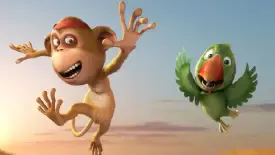
The monkey looks like an old British man visiting Thailand for sex tourism and the parrot has human teeth. This is Delhi Safari.
No. 425255
File: 1729281007854.webp (1.62 MB, 3840x6270, Tekken_8_-_Asuka_Render.webp)
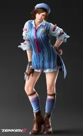
>>422851I kinda don't mind Lili's new look as it does feel like a nice progression of her classic white dress but touched up. However I just am not a fan of the thigh socks, I feel like they should've just gave her something like lace tights or leave her legs bare but give her some bloomers to wear underneath.
But I do see where you're coming from anon, a lot of the newer Tekken designs look tacky.
>>424364Honestly I was never really into Alisa's design from the getgo even back in the Tekken 6 days, her outfit looked so mismatched and I just didn't like it. I honestly liked her T7 design better kek. Her T8 look is "meh" to me, it's better than T6 but I feel like there is just way too much going on for it's own good.
As for my own Tekken contribution, Asuka's T8 outfit is horrendous, I hated it the moment I saw her trailer. Like WTF were they thinking with this look? The outfit just looks so uncoordinated, uncomfortable, and I don't understand why they'd put her in heels when she's more of a tomboy character. Her T7 look was bad but more on the bland side (and coomifying her with the cleavage). Asuka's one of the examples of a character where I only like her debut outfit T5 and she has since not worn a better default outfit since then kek.
No. 425760
File: 1729466349330.webp (337.13 KB, 1080x1920, dori.WEBP)
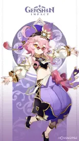
>>425211>Stop reeing at average animu pretty boys that because of your personal vendetta against gacha.Because 2 posts out of this whole thread mentioned mihoyo characters? Their games do have terrible designs, slapping animu faces and pretty colors on cluttered turds doesn’t make it better.
No. 425881
File: 1729501488594.jpg (1.39 MB, 1384x2627, The Ancient Magus' Bride Wizar…)
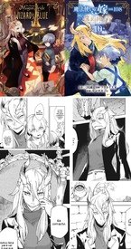
Someone described this as the gender-swapped version of Ancient Magus Bride(in fact this is a spin-off with same author but different artist), which would be incredibly based if the FL’s design wasn’t so fucking bad. Not even the artist who designed her knows how to draw her, judging by these panels.
It’s such a boring approach for a female monster too, just slapping on pretty anime eyes, hair, and boobs. It’s even worse when she’s colored with a fleshy pink skintone, looks like a deformed human freak of nature who should’ve been aborted instead of a cool mysterious beast like the skull man in OG Magus Bride.
No. 425895
>>425881>just slapping on pretty anime eyes, hair, and boobs.kek, it's so fucking lazy
>>425886This doesn't happen in the original manga, kek. Elias is very monstruous. Moids are so afraid of drawing unfuckable female characters. Not sure if the artist is male or not, but their gallery sure makes them look male.
No. 426040
File: 1729547772664.jpg (734.22 KB, 1170x645, uncle tommy.jpg)

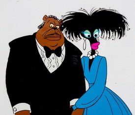
>>421257https://youtube.com/watch?v=t9nyiBKtsj4>1:20>”Come on in and give your UNCLE TOMMY a bear hug!”KEK WHAT WERE THEY THINKING? This has to be on purpose with the blaxploitation caricature design.
No. 426294
File: 1729625169277.png (538.63 KB, 497x1500, Tracer_ow2_portrait.png)

I honestly think she belongs here.I never understood why she was popular at one point when she looks like this.
No. 426310
File: 1729626296604.png (2.56 MB, 1920x1080, VS--YouTube-AliceInBlankLandME…)
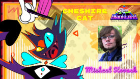
>>426040Of course 'you know who' had to show up and voice yet another tumblr bait character.
No. 426731
File: 1729781662734.png (2.14 MB, 2136x1816, 1705053906787.png)
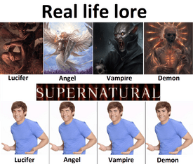
do the later creature designs on supernatural count, In the beginning the majority of their targets were ghosts, whose designs were influenced by who they were as people and how they died and these designs were interesting and creative, but as the show progressed, they introduced more and more monsters such as werewolves, leviathans, skin-walkers and dragons, all of which were once regular humans, sometimes with contact lenses and I remember it was the dragon episode that made me stop caring about the show because again, the dragon were just regular people with contact lenses. So, I knew the show had given up trying
No. 426738
>>426731as boring as it was, I give shows like that a pass for shitty creature design because they're often working under ridiculous time/budget constraints. Logically, that means that they should probably just be smart and limit themselves (eg don't put in a bloody dragon if you can't get the okay from the execs to put in an actual dragon kek), but Supernatural had the same kind of story progression as a long-running shounen, so it was constantly trying to add new and bigger threats and nonsense (it might sound weird but networks and stuff were very cagey about shows being
too fantastical for the mainstream audience, even GoT was surrounded by constant reassurances that you could ignore the silly dragons and ice zombies and stay for the very serious human drama/politics, it's not for nerds I swear– HotD shows a shift in attitudes in this regard, actually). I didn't mind the use of 99% human-looking monsters for demons/angels, since they're spirits possessing a body, or vampires as they were originally human, and hell hounds being invisible was fun, but yeah the leviathans and dragons and other goofy shit were pushing it a bit too far kek
If the show was 100% animated or a novel instead and still had designs like that? yeah I'd be big mad lol
No. 426911
File: 1729829107677.png (303.33 KB, 667x300, PEWIfBF.png)

>>426738>>426752the awful creature design came when they had a much higher budget and basically enough time and freedom to do what they wanted and they chose to half-ass it cause they knew they'd always be renewed for countless more seasons
picrel is s1 monster design for compassion
No. 427230
File: 1729924275735.png (230.35 KB, 791x1076, 3xpdmzdi105b1.png)

No. 427233
File: 1729925366503.jpg (7.48 KB, 202x275, redline.jpg)
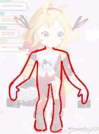
>>427230tried to redline it
>>426040no way nobody told them how racist this sounds KEK
No. 427509
File: 1730028452927.png (5.76 MB, 3070x4938, Arlo728556.png)

I haven't seen this movie but worst dinosaurs I've ever fucking seen
No. 427513
File: 1730029574527.jpg (295.08 KB, 1200x1478, 1000028317.jpg)

>>427509Don't forget the triceratops with predator eyes.
No. 427516
>>427514I also found it so funny how they felt the need to make the human child act like a dog. Filmmakers have no other ideas on how to make companions endearing so they just made a human child walk on all fours and bark kek. Ice Age did the same concept
years ago and that baby just acted like a normal kid!
No. 427520
File: 1730030479496.jpg (187.78 KB, 994x804, 1000028318.jpg)

>>427509There was a brief moment where furries were attracted to this creature kek, the fact
this is the least shitty dinosaur design in the movie says it all.
No. 427523
File: 1730031191818.png (270.74 KB, 1102x851, 96486486877577645563.png)

>>427516This is a common trope and as someone who hates dogs I abhor it every time kek
No. 427550
File: 1730042002159.png (2.35 MB, 1920x1080, image (4).png)

>>427509I have a lot of beef with this movie, I've always been into dinosaurs but I understand mainstream dinosaur media will never even attempt to be scientifically accurate. Regardless, the movie is the most disappointing thing I've watched where a cool concept get's wasted on a "child with dog" story. Also how ugly the characters really resonates once you see them with the photorealistic scenery.
No. 427551
File: 1730042180905.jpg (1.2 MB, 4096x1711, ugly dinos.jpg)

>>427550Samefag but the worst designed characters are probably the raptors, they're genuinely hideous.
No. 427585
File: 1730052540172.gif (88.4 KB, 220x169, love-lick.gif)
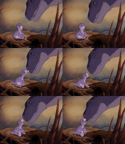
>>427509The person who oversaw the character designs in that movie should be working in a toll booth. How do you manage to fuck up a concept as enjoyable as dinosaurs?
>>427510>>427550The dinosaurs seriously look like they were rendered with software from 2002, while the backgrounds look cutting edge and hyper realistic. It's so distracting. DreamWorks has a lot of issues, but the Trolls and Kung Fu Panda movies are very visually cohesive, where the backgrounds are as stylized as the characters. Neither Arlo nor the human child are at all cute, which is a gigantic mistake if you're working on a kids' movie. People bitch about how they find the dinosaurs in Land Before Time ugly, but I think that they manage to be humanized and cute without compromising their more dinosaur-like attributes.
Also the cowboy shit is completely retarded and it's the kind of idea that should have been nixed during script revisions. The dinosaurs should have been medieval or something instead.
No. 427587
>>427513>>427585Samefag. Note how Little Foot's eyes are on the
sides of his head, because Don Bluth wasn't a retard and knew that Apatosaurus was an herbivore. If you arent super careful about it, sticking front-facing eyes on a prey animal is a great way to send your character designs careening into the uncanny valley.
No. 427598
File: 1730055238959.png (695.36 KB, 1120x713, Disney_dinosaur_species_graph_…)

>>427550>>427551as another dinofag with turbo autism i instantly knew i would never watch this. seeing those raptors makes me angry. what a revolting design choice.
disney's dinosaur gets a lot of flack, but at least the dinos looked good. not scientifically accurate, but pleasing to the eye and more respectful than this garbage.
No. 427623
>>427587I think the most egregious thing about the triceratops is that they picked the
one herbivore with a giant fuckoff horn growing
right in front of the place where front-facing eyes would go lmao
No. 427627
File: 1730058576437.jpg (163.35 KB, 1920x1080, 1000028345.jpg)
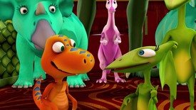
>>427587Even friggin
Dinosaur Train got this design aspect right kek. Speaking of Dinosaur Train, I'm nominating that baby T-rex as an example for the thread because its protruding bug eyes are honestly just unnerving.
No. 427863
File: 1730154218976.png (729.53 KB, 984x1570, Seiko_Anime_Concept_Art_webp.p…)

havent watched this anime but shes supposed to be a grandma
No. 427864
File: 1730154706925.png (78.88 KB, 180x282, 1000078294.png)

>>427863She has white hair,
nonnie, and her boobs aren't perfectly round balloons, that's what happens once we hit our 70's then, when we're 90 we transform into pic related.
No. 427944
File: 1730180850224.webp (93.87 KB, 700x700, Alear_Profile.webp)

alear is genuinely hideous. and i hate how female alear's design is sexualized just like female byleth.
No. 427973
File: 1730204495492.png (271.66 KB, 999x681, alear.PNG)

>>427944The beta design is just as or even more hideous, Alear really had no chance with this designer kek. What happened to the people whose role is to tell artists to dial back retarded design choices?
No. 428014
File: 1730216853769.png (1.2 MB, 1183x789, 20240203021427.png)
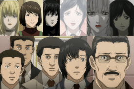
>>427863I wanted to post her but couldn't remember what anime she's from. The hair and glasses make her look like a Bayonetta wannabe, and her outfit is pure shit taste. I get that it's intentional to some extent but the fact that it's so sexualized makes me roll my eyes so hard. I'm so eager to see more cool actually middle aged or old female characters in media, there are so many possibilites for interesting designs when you don't give every character the same safe features, but no we just gotta have lazy coomslop, hate it
No. 428379
File: 1730318564411.jpg (286.64 KB, 1440x1440, blackmyth-1723969364570.jpg)

i hated this game before we even got the leaks about sexism in the company, the character is fucking hideous. and i love monkeys. monkey-people are cool. they managed to make a monkey-man god character look like a creepy, sickly freak who crawled out of a cave
No. 428380
File: 1730318610696.jpg (373.81 KB, 1920x1080, 378869580_702831931883818_6376…)

>>428379fucking raid shadow legends has a better design
No. 428970
File: 1730509807774.png (113.24 KB, 673x1309, Ghislaine_Dedoldia_anime.png)

Absolutely hideous
No. 428971
File: 1730509836027.jpg (75.81 KB, 630x1200, MV5BMzQwMTU0NmEtZjg4NC00NDM2LT…)

No. 429054
File: 1730547368532.jpeg (392.4 KB, 2382x1340, FaZPkAlXoAIIl8z.jpeg)

>>428993God I hate dark blue with teal so much
Here's yet another indie animated series - this one wants to be a musical apparently, so good luck with that. It's trying to be diverse with its cast, of course, but I don't like the main cast since I literally could not tell that the purple one is "Vietnamese-coded" without the creators literally spelling it out on their YouTube shorts. The green-haired one is Ethiopian, the blue one is Filipino and the red one is… Turkish? I think the designs are shit at actually representing what culture they are from, but the comments are eating up the designs so I guess I'm the actual uncultured one here.
No. 429117
File: 1730569511792.jpg (1.8 MB, 2410x2779, vietnamese ethiopian women.jpg)
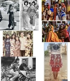
>>429054My first thought was the black girl’s hair looks a like another indie animated character’s lol, Piper from Far-Fetched, except Piper is cuter and simplified better for animating.
>I literally could not tell that the purple one is "Vietnamese-coded" without the creators literally spelling it out on their YouTube shorts. The green-haired one is Ethiopian, the blue one is Filipino and the red one is… Turkish?With the generic faces and colorful anime hair/eyes, I could see them being these ethnicities. But also I find their designs range from ugly eyesore (purple girl and orange haired people), to meh(blue guy, green hair girl), to really boring/basic (red guy and rest of background people).
Honestly if they took more inspiration from casual/cultural styles and let these characters have natural hair colors, their designs probably would’ve been more appealing and still feel appropriate for a magic story. Wouldn’t be any more jarring than what they’re wearing now, as it is they look like a mix of traditional/modern/sci-fi with uglyfuck color schemes.
No. 429397
>>429054This looks like it was both designed and animated by 15-year-old Twitter kids. It'd be really sad if the creators and animators were over the age of 20.
Also, there are parts in the background that weren't properly blurred out, pink/purple gal has white pixels around her boots as if a white background had been badly cropped out, and red guy has four fingers on his right hand (unless he's mean to be symbrachydactyly representation, kek).
No. 429405
>>428971This looks like someone took every single Tumblr sexyman and put them into a blender.
>>429085We were literally just talking about this in the anime thread. Even the most moralfaggy of weebs will excuse ANYTHING and insist that it's ackshually muh deep narrative as long as the art is above average. The most famous example is probably the Monogatari series.
No. 429713
File: 1730792157026.jpeg (489.38 KB, 4096x2048, 1729356505301.jpeg)

they look like they are made of plastic
No. 429860
File: 1730843116271.jpg (79.47 KB, 736x1104, 98d524c8325b668f3cb591b3ab669e…)

Who looked at this and thought it looks good??it's even worse when he's animated.
No. 429868
File: 1730846245826.gif (466.85 KB, 500x282, static-assets-upload1762592156…)
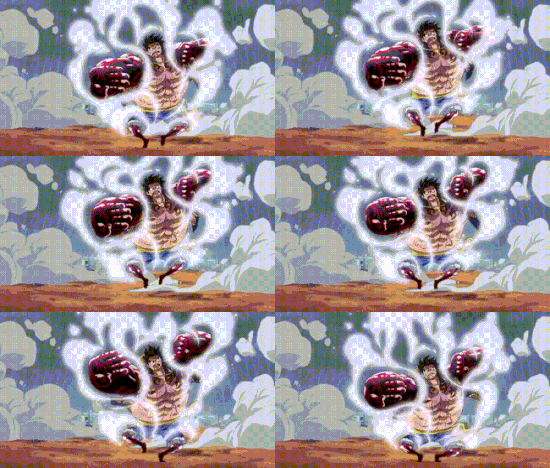
>>429860Samefag,so retarded-looking.
No. 430454
File: 1731023633211.jpg (177.99 KB, 700x480, 3262-910001083.jpg)

No. 430563
File: 1731078177512.jpg (26.94 KB, 300x370, 300.jpg)

>>429860Surprised you're so put off by Gear 4 considering the weird shit you have to sit thought before you reach it, Oda is obsessed with making the ugliest motherfuckers possible
No. 430569
>>429901Mods will label infighting the truth.
I am so tired of this “pretty culture” where everything should be cute and pleasant.
I didn’t like this form aswell at first but it grew on me a lot, it suits Luffy and in animation it’s fun to look at.
No. 430590
>>430587Yeah, I absolutely hate that and I cherish female characters that go against it, I hate that every time a female character is mentioned people just have to fucking spam on how they're bangable instead of their character.
Still doesn't mean every character has to be centered on fucking.
No. 430878
File: 1731182106879.jpg (146.59 KB, 1280x960, vlcsnap_2020_11_14_22h11m13s14…)

Even as a kid I found them hideous and unnecessarily sexualized.
No. 431170
File: 1731269620485.png (623.89 KB, 962x500, Screenshot 2024-11-10 121217.p…)

this is a soulless ripoff of my friendly neighborhood, which was actually good and didn't get a retarded fanbase because it didn't pander to those types, meanwhile this one has a dumb coomer/gendie fanbase. figures.
No. 431176
File: 1731271595331.png (428.72 KB, 828x1187, AdamHazbin.png)

>horns similar to Blitzo's
>sharp teeth
>looks more demonic than angelic
>black mask
>bad color scheme with piss colored wings and sleeves
>ugly robe that looks out of place
This is supposed to be an angel??you had one job,viv.
No. 431178
File: 1731272056074.png (1.32 MB, 2048x2048, Emily_Render.png)

Emily (I hate this name, an angel having a human name makes no sense)is just a shitty bland recolor of Charlie.the fingerless gloves are so stupid.
No. 431203
File: 1731280055072.jpeg (59 KB, 1080x608, emily-and-charlie-will-end-up-…)

>>431196Pretty dumb metaphor if you ask me.idk they look quite similar to me they even have the same face shape.
No. 431273
File: 1731294738624.jpg (1.75 MB, 3368x4096, standeedesignfinal.jpg)

I will never forget what a massive trash fire A Cyberpunk:Ghost Story was especially the god awful designs.Moids only cared about her and the game because big bobba.
No. 431679
File: 1731437040641.jpg (484.32 KB, 1440x810, a1MlbLBk5Sy6YvMbSuKfwGlDVlb.jp…)
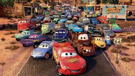
Especially their disgusting looking eyes and mouths.still gives me the creeps.what were they thinking at Pixar with these hideously grotesque abominations??
No. 431743
File: 1731461044734.png (805.22 KB, 1024x1024, c4d2f7dd49fc8eb202af325680b89e…)

I laughed so hard when i accidentally pulled this thing in my gunfu gacha.
No. 431747
File: 1731461590654.jpg (273.93 KB, 850x1201, sample_9dd46e4ad4643b2c7ee2abb…)

>>431744yup, from a chinese gacha. She looks like some /pol/ antisemitic-chan, she also has an smug/yandere personality to top it off.
No. 431768
>>431743>>431747The WWII
toxic yuri doujin involving her and the Nazi gun really fucked me up.
No. 431775
>>431770It doesn't have a name but here's the link:
https://danbooru.donmai.us/pools/17614Just to warn you, it's a fucking WWII
Holocaust AU, if you can't stomach. Seeing these animu girls with their wild, kawaii hairstyles with ribbons and frills while wearing the concentration camp uniforms is kekworthy though.
No. 431913
File: 1731516834794.jpg (108.7 KB, 960x960, 465215054_18372384778111630_46…)
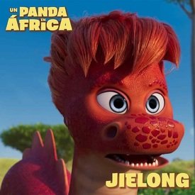
ugly dragon
No. 431924
File: 1731520394308.webp (75.04 KB, 713x599, Ingo_and_Emmet.webp)
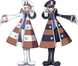
These two are kinda ugly but I see them spammed in a lot of threads lately. They have wide muppet mouths and wear a traffic cone with clown shoes, I don't get the appeal
No. 432056
File: 1731543453031.jpg (242.76 KB, 2048x1352, GEy5GBvXAAARvlv.jpg_large.jpg)

I can't get over how boring and ugly this design is.her outfit makes no sense and the colors clash so badly.no sense of harmony whatsoever
No. 432057
File: 1731543527451.jpeg (661.42 KB, 4096x1638, FOQLYq5X0AEccni.jpeg)

>>432056From the same cartoon,this one is even worse.all the aliens from this shit are furries.
No. 432059
File: 1731543812368.jpeg (598.25 KB, 4096x1638, GWXBIRtX0AMtnsq.jpeg)

More bad indie cartoon designs definitely not inspired by Vivziepop at all.
No. 432067
>>431924>>432062Eh, I've only seen them in the husbando thread and the Pokemon thread which, aren't those where that type of post is supposed to go?
If anything, complaining about it in another thread seems more underage and petty.
No. 432070
>>432068Yes, it is. I'm expecting
>>432057 not women complaining about how somebody posted something they personally didn't like like they're in a highschool Facebook group.
(minimod) No. 432074
File: 1731546831557.jpg (63.17 KB, 350x500, MV5BMTQ2MzI0ODg0M15BMl5BanBnXk…)

I can't believe this extremely heinous atrocity hasn't been posted here before.
No. 432076
File: 1731546940534.gif (757.65 KB, 317x240, 3msgzt9ponkz.gif)

>>432074Can't believe I forgot about this. I read the manga years ago
No. 432081
>>432057That's a straight up furry. His face is so small too, squished horizontally and almost inexistent in a profile view.
>>432059Some parts of this are almost illegible. How many of the humans are trannies? I'm betting on Alejandra and Levi at least.
>>432080Imagine the damage it did to your growing mind. I used to be an animefag and since deprogramming myself I can't not look at them and see the misogynistic indocrination. It fucks with young girls minds.
No. 432085
File: 1731548346900.gif (13.37 MB, 960x720, 9212456746a8899e93f0e4c72c3c38…)

>>432083I think most people find it wacky but who knows
No. 432092
>>432074I remember when people were rightfully making fun of the pink-haired abomination (the twintailed, glasses wearing one) for having a rightfully disgusting design—but at the same time,
another certain big boobed pink haired loli from a certain dragon anime is let off the hook. Why?? They're practically the same just from different eras!
No. 432094
File: 1731549942856.png (Spoiler Image,621.87 KB, 960x720, VS--VideoPlayer-25’35”.png)

>>432074When I first watched this schlock, I was really hoping that the teacher character (green haired glasses girl) wasn't really gonna be coomified because she doesn't have those chest tumors, but I was wrong. At least she's an adult.
(spoiler this) No. 432143
File: 1731573637029.png (2.19 MB, 2960x1440, ebplOzQ.png)

No. 432159
File: 1731577093819.jpeg (126.41 KB, 726x866, EasW95yXQAEXfdX.jpeg)

>>432151the character itself is based on him
No. 432346
File: 1731630044395.jpg (95.64 KB, 691x388, hoppers-D23-01.jpg)

Horrendous
No. 432352
File: 1731631046256.jpg (383.07 KB, 1735x1082, hearts of titan.jpg)

>>432056>>432057Kek this straight up looks like it could be a spin-off of picrel, complete with the alien space guy furry too.
No. 432372
File: 1731637178949.png (3.06 MB, 2127x2982, shirt-print.png)

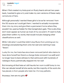
A radfem podcast i listen to often features this lesbian artist named Rusty, i checked her comic out of curiosity and it's absolutely hideous. She hates gendies but draws exactly the same as them. Apparently she also hates fujos and yaoi but used to draw mpreg one direction fanart kek. Hoping we someday have good radfem comic artists that arent afraid of opening a loomis book.
No. 432376
File: 1731638895929.png (76.59 KB, 275x353, wtffffffff.png)

>>432374The art for the comic itself is even worse. The fatty's nose is on her forehead. The black woman is also tall and more buff in the comic so i dont know why she drew her as a womanlet fat tif on the cover.
No. 432387
File: 1731643684651.jpg (68.46 KB, 640x655, tumblr_942ef58dabe9c027aeb5359…)
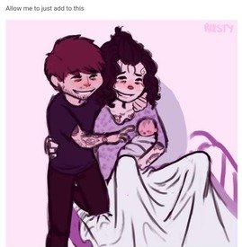
>>432385i kinda feel bad for her because she has insane handmaiden haters but fuck if hating fujos while drawing mpreg one direction fanart isnt hilarious
No. 432388
File: 1731643751218.jpg (120.61 KB, 720x600, tumblr_b9dc9356c6bb058aa6f0452…)

>>432387Also, speaking of her handmaiden haters. There is one that tries to redesign all the trannies from the comic and ofcourse they are all coomerfied smol dainty anime girls
No. 432389
File: 1731643830529.png (103.89 KB, 684x882, seething handmaiden.png)
>>432388I admire the seething she creates amongst trannies and handmaidens.
No. 432390
File: 1731644131518.png (1.78 MB, 1495x1190, obsessed.png)

>>432389This handmaiden is absolutely obsessed, its so funny. They are supposed to be non twansphobic uwu redesigns, aka making them coomerbait animu girls like the hulking misogynistic troons want to be. Its funny that ''all shapes are beautiful, women can be hairy/have bears/be tall/ have bulges uwu'' goes into the trashcan the microsecond a
TERF draws a realistic looking troon
No. 432455
File: 1731659440881.png (745.36 KB, 1280x1354, Iono.png)

>>431924They're cool though. I like their simple design and how they contrast with each other. Anyways here's an uglier Pokemon character.
No. 432467
>>431924you are the saddest and pettiest bitch i have witnessed on this site in a long time, my god. you're trying to ruin the pokemon thread because you're mad that people like these characters. truly jobless behavior
>>432461i like the giant coat on tiny women aesthetic but i fucking hate this character. the magnemite clips are cute though
No. 432567
File: 1731695140206.png (640.97 KB, 1280x766, 1280px-VSIono.png)

>>432455I've actually been playing pokemon scarlet recently and I think she looks even worse in game, her sharp teeth look so out of place
No. 432569
>>432567>>432455I still can't tell if I like this design or not kek. Something about it is more tolerable than most other bad Pokémon designs.
>>432567That being said, she looks a
lot worse in the game than the official art. The colours look so washed out here and the lack of contrast makes the clutter more obvious.
No. 432671
File: 1731721874427.png (125.89 KB, 512x512, Meow_Skulls_(Celestial_-_Featu…)

Why does Fortnite keep pandering to furries?
No. 432715
>>432382Seconded
>>432383It's a dumb forced meme from the rate my art thread
No. 432873
File: 1731795508976.jpeg (902.09 KB, 4500x5500, IMG_3106.jpeg)

I know this is old but seriously, it was the start of these ugly ass indie internet cartoons where they only cared about the characters being a brigade of faggots, trannies, gendies and token minorities that could only be written by the mind of a racist libshit who eats $25 breakfast sandwiches, so basically creating an unironic Drawn Together parody. They really paved the way for fag pandering projects like Hazbin and others
No. 432877
>>432873they didn't pave the way for shit, i was a totally unknown project made by some poorfag in is living room and it only ever made a trailer. no one ever noticed beyond a few posts making fun of it on tumblr and a kiwifarms thread that died years a go. it got 0 attention from anyone in the industry or from the public at large, i don't think anyone even remembers it besides terminally online autists
like me who read kf back in like 2015
No. 432911
File: 1731808120875.jpg (Spoiler Image,167.16 KB, 1000x1409, MV5BZjE1MTI1MDktZDQwMS00NGU2LT…)

>>432074This other horrific abomination of an anime,I don't know which one is worse.absolutely disgusting I don't know why this was turned into a series in the first place.
No. 432953
File: 1731824279575.png (547.18 KB, 892x1314, latest-1815436455.png)

Sorry in advance if this is somebody's husbando, but I cannot stand this man's design.
No. 433025
>>432911Btw that angel character is the obligatory trap for the gay pedo audience
>>432925Ngl, I think this applies to more anime than you'd think. I know they supposedly pay a lot to the voice actors, but when the art and animation is aggressively cheap-looking (and 90% of the runtime is characters standing motionless and talking) you've gotta wonder where the rest of the budget is going kek
No. 433151
File: 1731906031566.png (183.35 KB, 315x730, Galko_Render_01.png)

I always found her design ugly and stupid looking, especially her boobs.they wanted her to be Sonico 2.0 so badly they failed.
No. 433159
File: 1731912479170.png (59.14 KB, 180x467, Hestia_DanMachi.png)

I don't understand this retarded coomshit design of having a ribbon holding her boobs. It looks uncomfortable and annoying. Plus her name is based off a Greek goddess that doesn't look anything like her. It's just as bad as those waifu coomshit Fate designs.
No. 433312
File: 1731973919068.png (84.66 KB, 307x360, Loona.png)

I don't get the obsession this boring furshit gets.back in 2010-2012 Deviantart I've seen a lot of furry OCS that look like her so she isn't anything unique or new.also the red in her eyes clashes really badly with the rest of her design.
No. 433347
File: 1731987172302.png (87.87 KB, 265x360, Steg_%28Steven_Universe_The_Mo…)

I bet it was agonizing to draw and animate him aside from that his hair looks like poop.
No. 433352
File: 1731987641184.jpeg (43.96 KB, 400x400, IMG_7121.jpeg)
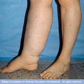
>>433347I don't like the lymphedema legs
No. 433359
>>433316It's 'cause she's a
hellhound. Haha, get it??
No. 433361
File: 1731991632526.jpg (196.84 KB, 736x939, ca4c6f16ba0f55d8c0b8e607f00274…)

just started watching cowboy bebop and faye's outfit is such an eyesore. her shorts always look like they're riding up her ass
No. 433368
File: 1731995531609.jpg (114.05 KB, 1325x1719, ewhitewolf-kurodesigns-shot-3d…)

from some coom game
No. 433839
File: 1732131083558.png (1.67 MB, 877x1449, Kitana & Mileena, Old vs New.p…)

I brought up this topic in the last thread and I figured it would be okay to continue the conversation in this thread concerning oversexualized female character design and how you have some people who think that non-sexualized female designs are "woke".
Mortal Kombat is one of the best examples of this argument behind Lara Croft and her redesign where you have people (mostly moids) who say that Mortal Kombat has went "woke" with their female characters ever since MKX when they started making their female characters less overly sexualized. Personally, I'm someone who liked the new direction with the female characters because while thee have been some not so great looks, the ones that hit, hit so good because they look like actual warriors that you can take seriously. But I've gotten into arguments where people say that my dislike of overly sexualized characters is because I'm jealous of them and lack the "body confidence". Whenever I heard this from moids, I knew it was just them seething because they aren't getting female characters that they can jerk off to but then I'd get it from some other women and it baffled me. I couldn't help but think that women who think that overly sexualized female characters are empowering and "better" are handmaids but then I feel like that's not fair of me to think.
It's not like I'm against sexy designs but I prefer it when it fits the character and the design still has some sense of style or cohesion that isn't solely just "get her as naked as the "M" rating will allow".
My question to you all here is do you think that there can be a middle ground for sexy female designs? Do you like female characters who look normal ("woke" as the whiners would call it)? Is there validity to thinking that a woman who screams empowerment towards overly sexualzied designs are just doing it for male attention? Just thought I'd get a little mini discussion going.
No. 433844
>>433839the "new" versions are still sexualized though
>titty window>skin tight armor>makeup>high heelsbut yea nona, i think that people (both m and f) who think that the older mk designs look better lack any sort of class or sense of aesthetics whatsoever. grotesque femininity will always be a loss design-wise. can't believe the number of women saying that the same treatment given to male characters would even the playing ground, because actually both are pitiful and lazy design choices catering to the lowest hanging fruit audience.
No. 433860
>>433851Iirc it was the titty ribbon and how short she was that did it.
Also, from what I remember people felt pity for her since she's kind of a loser and the mc only likes her as a friend, so she got the "absolutely useless, but she's hot" demographic.
No. 433864
File: 1732133426736.webp (90.78 KB, 835x1080, Skarlet_officialfinal.png)
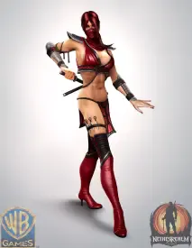
>>433843I agree. And I think we see just this with Mortal Kombat and why there are a lot more women who came to Mortal Kombat around Mortal Kombat X. I remember when MK9 was out and not many women played the game and one of the frequent reasoning was because of how the female characters were presented. Then MKX comes out giving the female characters more conventional looks and it attracted a lot more women to play much to moids annoyance.
A lot of the newer designs look well-dressed and still posses a unique style pertaining to their background.
>>433844>the "new" versions are still sexualized thoughI don't disagree there. They're sexualized but not egregiously and I think this is the middle ground. And it's good insight on moids who complain about the "wokeness" of MK when the female characters still look sexualized, just not pornographic and that's how you realize that the moids are just pissed that the women don't look like themed strippers anymore.
>can't believe the number of women saying that the same treatment given to male characters would even the playing ground, because actually both are pitiful and lazy design choices catering to the lowest hanging fruit audience.See if there was a hypothetical game where the male characters were as sexualized as the female characters, I wouldn't mind but as far as a game's integrity, I agree that iw ould be pretty desperate lol
No. 433872
File: 1732134147137.webp (55.04 KB, 387x921, kitana-evolution-v0-82w1oajoih…)

>>433862Agreed! I mean, I came into Mortal Kombat around Deception and as clunky as the game was, I still had fun with it but the female characters just looked so dumb and made 14 year old me feel uncomfortable so I mostly played the male characters and I didn't really touch a female character until MK9 where I played a little bit of Jade. The newer designs are just superior, sexy + strong, a decent enough combination for MK but the annoying scrotes think that the game series lost it's edge by -gasp- treating the female characters like actual characters and not sexy lamps. Never mind that the games are still a gore fest and considering how they still sell, I don't think MK has been too negatively affected at all.
>>433866Yep kek. Her stripper ninja design is easily the worst one imo because it really does feel like the devs didn't even try to make her look stylish. The other stripper designs were just as tacky but at least they had .1 thought put into them.
Also this look here (picrel), this is Kitana's "princess" outfit… Kek
No. 433876
File: 1732134358386.png (146.23 KB, 640x1325, 1000029390.png)

>>433864>Then MKX comes out giving the female characters more conventional looks and it attracted a lot more women to play much to moids annoyanceGood! Even as a kid who enjoyed playing MK9, I still thought the female characters were dressed in pretty ridiculous clothes. I used to exclusively play as Sonya because hey, at least she was actually wearing pants kek, and also Mileena because at least her monster mouth was interesting. Scrotes misinterpret this as "girls love coomer designs and the mean wokies are ruining everyone's fun" when really a lot of female gamers just tolerate it.
No. 433900
>>433347I hate hate HATE the corporate memphis tree-trunk stumpy elephant legs in these shows. Also
>>433360 you're so right, his right foot has the toe on the wrong side wtf kek
No. 433948
File: 1732156967263.webp (73.21 KB, 675x1200, DOA4_Helena_2.webp)
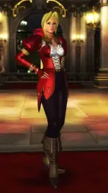
>>433839>My question to you all here is do you think that there can be a middle ground for sexy female designs?Yes. However, it feels like we reached a point where if the character doesn't have absurdly huge boobs and isn't practically naked, scrotes are going to seethe anyway.
No. 433969
File: 1732166042998.jpeg (390.34 KB, 720x1020, ki0c037pp1cc1.jpeg)
>>433948Helena! She's actually one of my favorite chsracters from that train wreck of a series and thats one of her best looks imo lol.
I agree though, it does feel like moids would think any design even if sexy, doesn't have her practically naked witu books bigger than her head, they'll rage and whine "woke".
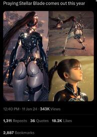
And even if the character isn't big chested, they will still complain about other things like that character from Stellar blade.
No. 433988
File: 1732180415017.jpg (151.49 KB, 736x1310, Skarlet_MK.jpg)
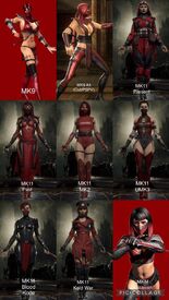
>>433963I guess everyone's taste will differ lol I think the new ones look fine and look pretty good when in motion. I understand where you're coming from with how you feel the new outfits don't look as dynamic and striking from a shape perspective but I dunno, I still can't help but like a lot of the new looks.
Also because I shared Skarlet
>>433864 using her as an example of the worst of the stripper-ninja look, she's a good example imo of someone who got much better looks in the newer games where she looks stylish and cool but I'm bias because I have a soft spot for edgy designed characters kek.
No. 433989
>>433876>SonyaI totally understand what you mean, Sonya's outfit wasn't the worst since it actually looked like an outfit-ish (those pants still look uncomfortable as hell), all she needed was an under tank and it would've been passable. I also didn't necessarily mind Mileena being over sexualized because it seemed believable that she would use her body to allure and devour her moid
victims, just bite it right off lol.
But you're right, moids who think that most women love coomer designs and not understanding that we just put up with them because we didn't really have a choice speaks on their ego and it's all the more funny when they whinge about MK female designs looking more respectable and how more women actually love them with the exception of the few pick-mes.
No. 434000
File: 1732193868276.webp (55.57 KB, 1200x627, Overwatch-2-Hazard.webp)
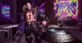
New incredibly boring Overwatch 2 hero from Blizzard. And people are saying this is a good looking character that was designed specifically to sell a lot of skins, wtf.
No. 434023
File: 1732203057490.png (3.35 MB, 2309x830, MV5BZmNmZGNlYTYtMDgyZi00YmIzLT…)

>>433839Beyond "normal" or "sexy" I just wish female and male characters had the same variety and not every female character had to be fuckable, it's really jarring when you see it. I'm so sick of it at this point if a game has this issue I don't touch it
No. 434119
File: 1732216236584.webp (63.44 KB, 1920x1080, Stellar-Blade-outfit-location-…)

>>433969I thought it was cool how her body was modeled after a real woman's (so not grossly exaggerated) but her outfits are so ugly aside from a handful…
No. 434316
File: 1732263168462.jpg (899.82 KB, 4096x2633, Fve4QdoXsAAcQgT.jpg)

The design is so busy. There are so many extraneous details, and I don't like it.
No. 434360
File: 1732281496209.jpeg (1.86 MB, 1640x3099, IMG_7126.jpeg)

The shirt buttons infuriate me.
No. 434363
File: 1732282235101.gif (67.15 KB, 220x210, 1000029110.gif)

>>434318>IronlungKekkkk nonna that's brutal
No. 434382
File: 1732287881430.jpeg (80.16 KB, 555x673, IMG_7073.jpeg)

>>434364Clorinde from Genshin had the same design trait. I get it’s meant to be sexy but Zani and Clorinde both seem like professional types so why the hell would they wear a tight shirt that doesn’t properly fit!! I hate character designs that priortize looking good over making sense for a character. Also picrel is what it reminded me of kek
No. 434431
>>434382>that picKEKAROO
>Zani and Clorinde both seem like professional typesThis is what grinds my gears the most. I know it's gachashit so I need to turn my brain off, but the way a character dresses tells a lot about their personality — for example, Zhongli. It is frustrating because they keep adding these coom elements to every single female character, making it almost impossible to take them seriously.
No. 434444
File: 1732302881693.jpg (94.82 KB, 960x635, 5662012-48558.jpg)

more of an "awful character redesign" but I've always hated how he looks in MGR. can't help but feel like they made him ugly to appeal more to moids
No. 434481
File: 1732307261049.jpg (115.56 KB, 1500x1000, DREAM-PRODUCTIONS-112024-bb093…)
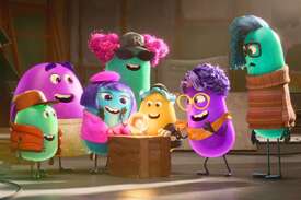
Horrible,They all look like they came from a jellybean candy commercial.
No. 434534
>>433839Terrible opinion but I liked many of the older clothing designs for the characters, both men and women, in mk. The entire series is so trashy I didn't have a problem with them. I'm not saying I hate the new designs or would whine if they covered up the women's skin, though.
I only really played the big 3 for ps2 though, as that was all my family had growing up. What I loved the most about the women's designs though was how they had wide shoulders with more narrow hips, a typical fighters build. I know that most of that was just due to graphical limitations but it was really cool seeing actual built women in fighting games. I see a lot of eastern fighting games designs and the women are all stick armed and narrow shouldered. Honestly I wish mk would push the envelope more and make the women look even more stacked, to better even out against the men. My favorite design from those games though was a demon woman whose main outfit was this white, sort of ninja outfit with those cool traditional Japanese hats with the veil. I always thought she was so pretty, and she was fully clothed.
No. 434557
File: 1732323224010.png (758.33 KB, 833x1024, MK_Ashrah Old vs New.png)
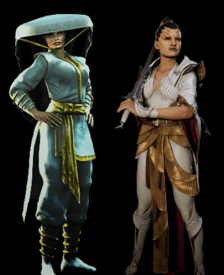
>>434534AYRT and I can understand. My first MK game was Deception, which was the sequel 3D game of that trilogy and I eventually played all 3 before MK9 came out. I understand what you mean in terms of how the women were built as with the exception of Kitana, the women had muscular builds and weren't rail thin anime girls which was cool to see. I remember hearing moids say that MK women had "man faces" but it was so clear they were just saying that because they were comparing them to Japanese fighters like Tekken & Dead Or Alive.
>Honestly I wish mk would push the envelope more and make the women look even more stacked, to better even out against the menThey kinda went this direction with the character Sheeva in MK11, she's tall and kinda built like a brick house. Moids complained about her and called her "woke" so that means they nailed it kek
>My favorite design from those games though was a demon woman whose main outfit was this white, sort of ninja outfit with those cool traditional Japanese hats with the veil. I always thought she was so pretty, and she was fully clothed.Oh you're talking about the character Ashrah, yeah I loved her design as well. Her redesign in MK1 looks cool as well but I actually prefer her original look, that hat was awesome.
No. 434570
File: 1732329240119.jpg (176.8 KB, 908x1210, 3375d814b404fec92ba79e4544bac1…)

BA designs are either bangers or absolute garbage.
No. 434791
>>433839I've never played MK, but contrary to what another nona said, I like the newer designs, even the pink one. Why? Because it shows about as much skin as a male character's outfit, IMO, and the breasts/cleavage aren't emphasized too much by the art style, despite the clothes being designed that way. But the number one thing I like about it is that she's stocky compared to characters from other franchises (female characters are rarely given normal human proportions, to the point that when it happens, scrotes whine about them "looking like men" since they've forgotten what real female bodies actually look like and how they function) and the outfit completely covers her lower half, just like any male character's outfit (except for the toes, it would be even better if she was wearing boots), emphasizing her strength and combat skill even more (the pose also helps). The cleavage doesn't bother me that much because of it.
>do you think that there can be a middle ground for sexy female designs? Do you like female characters who look normal ("woke" as the whiners would call it)?I was going to say that I don't see the point in asking these questions here, when everybody agrees that the answer is yes. But I guess it's a good way to get people to talk about that kind of design more.
>Is there validity to thinking that a woman who screams empowerment towards overly sexualzied designs are just doing it for male attention?It's either that, or she's so utterly blinded and naive that she actually memed herself into believing it's empowering. Or she's just coping.
>>434534>What I loved the most about the women's designs though was how they had wide shoulders with more narrow hips, a typical fighters buildThis is what I'm talking about. Glad to know someone else noticed that and agrees. Even if it was unintentional, it's a breath of fresh air.
No. 434792
>>434487Have you seen the Vtuber thread? There were anons praising a turbocoomer design that has the avatar's tits literally out in one of the alt versions, the bar is non-existent for even female Vtuberfags. They're so used to consuming scroteshit that they don't realize everyone else hates it or why. Same with zoomers and their love of Vtubers and Genshit and its clones, they can't even tell all those extremely busy designs are unbearable to look at to any normal person.
>>434000This is so fucking lame, he looks like human Shrek with a Vtuber skin.
>>434481Forget the jellybean thing or the beanmouth shit, what the fuck are those clothes and hair? Every CGI character with this fashion sense looks so cringe, ESPECIALLY with the hyperrealistic textures on every surface.
No. 434836
File: 1732406009620.jpg (1.26 MB, 1575x2000, Lars_Alexandersson_TK8.jpg)

I've always hated Lars and his stupid,over the top,faggy clothes and hairstyle but this is absolutely bad on every level.he always looks out of place in the Tekken universe and this proves it even more.
No. 434840
File: 1732406987853.png (964.71 KB, 540x1106, melody.png)

>>434792>Same with zoomers and their love of Vtubers and Genshit and its clones, they can't even tell all those extremely busy designs are unbearable to look at to any normal person.I don't get how people watch these character designs play video games. I'd be distracted by all the random shit attached to them that I'd forget to focus on the gameplay kek.
>>434487Agreed. Vshojo designs in particular are an unholy combination of overdesigned bullshit and coomer garbage. Picrel.
No. 434844
File: 1732408310632.gif (2 MB, 245x245, download (15).gif)
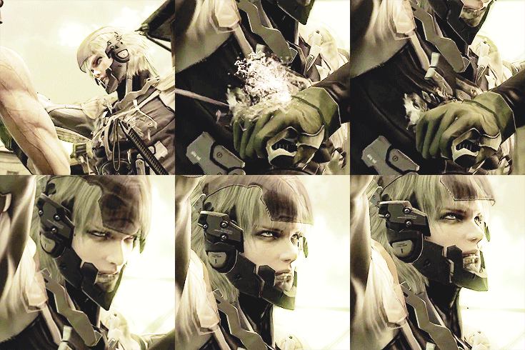
>>434444Stop, he was just given a nosejob against his will, probably.
>>434467He is hot in MGS4 because he looks depressed the whole time, gets gored/stabbed a lot, bleeds white liquid all over himself, cries, and has his limbs ripped off but still fights. You're right though that Raiden doesn't deserve to suffer.
No. 434931
>>434844>>434482he is 2edgy4me moidslop in MGR, that alone makes me dislike the design even though I love him as a character and he has been in my husbando harem since I first played 4
I agree he was hot in MGS4, in spite of the reasoning the devs had as pointed out here
>>434467 No. 435010
File: 1732464202893.jpg (706.71 KB, 1800x1000, 1732411221987.jpg)
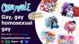
From bad art:
It needs more QT+ flags.
No. 435328
File: 1732587531342.jpeg (124.19 KB, 889x1340, GGv5o6_WgAAKbde.jpeg)

I couldn't find a better screenshot but yeah this is such an ugly design.what an eyesore, especially the stupid rainbow clown hair.basically a Tumblr trash OC.
No. 435343
File: 1732594233630.jpg (49.24 KB, 570x437, one-piece-film-gold-original-c…)

No. 435351
File: 1732604254556.png (801.44 KB, 778x611, 716BE6BA-1C76-480E-9CC6-F4709E…)
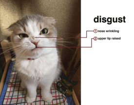
>>435343I can’t overstate enough how much I hate this franchise and the designs in it.
No. 435436
File: 1732633755041.png (769.34 KB, 508x860, 1000029670.png)

I already posted this atrocity in the wasted potential thread but it belongs here too.
No. 435557
File: 1732648650663.jpg (131.11 KB, 632x1200, punchline.jpg)

The colors are just so bad
No. 435614
File: 1732656994775.jpeg (279.66 KB, 750x1000, lars-tekken6-2player.jpeg)

>>434836Fucking Lars, I agree anon, his over the top outfits looked so tacky and didn't look "cool" at all, just overly designed. The only outfit he ever wore that actually looked okay was his Tekken 6 alt (picrel) but even with that, the aesthetic is ruined by his godawful hairstyle. I don't understand how anyone can think his hairstyle looks good in any capacity.
The sad thing is I remember back in the Tekken 6 days, I customized him a normal messy haircut and in his default outfit, removed that stupid cape and he actually looked a lot better imo.
Lars and Alisa were the beginning of the end when it came to horrible character designs in Tekken.
No. 436448
File: 1732849436130.png (183.59 KB, 340x535, SXSGEspio.png)

I'm sorry but he's one of the most badly designed Sonic characters there is.His face is so awkward looking and unappealing compared to the rest of the Sonic cast.I hate his weird head shape & his horn position also his color scheme sucks.he looks out of place if you compared his design to Sonic's or even Jet the Hawk.
No. 436765
File: 1732932053453.jpg (72.69 KB, 483x586, A18036-2781506575.1466817007.j…)

This was basically softcore porn and I hate everything about it especially the designs.
No. 436794
File: 1732938245666.jpg (59.95 KB, 598x649, GdkeckhXAAA2PgY.jpg)
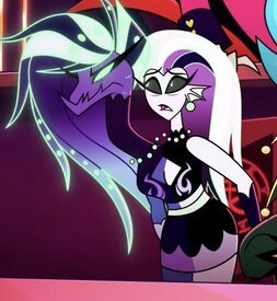
Gosh,where do I start? This is horribly ugly and the fact that it's supposed to be Leviathan makes it worse.its so painfully bad.I hate Viv and her overdesigned garbage characters.
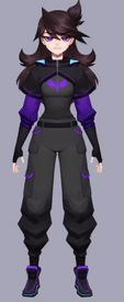
No. 436864
File: 1732959142086.png (260.44 KB, 432x1054, Jaiden_Animations.png)
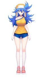
No. 436871
File: 1732959971916.jpg (330.31 KB, 2214x4096, Daidessa.jpg)
No. 436876
File: 1732960400748.png (496.91 KB, 751x875, 2FtWWQA.png)

No. 436884
I know people shit on Validate for the gender/racebait clownery but the character designs aren't even that bad. They're fine on their own, they're cohesive and display the character's personality pretty well, I would say Yolanda is actually pretty cute. People are really just hung up on the retardation the creator is committing and the game itself being bad to give them an objective judgment, I'm even going as far as to say that I'm fairly sure that if they were white a lot of people wouldn't shit on them as much.
>>425211They banned her because she was right. This is just a clone of the "art styles you hate" thread, people are posting mihoyo bishounens because they're angry at gachaslop or all the eebil tumblr ass jay dubya OCs that make them cringe instead of actually awful character designs that make no sense. Like I would say
>>434840 is an actual bad design worth posting to the thread.
No. 436885
File: 1732962548031.jpg (41.32 KB, 1000x563, MV5BMDYyYjkwZTAtM2ZiMi00YzYxLW…)

>>436883kek i thought the same thing
No. 436898
File: 1732966249278.png (237.3 KB, 1260x694, 141.png)

>>436876Isn't this manhwa comedy, though? I think it's supposed to be absurd.
No. 436907
File: 1732969495273.png (2.9 MB, 1142x1646, a6c.png)

>>436902The Ki Sisters, apparently it's still being translated and people say it's hilarious as fuck.
(I literally only learned about this manhwa a couple of hours ago when I went on Know Your Meme to get the source of an unrelated pic kek, it's getting popular really fast)
No. 436921
File: 1732975270444.jpg (975.38 KB, 1080x1994, Screenshot_20241130_110012.jpg)

>>436907I've started reading, it's absolutely hilarious and I want the older sisters to do things to me
No. 436942
File: 1732983117332.png (899.8 KB, 1024x985, 2t7RDjd.png)

vi looks like she's made of cardboard
No. 437374
File: 1733099072877.jpg (91.49 KB, 400x798, gallery_1_15_67022.jpg)

The fact that she's supposed to be a teen makes it worse.
No. 437692
File: 1733195952773.jpg (79.24 KB, 600x338, Untitled.jpg)

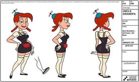
i don't hate the show/characters but it always bothered me how amy and leela are dressed like that. why can't they have sensible clothes like the men
No. 438442
File: 1733437456207.png (201.2 KB, 464x576, AngelaMysticGuardian.png)

Just Ralsei from Deltarune but with boobs
No. 438453
File: 1733441512373.jpg (Spoiler Image,316.95 KB, 1574x1574, Gd_2lXzXYAAwf4Q.jpg)

"She's totally a tif, guys! Not a man with tit chops and vagina. Is a tif!"
Just say you hate to draw curvy female bodies.
No. 438455
File: 1733441792271.png (2.78 MB, 1920x1080, 1nvmcozw1v151.png)

>>437692>>438063From Leelah I could get it's for comfort during her job, that's why she doesn't wear common shoes neither. For Amy I think is more to feel and look younger than she is, of course she would wear that. Even if they wear dresses, you can notice the difference.
No. 438760
File: 1733540625530.png (1.95 MB, 1000x1981, OW2_Venture.png)

This is late because apparently the character was released months ago but I only found about them now. This is a real nonbinary character from Overwatch. I can't believe this tumblr tier ugly crap is now everywhere in AAA western games. Actually looks like one of those Concord characters kek.
No. 439057
File: 1733663685585.png (1.57 MB, 1801x1080, kFqeAjk.png)

can't tell who's worse
No. 439151
File: 1733687881802.jpg (286.46 KB, 2048x1250, tumblr_41d0a80d2f35cba7c043591…)
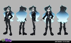
Totally not pandering to those with a femboy fetish! Not at all! The only good design from the show is the black witch girl (Piper) the rest are trash.
No. 439182
>>439175Gross. I like GNC men, but this is obviously fetish bait. The hips ruin it
>>439180Same here. It's unfortunate.
No. 439586
File: 1733793918751.png (2.15 MB, 1716x1446, left new right old.png)

new(left) old(right)
The new girls frontline designs are fucking attrocious. They werent amazing before but they were better than this ugly scifi chinese garbage.
No. 439588
File: 1733794280400.png (979.29 KB, 1042x838, why.png)

look at how they massacred my girl, i am so pissed.
No. 439590
File: 1733794850025.jpg (53.54 KB, 750x444, 2d8a7fca9f6a6da11fed5157d722ff…)
what the fuck
No. 439826
File: 1733904565248.jpg (230.96 KB, 1436x1100, Untitled.jpg)

>>439795this video is not even as bad as most ren and stimpy episodes, which he seemed to create solely to scare children, there were so many scenes of creepy men acting predatory toward r&s. looking back on it now it seemed to have a serious "molestation of the innocent is funny" vibe. this character in particular haunts me. i wrote about it before, but there was this creepy old man who was almost always naked and invaded r&s's personal spaces and acted really rapey.
No. 439854
>>439826Yeah I noticed the same pattern with his art and the idea that molesting/taking innocence is funny. I mean no shit a man who preyed on young girls would be into that.
>>439586>>439588At this point I actually am happy video game creators desexualise women or remove sexy aspects of their designs even if it is done for the woke points. Men play games not to enjoy them, but to masturbate to their waifu of the month until moving on to another shitty gacha game.
No. 440524
File: 1734148269369.png (115.77 KB, 475x475, 053_f2.png)

I don't have to say the obvious for this one
No. 440533
File: 1734151072652.jpg (97.46 KB, 1000x453, CyanaTurnaround.jpg)

No. 440540
File: 1734159671894.png (324.25 KB, 613x1099, 1733687881802.png)

>>439151I tried to masculinize the character design a bit and keep his gnc vibe.
What do you think?
No. 440561
File: 1734172924511.jpg (104.72 KB, 573x1000, gholdengo.jpg)

>>439057that yellow thing on the far right looks like if that one ugly ass cheese string pokemon went to hell
No. 440854
File: 1734302446006.jpg (172.81 KB, 736x1971, aa1865318f9f2090a695dfd6d95ad1…)

She looks like a white girl painted black.
No. 440863
File: 1734305921724.jpg (84.66 KB, 624x768, bUkRTaO.jpg)

>>440854Maybey is an horn african woman.
No. 440867
File: 1734306714730.jpg (456.78 KB, 1920x1080, zarya-00.jpg)
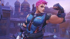
I prefer characters with feminine aspects than women who look like men with boobs.
No. 440870
File: 1734307583287.jpeg (440.19 KB, 1920x1440, 1rL8WEh.jpeg)

>>440867I don't care about that but I fucking hate her hair design, this is the haircut for libfems who support troons in women's sports, no real female athlete would be caught dead looking like that
No. 440872
File: 1734308164013.webp (33.13 KB, 392x825, Tracerskin1.webp)

>>440870Tracer has short hair and is a tomboy, in my opinion her design looks good.
No. 440876
>>440872Tracer is so ugly, she's so clearly done for coomers into ''tomboys'', aka women with short hair with a perfect ass and womanly figure and girly personality. The meltdown coomers had when they nerfed her ass was hilarious thought.
>>440867She doesnt look manly thought, she looks like Rosie the riveter.
No. 440877
File: 1734309624698.jpg (198.11 KB, 1014x1200, GRb5mZDbIAAObgV.jpg)
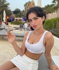
>>440876This is an idea that coomers have of tomboys, pic related they said it was a Roman femboy.
No. 440879
>>440877>They said it was a Roman femboySeriously, what
is this new brand of rightoid mental illness?
No. 440880
File: 1734309825132.jpeg (89.88 KB, 736x736, 85A3DE73-C500-4B9C-A866-1587B1…)

>>440867i like zarya a lot, i was mad when they gave her an ugly ponytail in the sequel. she has some cute skins with better hair, like her workout one, where she just looks like a cute lesbian.
No. 440883
File: 1734310048267.png (1.17 MB, 1064x1118, c82.png)

>>440881His face is super feminine but for coomers because she has short hair she is a femboy.
No. 440885
File: 1734310223109.webp (456.95 KB, 1808x2670, 1D21079A-E703-4C86-88B0-5E1B0A…)

>>440882the character design in overwatch 2 is mind boggling bad. their new character, hazard, is a complete joke. kiriko, venture, illari, juno especially, and lifeweaver all look completely out of place. i think junker queen and sojourn are the only two newcomers in the sequel that look like they belong, and mauga a little bit too.
No. 440913
>>440885He has the "how do you do fellow zoomers" color scheme too kek.
OW used to have such nice designs too. Maybe not unique, but they were basic concepts executed well. The new characters look cheap and have a really unappealing mix of coomerism (that new character is obviously bara bait for example) and "quirky" ugliness. I hate how much of current geek media reeks of being made by and for pornbrained mentally ill tumblr/twitter weirdos.
No. 440966
File: 1734334220415.png (4.13 MB, 1555x2074, dsadsdadasd.png)

Even as someone who likes this franchise i cannot defend these monstrous designs.
No. 440969
>>440867Lol, could any of you have imagined how the schizophrenic anti-woke, anti-DEI, "muh ugly woman propaganda!!" would've reacted to Zarya's design if she was released today?
When she was released eons ago, most of the jokes were about her being a genderbent Heavy clone. Man, I yearn for those days.
No. 440970
>>440879The more misogynistic a man is and the the less acsses he has to women—the more likely chance he'll engage in prison gay boy diddling.
It reminds me of the "dancing boys" phenomenon in Afghanistan. Men have no access to women—don't even know what they look like, grow sexually frustrated especially in their repressive fundie society, "hmmm I wonder who I can use as my personal fleshlight to get rid of these urges… I know!
Boys. They're weaker and since they don't have facial hair (yet) they aren't
technically men (yet) therefore it's not gay! (Read haram)."
No. 441291
File: 1734465550859.jpg (87.75 KB, 686x386, hq720.jpg)

No. 441296
File: 1734466381562.png (538.84 KB, 540x1042, 1000002996.png)
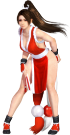
I'm not even in street fighter but this shit is so retarded, look up mai street fighter teaser if you want to wonder if you're on rule34
No. 441299
File: 1734466607112.jpeg (25.26 KB, 491x625, images-9.jpeg)
>>441291Nta but a reminder that the model that mocaped the 3d model looks like this(still full of plastic), and yet they turned her into a fucking blow up doll
No. 441313
File: 1734468943038.gif (65.49 KB, 159x196, B76ADD49-8773-4E62-905D-021379…)
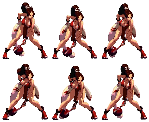
>>441296the fact they wasted a slot on her in SF6 of all games is such a fucking tragedy, she doesn't even have a fun, quirky personality or interesting playstyle to balance out her shitty coombait design. we'll never get remy (or other more niche characters) back because capcom will gladly waste time and money on SNK waifus no one has given a shit about for decades already instead.
No. 441326
File: 1734469857728.jpg (322.73 KB, 1200x630, sf6-terry-first-video-release-…)
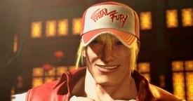
Utterly hideous and grotesque,why would they do this to him?
No. 441331
File: 1734470158403.jpeg (86.69 KB, 540x540, F920C4DA-7D2B-485D-B96C-7A04DA…)

>>441326i was so disappointed by how ugly they made terry, especially since they do manage to have some handsome male characters in sf6. but capcom loves making only the female characters have nice faces, so i should have expected them to fall back into this. i'll forever be bitter we almost had bison return as a bishie.
No. 441333
File: 1734470568858.jpg (329.92 KB, 2000x1000, antonblast-review-thumbnail.jp…)

This is fucking ugly,it's such an eyesore.The designs and colors are so awful.its trying hard to be edgy too.
No. 441337
>>441291…are the lights on the black suit
supposed to look like ovaries?
No. 441340
File: 1734471401675.jpg (163.34 KB, 1574x1570, Momo and aira (1).jpg)

I haven't read dandadan. Is there a reason why these two girls look exactly the same? I was so sure it was the same girl with a bad hair dye.
No. 441341
File: 1734471910361.jpg (156.71 KB, 1006x1500, GdwZCOzWsAAam93.jpg)

>>427863Here's a better design
No. 441344
>>441340Drawing very good weekly is hard, the male characters have similiar faces as well.
Their personalities are different enough that it's not that big of a deal.
No. 441353
>>441341Ngl is it bad that I give "stay youthful with the power of magic a bit of a slide?
If I could I'd stay looking young and fit forever.
No. 441357
File: 1734474410891.jpg (48.46 KB, 500x1237, 1000030302.jpg)

This isn't, like, egregiously bad or anything but I'm rewatching young justice and I think picrel's colour scheme doesn't go together at all. Also it bugs me that we barely see her cool and scary true Martian form, even when she gives herself a more "alien" look she's just bald with weird eyebrows
No. 441360
File: 1734474739629.gif (6.62 MB, 512x900, 7cd194dab89d9d0e708cb5257870b7…)

>>441291goddam these are so ugly even for coomshit.Makes Nikke coomslop look like actual masterpieces next to these sewer colored garbage designs.
No. 441362
>>441291They scream "referenced from AI" with all the random clunky details which
distract from her body shape instead of accentuating it.
No. 441382
File: 1734476620575.jpg (91.21 KB, 600x627, rc05503.jpg)
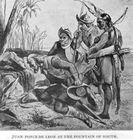
>>441364Aging, not aging women. It's a general human thing.
No. 441383
>>441341I’ve learned to look past her retarded design cause I like her as a character (pelt me with tomatoes), but this is really cool. Did you draw this
nonny? I love it. She would look so much more powerful and badass with a couple aging lines, like wrinkles around her eyes and cheeks.
No. 441391
File: 1734477739619.jpeg (93.83 KB, 736x1185, DD960963-A8B3-48EC-94AB-209042…)

>>441363i think SF6 has some attractive male characters, so i know they could do remy or vega justice if they wanted to. i would prefer them over the crossover route the franchise is taking now, which will cheapen the game by a lot. i hope that terry and mai don't sell at all so they stop trying to prop SNK up, but its already been leaked that s3 will have more crossover characters.
No. 441393
>>441326Ugh, he got that Zac Efron surgery.
>>441363Same. Keep my husbando out of SF6
No. 441396
File: 1734478363118.png (1.43 MB, 3961x3921, Satan_Render.png)

He's just another big red devil,making him a dragon isn't even original.Also the striped horns look stupid and his legs look goofy too.fans are coping and delusional to say that he is the best portrayal of Satan when he's,again,another big red guy #9422 he's basically an imp but bigger and with wings.
No. 441427
File: 1734487042391.jpg (61.21 KB, 595x726, GdkfjZdWoAAtviM.jpg)

>>441396Belphegors design is awful too because of course it is.the eyes on her neck literally make no sense the worst part each of them are mismatched colors with stupid pointless eyelashes for some reason?Each and every day I feel bad for the animators that have to work on this.
No. 441430
File: 1734487454543.jpg (737.31 KB, 899x1155, Official_Belphegor.jpg)
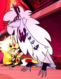
>>441427Here is a screenshot where the eyes are open.really stupid to make them mismatched,what a really dumb design choice.
No. 441635
File: 1734561390651.png (337.36 KB, 575x967, Mona_Lethal.png)

No. 441637
File: 1734562163889.webp (130.11 KB, 1000x1079, 5wXq3Gv_xRJRW4uOT70shhdNbGL-6Z…)

>>441399Lucifer and Satan are separate characters in Hazbin/Helluva. It's not exactly wrong, Satan was first and Christian fanfic later kinda merged them (that's the very short version). Lucifer in the show is the terrible tumblr sexyman in picrel .
No. 441658
File: 1734572140112.jpeg (92.82 KB, 1200x505, download (1).jpeg)

Jorge R. Gutierrez's designs never translate well in 3D.
No. 441660
File: 1734572844448.jpeg (1011.02 KB, 1088x1622, IMG_3330.jpeg)

>>441396If I have never seen this series and someone told me this was supposed to be Satan,the ruler of the underworld I would laugh at their face.I always hated him since I first saw this design.Its is the most uncreative depiction I have seen in a longgg while.Everything about his design,ESPECIALLY the tacked on imp horns screams rushed.Its so laughably clunky.I know this is Lucifer and not Satan ,but Viv has done a much less atrocious direction of the underworld king years ago.I loathe how every design in the hellaverse is drawn to be “~sexy~” and absolutely nothing in this one flows together coherently.I almost can’t believe she went with this but I should never expect quality with Vivzie.
No. 441667
File: 1734573682736.jpeg (231.91 KB, 1120x1280, IMG_3331.jpeg)

>>441427Same anon as above but I can’t look at this character without thinking it’s the ‘love’/rape child of these two.Kinda funny if Viv was inspired by another furry series based on the Ars Goetia with same-y characters and controversy around dubcon.
No. 441740
File: 1734613350029.jpg (2.14 MB, 3307x2109, Hobgoblins_Anime_Settei_Sheet_…)

There are no words to describe how much I hate this
No. 441829
File: 1734649570431.jpg (64.76 KB, 405x837, FywG8XXWcAAgI4q.jpg)
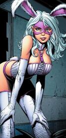
She's apparently an not a well known Batman villain and I can see why.
No. 441831
File: 1734649786605.jpg (473.68 KB, 1040x1600, Helena_Wayne_Last_Rites_006.jp…)
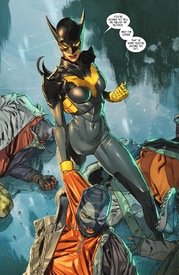
Why is her navel visible? It looks like she's wearing body paint at first.
No. 441843
>>441831Are those…
armpit pouches? Why???
No. 441919
File: 1734677760284.png (890.41 KB, 1200x957, manon.png)

>>441326disgusting
>>441331>>441391these are nice
Meanwhile I think Manon looks hideous. Her face is gorgeous but the rest of her design is aggressively ugly. Her design feels discordant with too much visual bulk in some areas like around her shoulders. The hair is ugly, the outfit is ugly, the emphasis on her feet skeeves me out. Her design doesn't communicate 'ballerina' or 'judo' at all, it's more a grab-bag of random clothing pieces and accessories.
No. 441941
File: 1734689140910.jpg (85.56 KB, 824x697, whats-your-favorite-princess-v…)

I finally have a place to admit that while I used to like adventure time I found 95% or so of the designs to be ugly and unappealing
No. 441967
File: 1734701313245.webp (89.27 KB, 351x932, Drake_Unmasked_FB.webp)
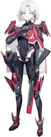
It makes me laugh this ugly shit is named drake
No. 442075
>>441331>i'll forever be bitter we almost had bison return as a bishie.No no wait what please
nonnie tell me more I didnt hear about this.
No. 442079
File: 1734741464244.webp (149.02 KB, 1296x2198, IMG_6647.webp)
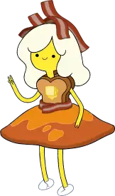
>>441941I like that they weren’t all just generic human-looking pretty girl designs like bubblegum and flame princess. That being said, my favourite is breakfast princess. Frozen yogurt princess and space angel princess were cute too.
No. 442082
File: 1734741741820.webp (27.53 KB, 720x401, hot dog princess.png)

>>442079You're all forgetting someone very important
No. 442083
File: 1734741754417.png (4.89 MB, 2400x3000, 1000030379.png)

>>442079Space angel princess is a cutie! Also in my opinion Raggedy Princess' design is absolutely perfect
No. 442099
File: 1734745461289.png (89.15 KB, 358x552, Princess_Princess_Princess.png)

>>441941None of these offend me, though some are kind of forgettable. I like that none of them feel sexualized, and that the showrunners were willing to make the female characters as weird visually as the male ones. So often in fantasy settings, the male monsters and characters are varied while their female counterparts are generic coombait.
Inb4 someone brings up Fionna: she was designed by a woman, cope.
No. 442100
>>441333Of course the playable female character can't be TOO ugly or else everybody will lose their minds
>>441353Powerful old man characters never stay looking young and beautiful (Master Roshi, etc), why should female characters be the only ones to do so? You can tell in this case the mangaka just hates older women and is a coomer, any canon justification (if any) is just a cope. An old character that wants to look young can be done seriously without coomer intentions but this is clearly not one of those cases imo
No. 442136
File: 1734759086437.png (32.87 KB, 887x170, concerned ape.png)

What a downgrade from the first pixel design
No. 442274
File: 1734828230114.jpeg (445.52 KB, 2048x1490, IMG_0940.jpeg)
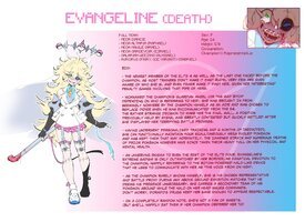
Can we also rip on shitty OC lore here? Popular NSFW artist ThiccWithaQ seems to be incapable of writing an OC that isn’t an edgy shitheel devoid of any other sort of characterization so it makes sense why his coomer fans only care about what they look like without their clothes.
No. 442353
File: 1734879736934.png (501.42 KB, 752x1211, OfvGifK.png)
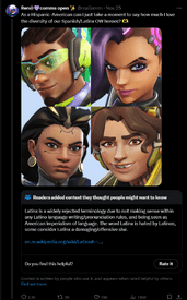
No. 442379
>>442174I didn't feel like the show portrayed any of what Finn did and went through in that episode as positive tho? Him going on the "kissing spree" was obviously something he did to ignore his problems without actually addressing them and most definetly didn't cure his depression. The same with LSP deflowering him, he looks uncomfortable and puts that memory "in the vault" aka he was repressing him like everything negative in his life.
The Fandom already doesn't like that episode since it's incredibly uncomfortable to watch but you need to be some sort of delusional to take that the message of the episode was that "kissing girls to get rid of your problems is a good thing", just saying.
No. 442416
File: 1734899579566.webp (104.88 KB, 1080x607, sf6-m-bison-unused-designs-v0-…)
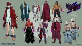
>>442075NTA but she's probably referring to picrel. Its sad to see what could have been
No. 442432
File: 1734904389649.jpeg (591.29 KB, 927x924, 6C735F4E-19A2-41F3-B0DB-E4FCD1…)
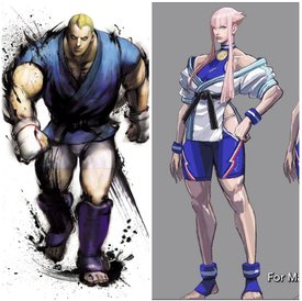
>>442284>>442355That pose makes the design look more bloated than it is, here is a better look at it, but Manon is basically just a genderbend of Abel. Street Fighter has always had quirky characters with different interests that reflect their personalities and play styles, but Manon gives me the vibes of a one appearance character. For Manon, the different attributes of modeling, ballet, and judo shows more so in her animations which are pretty well done.
>>442416Thank you for posting for me nonna, I appreciate it. I think any of these would have been far more interesting than the design they ended up going with, but it seems that Capcom can't move on and try anything daring with their characters. I personally would have enjoyed the long haired cyborg bison, what about you? Also pains me that now we're just going to get a bunch of SNK characters (and other crossover characters, the director wants Subzero in the game for example) without any sort of upgrade to their design to be more modern in each season, this roster is going to suck.
No. 442481
File: 1734926453386.jpg (122 KB, 1108x831, wZwOdpD.jpg)
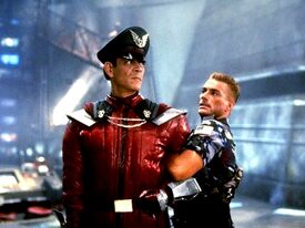
>>442416>>442432I know 3DPG, but to me this is one of the best Bison even if Julia was totally sick during the movie. Capcom should have based Mr Bison/Vega more in his role, it was killer (no pun intended).
"But for me, it was Tuesday."
No. 442484
File: 1734927086000.jpg (82.96 KB, 1200x675, aki.jpg)
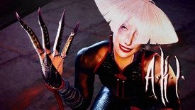
>>442432Manon feels like a one-appearance character too. The concept for her character doesn't seem strong enough in general and the design doesn't help. I agree the concepts are better communicated in animation but is that enough? Of the new characters I think Aki has the best design. I thought she was actually kind of weird and offputting at first but she looks really striking and fits the universe.
No. 442554
File: 1734963433268.webp (142.7 KB, 619x888, IMG_7358.webp)
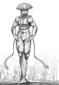
>>442484She looks like the fruity ballet guy in Kengan Ashura
No. 442962
File: 1735171866527.png (904.35 KB, 980x578, 1a1e31_e703981c9f3a4a309ac23a0…)
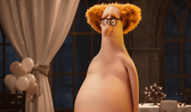
All the designs from the franchise are bad but this one is definitely the worst.so disgusting and ugly.
No. 443064
File: 1735244159656.jpg (104.84 KB, 667x1000, 1000030695.jpg)
>Be me, going to a comics-themed party next month
>Contemplate doing a Harley Quinn cosplay
>Literally EVERYONE suggests the hideous and tryhard Suicide Squad design
I know Margot Robbie is pretty, but even so, how did THIS capture the hearts of DC audiences for so many years kek
No. 443136
File: 1735264102648.jpeg (132.95 KB, 500x764, IMG_6676.jpeg)
>>443064I think the debbie harry inspiration is cool in theory but the “daddy’s lil monster” shirt makes it immediately cringe. Also I can’t stand when Harley is styled with pink and blue or red and blue, she looks so much better with her original black and red colors. Also the whole clown/harlequin element being completely absent is annoying as fuck.
No. 443143
File: 1735264900464.jpeg (257.34 KB, 1199x1492, IMG_6680.jpeg)
>>443064Ngl I’m guilty of liking some of Harley’s more sexualized/coombaitey iterations, her Arkham asylum outfit is one of my favourites. I wish they made her wear a red/purple colour combo more often.
No. 443330
File: 1735349873286.png (1.2 MB, 877x1100, Abel.png)
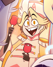
This is just human Lucifer but fat with wings.seriously?what's with Viv liking blondes so much??it's funny Abel is supposed to be an angel when he just looks like a regular person.Her angel & demon designs suck ass I don't understand how much praise she gets as a character designer.this is just extremely lazy.
No. 443434
File: 1735381476995.png (147.56 KB, 235x361, wN10WP1.png)
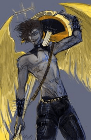
>>443345>Because Adam is fatI refuse to accept that
No. 443682
File: 1735460030528.webp (61.18 KB, 700x700, lime.webp)
I like lime but i cant get over the thong, its retarded even for degenerate design standards
No. 443690
File: 1735464702602.png (1.31 MB, 1130x1109, TxtDojk.png)
No. 444415
File: 1735683802719.png (196.41 KB, 250x378, Galacta.png)
Belongs here since this is supposed to be Galactus's daughter.Why is she even showing skin? wearing thigh highs and a mini dress?and of course her cleavage.worst Marvel design.
No. 444419
File: 1735684891535.png (738.69 KB, 958x1597, Arthur_Pencilgon_anime_design.…)
The pants make me irrationally angry
No. 444429
File: 1735687980503.jpg (120.39 KB, 696x442, marvel-rivals-tier-list-696x44…)
This shit is lazy, at least the guys have some sort of armor or outfits. All the women just get different colored bodysuits or a crop top. Very evident they drew the male characters with both of their hands while the women with one
No. 444433
File: 1735688410277.jpeg (41.11 KB, 502x668, GfJ1ChSWEAEauMK.jpeg)
>>444429There's unreleased skins in the files that are even more revealing. This shit is so annoying, especially because Scarlet Witch has one of the better base skins for a female character in the game.
No. 444921
File: 1735847697264.webp (33.91 KB, 640x480, FwPCSS_Cure_Bright_Final_Pose.…)
I've always wondered how a skilled artist would try to make the color palette work if commissioned
No. 444927
>>442962looks like the average tif
>>444919"Diversity" is when all people look related, speak the same language and come from the same latino culture and are referred to by what is considered a slur
No. 444940
File: 1735855497409.png (561.01 KB, 640x820, CurrentDeb.png)
>>441635I like some of the designs from the cartoon but this was blatantly bad.how did they got away with designing the mom like this??feels very fetishistic.
No. 444997
File: 1735875956684.webp (Spoiler Image,38.16 KB, 700x1050, eComBilderFullBody_0036_icon_t…)

>>444419They remind me of the godawful thong pants from Namilia.
No. 445050
File: 1735895432402.png (2.9 MB, 1442x2159, 1000012806.png)
Men just have zero sense of aesthetics when it comes to characters. Bayonetta is sexy and looked cool, she was designed by aomen though so it didnt feel like just "sexy woman". This girl literally looks like something out of those "try not to cum" porn games. It looks cheap, idk how else to describe it
No. 445152
File: 1735946289768.jpg (44.52 KB, 736x613, 67768321dd1c894c66eed9ff0f2286…)
I'm surprised not to see any Senran Kagura garbage posted here.
No. 445181
File: 1735954091830.jpeg (246.12 KB, 660x1024, A39EAA2D-9EE1-463B-9E7A-70873B…)
>>444415She's also a weird pregnancy fetish character..
No. 445182
File: 1735954157370.png (857.87 KB, 640x800, 610d7bcecbdca8d545882ee0df9dbe…)
>>445152senran kagura has some good designs sprinkled in between generic coom ones, then it has shit like this. Her hair was so uggo they had to redesign her the new game
No. 445199
File: 1735963620449.jpg (100.31 KB, 533x800, 1000018803.jpg)
>>445190Pretty sure her boobs are just hanging out. That's how it's depicted in her figurines anyway
No. 445212
>>445152>>445050These are so fucking horrible, I'm kekking my ass off
>>445181>>444415This artist/designer is clearly a weeb, yuck.
No. 447674
File: 1736636491292.png (420.46 KB, 573x378, download20241001034238.png)
One of the biggest downgrades in the history of designs
No. 447828
File: 1736675092524.jpg (122.63 KB, 850x850, sample_3f831016b40e1778841f71f…)
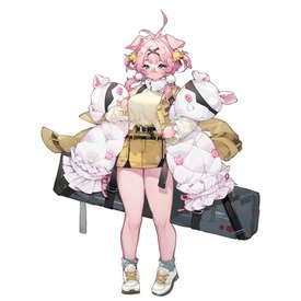
Every other character is a normal human and then you have this hideous furry pig girl, horrifying
No. 447839
File: 1736677113423.png (331.34 KB, 1024x1024, Tabuk.png)
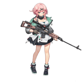
>>447828tabuk is a normal human, that's just one of her skins
No. 448007
File: 1736725501592.jpg (116.4 KB, 1000x593, Butt_Witch_model_sheet.jpg)
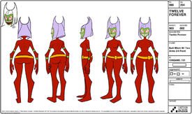
The entire character and design is wasted potential since the show could have had a cool androgynous villain as a metaphor for puberty but for some reason they went to giving her that rancid name and this horrible design instead.I feel like the show was only popular because of how much rule 34 she got.
No. 448009
File: 1736725721172.jpg (121.26 KB, 806x904, 1000031281.jpg)
>>448007The creator was a peso who got sacked for sexually harassing her female staff, so of course they portrayed puberty in a weird coomerish design. Picrel is part of a long Tumblr post she made which she literally tagged "pedophile" btw
No. 448034
File: 1736731129465.webp (142.83 KB, 1080x1920, Alolan Persion Fan Design.webp)
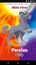
>>440524I love it for the memes but yeah, it's such a dumb design for Alolan Meowth who exuded cool and suave. My guess is they wanted to do something similar to Glameow where in it's first form it looks cool and stylish only to evolve into something that that is the total opposite of it. but the fact that we could've gotten something genuinely cool like picrel annoys me so much lol.
No. 448038
>>440867I actually like her design a lot except for the pink hair color. The haircut itself doesn't really bother me but it paired with the unnatural hair color is what gives the libfem haircut vibe that
>>440870 mentioned. If her hair was black or ginger red, I think it would look a lot better (thought they'd have to change the color of her armor to better coordinate with the different hair color of course). I think it's cool to see genuine bodybuilder looking women in games because it's not something you see all that often with female video game characters.
No. 448041
File: 1736732416710.webp (155.28 KB, 1200x1600, Mai_2006.jpg)
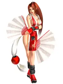
>>441296I've been aware of Mai since the late 90s and even back then as a kid I thought her design looked stupid and jarring. Like okay she's a kunoichi but the design is just so gratituous that it's not endearing or appealing. I remember the common moid excuse to justify her design is that she dresses like that to distract her male opponents and it's just stupid. Female ninja characters can be a gamble as they seem to be a favorite for moids to coomify and you rarely see an actually cool looking female ninja character.
>>441313FFR, there is nothing unique or special about Mai aside fro moid coombrain tits. I would've loved to see Menat come back, she was one of my favorite newcomers in SF5, she had such a fun playstyle.
No. 448044
File: 1736732707315.jpg (136.16 KB, 1260x870, kof14-angel.jpg)
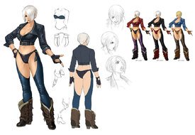
Since SNK was mentioned, I gotta throw the character Angel from the KOF series. The only thing I like about her design is her hair and her sprite animations but her outfit is a mess and it's as coom-male brained as they come as I can't see any actual woman wearing something like this out in public. She's supposed to be a wrestler but
No. 448048
File: 1736733952242.webp (162.24 KB, 750x1210, Bayonetta.png)
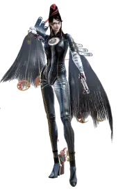
>>445050Agreed anon, it's like the designer tried to take inspiration from Bayonetta but then missed on the key characteristics that made Bayonetta's character design actually good. If Bayonetta was designed by a man and you saw the male-coombrain design of her doing all the things she does in the game, it definitely would've looked a lot more tacky, desperate, and degrading. But because Bayo had such a strong fashionista design, it actually did sell the feminine power fantasy that players enjoyed. Like it's cute how despite the sexualized nature of her character, there were some women (who are not pick-mes) still enjoy playing as her. And all the other characters in the game had nice designs as well, I loved how Jeanne looked in the first game.
No. 448049
File: 1736733984786.webp (147.95 KB, 1920x1081, 84A76C21-4953-4583-8AA9-B99A08…)
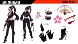
>>448041She recently received an "older" (she looks the same age) design for COTWs, and while its retarded, I do like it better than her classic design. It even evokes her supposed "metalhead" side with the leather, but SNK proves they have no taste with those awful flowers on the sleeve and pants leg. But her classic design feels so outdated and embarrassing, I really don't think I'll even be able to watch her gameplay trailer thats dropping tomorrow…
>I would've loved to see Menat come back, she was one of my favorite newcomers in SF5, she had such a fun playstyle.Same… I would rather characters with fun personalities or playstyles to get picked for slots, and I'm hoping this season sold badly so capcom cancels their SNK crossover autism they (supposedly) have planned for the rest of the SF6 lifespan… I was really hoping for more Third Strike characters as well, or characters that haven't appeared for awhile, but we get uglified Terry and a titty ninja instead…
No. 448052
>>448049AYRT, I haven't seen this look but I see where you're coming from, it looks okay I guess, something different than her tired old red/white outfit. I didn't know that Mai was a metalhead so I agree that the leather kinda gives a nice nod to that though yeah, the flower designs are out of place and they should've gave her bedazzled studs or something. I would've also given her a studded belt. Also I would've switched the high heel boots to combat boots but I know that's asking for too much from the moid designers at SNK who still go with the "sex sells" mantra.
But yeah thanks for the share anon, this is a breathe of fresh air for the character.
No. 448053
File: 1736734383725.jpg (33.96 KB, 400x853, 152300_crt_LsluL.jpg)

Speaking of female ninjas,I found this.its from a newly released anime called Otaku NEET ninja.
No. 448054
File: 1736734672823.jpeg (301.84 KB, 1920x1080, 9D8D1A68-95CD-423D-B2D7-E5F21A…)
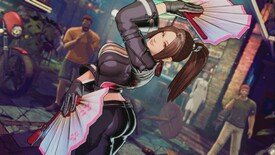
>>448052>I didn't know that Mai was a metalhead so I agree that the leather kinda gives a nice nod to that though yeahI feel like most people don't, it really never shows in her designs or personality. I think SNK is too afraid of giving female characters more personality than slutty or cute. I think studs would've been a better addition, too, instead of the poorly done traditional Japanese elements.
Her in game model does look like a bimbofication edit, though, so they don't deserve too much credit…
No. 448064
>>448051I agree,
nonnie. I think her design is tacky and cringey, I hate her mommy dommy schtick. I don't see a difference between her and any other fetish bait character.
No. 448066
File: 1736736741280.png (620.97 KB, 830x622, japanese_hoarder_cook_insects_…)
>>448053it's so weird how they think the average NEET woman would look like that and not like this
No. 448078
File: 1736739801134.jpg (64.96 KB, 686x386, hq720.jpg)

>>448061It has the Naruto mesh thing ig.
No. 448098
>>448054Right, I don't recall ever reading that Mai was into heavy metal but then again, it's been so long since I looked into the character bios because honestly KOF was one of those series that I thought had decent character designs (ignoring Mai & Angel) but the plot itself was confusing and just did not interest me. But this trait of hers definitely helps make it more understandable why she's into Terry's brother Andy since he kinda gives metalhead vibes with the long hair and all.
I'm hoping that they continue wit hthis new leather aesthetic with her, anything new than her tired kunoichi "uniform".
No. 448103
File: 1736745803782.webp (63.67 KB, 320x816, P5_Futaba_Sakura.png)
>>448066>>448070>hershey highways in her undiesfucking kek, that made me laugh more than it should've. But I agree with you both, moids have a weird outlook for what a NEET woman actually looks like. This
>>448053 interpretation reminds me of the character Futaba from Persona 5. I mean personally I like her design and kinda dress similarly (but I'm not a neet, I have a job lol), I just don't think the typical NEET woman would dress stylishly and really would dress more for comfort since she hardly leaves her house.
No. 448112
File: 1736746390316.jpg (437.16 KB, 1000x713, Bayo2.jpg)
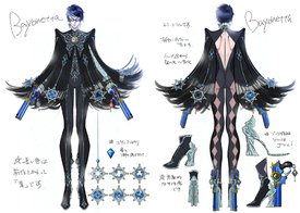
>>448051>>448064To each their own. Personally I like Bayonetta's design in her sequel game the most. I just don't see how her design in this game looks like fetish bait, it just looks like high fashion sketch design brought to (video game) life. I'm probably bias because I like fashion and I like the neo-Victorian-esq vibes of her style and world. I don't really see many moids outright feitshizing her in open social spaces nor do I see moids talking about how much they want to have sex with her.
No. 448167
File: 1736753941968.webp (143.3 KB, 1000x471, Bayonetta_-_Bayo3_Concept_01.p…)
>>448126Yeah no doubt, I saw it with Zero Suit Samus back in the day which sucked because before the whole Zero suit stuff, you didn't see that talk about her. But with Bayonetta, I just didn't see this, especially when the sequel released, I remember some moids saying that Bayo looked like a lesbian because of the short hair which didn't bother me because I would ship her with Jeanne lol.
>>448128Same, I love the short hair on her as well and it does let her design be more posh looking. I wasn't the biggest fan of her Bayonetta 3 design tbh, now that looks like too much is going on imo.
>>448136I would agree with this notion with her Bayo3 look (picrel) but not really for Bayo2, I think it strikes a nice middle ground. Though fair enough if you don't like latex suits.
No. 448251
File: 1736780000005.jpg (118.66 KB, 693x960, chafemaxxing.jpg)
>>448237>What the fuck does wearing leather have to do with liking metal music?even a normie would know that metal music is known for its leather fashion
No. 448264
File: 1736784144264.png (789.63 KB, 1024x640, bayo3jeanne.png)
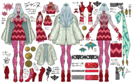
>>448167I never realised just how overloaded the Bayo3 design was, jfc. I thought it was ugly when they debuted it, especially the color scheme, but seeing it all laid out really showcases it. They did too much, she has way too much shit on her.
Jeanne's design is almost cool with the mod style, but is also pretty overworked. I'd love to see the original designer take a shot at both these looks.
>>448255Leather accessories are still a big part of fashion associated with metal, but the full leather Judas Priest look isn't as common anymore because that style of metal music is older now too. Most bands and fans these days stick to gauntlets, belts, vests, etc. Mai's costume looks more like she's into moto racing. Metalheads were also bikers back in the day, but she looks more Kawasaki than Harley Davidson.
No. 448383
>>448264Yeah I really had mixed to negative feelings when I first saw the debut of Bayo's design as well but couldn't pinpoint what it was that turned me off from it and then I saw the concept art and saw just how absolutely bloated her design really was and it made more sense. This is why I believe that her Bayo2 design struck that perfect balance of less is more, especially in comparison to what came next lol.
>Jeanne's lookI think Jeanne's look in Bao3 look a bit more eye-pleasing in comparison to Bayo but I'm bias because I love 1960s fashion. But I agree that there is definitely a lot going on with this design as well.
I agree with you in wanting to see the original artist make some Bayo3 looks for the characters even if it was just for fun.
>>448279Yeah the hair-material dress is cool but there's just no getting around that the design has way too much going on and has conflicting choices.
No. 448524
File: 1736833036942.png (Spoiler Image,748.4 KB, 1200x1132, 1200px-MLB_Reclusa_Render.png)

Spoilers for mario and luigi brothership if anyone cares: when i saw the design for the egg i was expecting a cool dragon or sea monster creature, and instead i got that tv head character from hazbin hotel except somehow worse
No. 448609
File: 1736894597231.png (264.79 KB, 1080x720, Ore24Lh.png)
No. 448632
File: 1736901366499.jpg (115.54 KB, 1200x563, FExkDqIWYAUInBf.jpg)
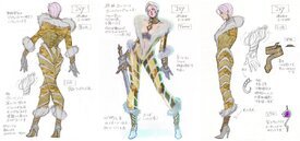
>>448264It's the same designer in all 3 Bayonetta games though, it's weird how she has really bad taste sometimes, like this outfit she designed for Ivy in SC4 is so ugly
No. 448750
File: 1736931854924.jpg (823.97 KB, 4096x1923, FExlDnDXMAAcExR.jpg)
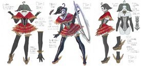
>>448632Oh I remember this look. Honestly I have a like and dislike view with this outfit of hers. I like the plunging fur-trim neckline and I like the matching gloves and boots but those coils on her legs looked so weird and it looked even weirder in the 3D model. It's very haute coutre and I think it fits Ivy's style but those coils just gotta go.
But seeing this, it made me remember the outfit she designed for Tira and I thought it was very cute.
No. 448751
File: 1736931966940.webp (90.96 KB, 1000x857, 1900750_781771845199483_536883…)
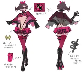
>>448632>>448750But then she designed this tacky ass outfit. I dunno, when Mari makes intricate designs, even the Ivy look shared, I think they can look pretty cool but when she caters more to coomer moids, her design taste plummets a level or two.
No. 448964
File: 1736988303151.jpg (192.34 KB, 1704x952, GhSbJSGW4AA9EbM.jpg)
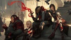
There are more garish designs in LoL, but seeing this just pissed me off kek
No. 449076
File: 1737034061483.jpg (127.69 KB, 1990x2579, QueenOdetteNetherworldOS2.JPG.…)
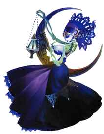
From a game called Odin Sphere, how can some people be so disconnected from reality that they don't realize how ridiculous it is to put a giant pair of tits on a bare skeleton kek, I don't get it
No. 449209
File: 1737063092155.jpg (60.52 KB, 640x467, 4a737adc932cba9333e8906f65fc0d…)

No. 449330
File: 1737090575799.jpg (106.96 KB, 798x1000, Odin-Sphere-Leifthrasir-PS4.jp…)
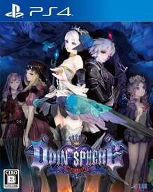
>>449076>Odin SphereAh, is that the same game that got its cover censored in the west for showing some inner thigh skin (crotch?) on a female character? It seems like every female character has coomer elements for no reason like the Zettai Ryouiki of the character on the cover.
No. 449639
File: 1737164830931.webp (150.91 KB, 800x611, 6745-Shiny-Lycanroc-Night.webp)
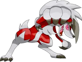
I hate this Pokemon it's so fucking ugly and tries too hard to look edgy like some 15 year olds first furry OC from Newgrounds.the weak noodle arms,the stupid eyes and the awful red color.
No. 449804
File: 1737212455138.jpg (26.47 KB, 517x403, Ghfq04dXEAAiVUn.jpg)
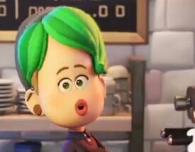
No. 451455
File: 1737535182637.jpg (153.76 KB, 1198x1030, GdsNpASWoAAAB86.jpg)
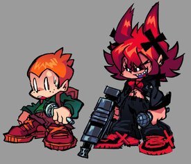
i hate everything from this game
No. 451635
File: 1737580002753.jpg (134.11 KB, 1000x1000, 55nwu6jrmm161-1162347503.jpg)
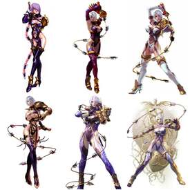
>>448632Oh wow I had no idea, I guess she was just in her maximalist phase when designing for Bayo 3. I actually really like this costume for Ivy though, I would say it's better than any of her default looks but it's not my favorite of her alternate costumes, so I guess right in the middle. I like that the coils on her legs are reminiscent of the rings she usually has around her thighs but less clunky and uncomfortable looking.
>>448750I wish Tira had more outfits like this, she's fun to play but her costumes are such ass most of the time.
No. 451676
File: 1737585701195.jpg (209.42 KB, 512x512, tiraarts3.jpg)
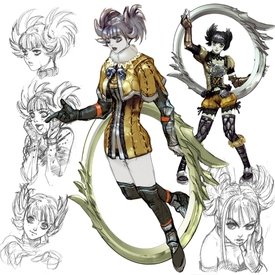
>>451635AYRT who shared the Tira art and your thoughts on Ivy I agree with. The only main outfit I ever liked was her SC5 look and that's only because I liked the Aristocratic elements they added to it which fit her character's background. Her SC5 alt look that was discussed, I think what you said about the coils makes more sense that I didn't think about lol.
As for Tira, mad agree. I usually tended to like her alternate costumes more than her defaults which were usually bleh. I was obsessed with her alt in SC3 way back in the day.
No. 451722
File: 1737594345187.png (187.39 KB, 1000x1563, Masha_(Work)_-_Profile.png)
It's kinda fitting that the enby character is ugly lol.she really is hideous.
No. 451723
File: 1737594511110.png (131.24 KB, 360x613, Rendered._Titan_Luz.png)
>>451722I hated this form of Luz because not only was it awful but it is underwhelming too.it looks rushed so that explains the end result for this design.
No. 451729
File: 1737595119527.jpg (80.54 KB, 576x1024, be5be51955605f7e6047bc388ba856…)
>>451724Kekk that's the only reason I knew this anime existed
No. 451783
File: 1737607167223.jpg (51.49 KB, 456x555, IMG_20171103_075714.jpg)
>>440524It's funny-looking, but I hate that that's basically its only gimmick.
No. 451840
>>440524Why? It's cute.
>>440533Straight Outta Tumblr
>>441340I agree, too generic.
>>441357Kawaii female Pepe?
>>441740I like this.
No. 451963
File: 1737651467763.png (531.68 KB, 729x426, ivy.png)

>>451635I would kill to see Ivy in more aristocratic/military outfits, it suits her so well. SC is so frustrating because I feel like there was so much potential for good outfits but they almost always missed the mark or went the coomery way
No. 451965
File: 1737651639948.png (410.25 KB, 622x622, FOPdh6sXoAA_Wy0.png)
>>451963Same with Tira I agree it was fun when they gave her more elegant whimsical outfits like
>>448750 No. 452256
File: 1737711588197.jpg (60.74 KB, 512x512, Ivy_SC3-Alt.jpg)
>>451963I agree, I loved Ivy's aristocratic/military outfits, I remember being so obsessed with her SC2 look and I would've loved to see her SC1 alt with the SC2 color palette, such a shame that they didn't bring these outfits back for character creation in SC5 or SC6.
Did y'all like her alt from SC3? I remember really liking it back in the day.
No. 452491
File: 1737742720256.png (813.09 KB, 1920x1080, GITMuvl.png)
No. 452700
File: 1737760286581.jpeg (346.61 KB, 1980x1611, GdgRW62XkAA78zA.jpeg)
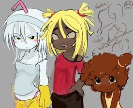
Idk if this counts but I hate it
No. 452715
>>452553AYRT and right on, so glad that more people actually did like her look in that game because it was her peak design in my opinion and it should've been her main look lol.To be fair though, with the exception of Tira's default outfit, all the characters were at their best in design in SC3.
And I agree, alt costumes are fun in fighting games since it lets the character's personality be more defined and immersive. That's why it sucks that SC6 doesn't have them.
No. 452728
File: 1737763926622.webp (487.89 KB, 1748x3300, Ashelin_from_Jak_II_concept_ar…)
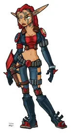
Ashelin from the Jak and Daxter games. As much as I love the Jak games as I played them so much way back in the day, Ashelin's design always bothered me even back when I played these games in the 2000s as a teenager. I do like her hairstyle and her facial tattoos but her outfit was just as scrote-porn brained as they came. She's supposed to be badass and sure in the game she is competent enough to handle herself but the male-gaze nature of her design does subtract from that. Maybe it's because I'm a bit more radfem but it even speaks volumes how whenever you hear scrotes talk about the game they mention Ashelin, it's always about her appearance and how she was their sexual awakening (eh…).
I feel like if her pants didn't have those stupid thigh exposed windows and was not extremely crotch hanging and tank top was longer, I wouldn't mind as much. It doesn't help that she's the only woman in the Krimzon Guard (the army-esq faction she led) and all the men are dressed appropriately and then you have her looking like that… It reminds me of Sonya from MK9
>>433876 where she's supposed to be a tough badass army lady but you just cannot take it seriously because of the coomer outfit.
No. 452877
File: 1737796562456.jpg (351.58 KB, 1000x667, __joseph_joestar_kujo_jotaro_j…)
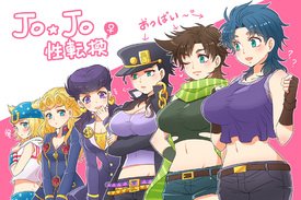
Post more bad genderswaps and gijinkas
No. 452889
File: 1737798758785.jpg (44.23 KB, 540x434, 92d6b871cbffcb334f0a2720dbe934…)
>>452877>just give them huge boobs and the same clothes and hair but sluttyBehead coomers I'd been thinking of drawing a proper Jotaro genderbend for literal years, because absolutely nobody ever gets it right、and that's the one that pisses me off the most. It's either Jotaro with boobs or Jotaro with boobs and a miniskirt. He's based on 80's banchō characters, the female equivalent would be a badass sukeban from the 80's, probably with a long-ass skirt and maaaaybe a cropped top. And I feel like female Jotaro would have very long and gorgeous 80's hair as well, not to mention she would NOT have a moeblob face. She wouldn't wear the hat, either.
No. 452963
File: 1737815183396.png (453.37 KB, 736x640, 2l66jSw.png)
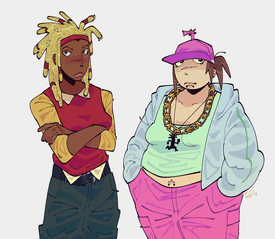
>>452700here's a better version
No. 453067
File: 1737827073365.jpg (430.71 KB, 1050x1485, mist-xg-sw.jpg)
>Hanzo's boobs not being covered
No. 453072
File: 1737827299202.png (2.66 MB, 1050x1485, mist-xg-ws.png)
>fat male character
>make her skinny and hot
>Junkrat isn't wildly exaggerated enough
>boobs not being covered
No. 453074
File: 1737827459320.png (2.64 MB, 1050x1485, mist-xg-ws.png)
>old roidpigs
>make them young and attractive
No. 453168
>>453067>>453072>>453074holy fuck these are all the same, no top and a tight bottom. if a woman made this they would all wear different kinds of clothes and have distinctive silhouettes, but we all know that already.
>>452700ewwww
No. 453300
File: 1737855286485.png (1.27 MB, 1039x1341, 38nfepi.png)
No. 453346
File: 1737862988731.jpeg (664.63 KB, 828x874, IMG_9452.jpeg)
Would be kind of cute but the side boob slit is so retarded. It doesn’t even look sexy, it just feels out of place.
No. 453356
File: 1737865010375.png (158.23 KB, 1024x1024, Spr_Masters_Serena_Palentine_2…)
>>453346This is how I feel about Serena's Palentine's outfit. At first I thought it was so cute, until I noticed the pointless exposed shoulders. Gotta pander to the coomers somehow.
No. 453367
File: 1737867428243.jpg (104.44 KB, 736x1030, 9619e02b94d418884b3c75fd073380…)
>>453356those shoulder cutouts have always looked stupid and they're super dated now. isn't serena supposed to be a fashionable trainer?
No. 453646
File: 1737921770208.png (843.47 KB, 946x2044, Mega_Man_X_DiVE_Hunter_Program…)

I don't know if this had been posted before and I'm sorry but Layer. And it upsets me because I like her. But this design with underboob sticking out is just stupid. In general navigators are sexualised in the series (except maybe Pallette), even Alia losing a bit of that edge she had in her X5 design and becoming an average moeblob. But I fear Layer had been doomed since start to be an absolute fanservice coomslop for the majority male audience.
No. 453834
File: 1737956572104.png (201.95 KB, 250x378, 1000002874.png)
I love fighting games and Killer Instinct is one of my favorites (I even went to local tournaments)
Anyways I recently got KI 3 on my PC and I absolutely HATE Cinder's design!
He looks so alien-like, oversaturated, and cluttered with details like those weird plates on parts of his body and his coconut/mannequin-ass face.
No. 453839
File: 1737957092658.png (396.74 KB, 500x1080, 1737921770208.png)

>>453646this character would look really cool without the retarded boobs and underwear. i love the color scheme and hair covering the eyes. i did a super quick edit. would probably remove or make smaller the white breastplate too
No. 453843
File: 1737957722576.png (Spoiler Image,917.53 KB, 1000x1108, Dragon's Crown Sorceress.png)

No. 453844
File: 1737957747721.png (Spoiler Image,1009.79 KB, 788x876, Dragon's Crown Amazon.png)

No. 454183
File: 1738024406782.jpg (Spoiler Image,225.01 KB, 884x594, 2048963198_76c0122d_1420841589…)

>>453843>>453844Kek it's the same artist who made
>>449076 he's repulsive
No. 454889
File: 1738178627876.png (376.4 KB, 640x1058, 2dgummigoo.png)

It's not that bad but his design is so boring.give him some boots or a bandana or some gloves ffs like an actual cowboy.
No. 455669
File: 1738365787290.png (280.35 KB, 568x821, VJY4Cdw.png)

>new avatar protagonists
No. 455862
File: 1738416826284.png (2.24 MB, 1920x1890, gOETZ7q.png)
No. 456073
File: 1738472667402.jpg (40.1 KB, 480x772, FB_IMG_1738472403880.jpg)
Couldn't find an HD version anywhere but this definitely belongs here.
No. 456078
>>455862honestly i think if they just gave him some long hair and maybe some thinner eyebrows this could actually look nice. i feel like the unfortunate art style is what mainly makes the design seem more unappealing than it really is.
also random nitpick but why are his toes a darker color than the rest of his skin? the shoes would've looked better if they were closed toed anyway. the artist should've just went with either regular jika tabi or sandals, trying to combine both of them just looks strange
No. 456294
File: 1738535652694.mp4 (2.95 MB, 854x642, Xs3SyHZ.mp4)
I don't know if this might be controversial, but I think lady oscar has pretty shitty character design, everyone looks the exact same, and the only difference is the amount of sparkles on them
No. 456327
File: 1738539145552.webp (86.95 KB, 1200x1733, Sprig_Plantar.png)

>>421632What a moment… Sprig was based on this character?
No. 456476
File: 1738575292121.webp (43.6 KB, 1080x1080, tetoteconnect-hatsune-miku-col…)
this character design is a joke
No. 456479
File: 1738577452916.png (174.53 KB, 960x800, Npc_zoom_3992764000_01.png)
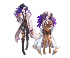
Most newer Granblue Fantasy character designs look like vtubers in a bad way.
No. 456892
File: 1738675183081.jpg (506.09 KB, 2048x1638, Gi3gOaqWAAE1ZjG.jpg)
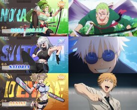
Saw this on Xitter. Idk what's this game is about these are just shitty coomified genderswaps of shounen male characters.
No. 456895
File: 1738675559584.jpg (21.86 KB, 316x121, kek.jpg)
>>456893its a Chinese gacha game but i do hope they get booted off google
No. 456897
>>456892ngl, i like f!zoro
This entire concept is so fucking dumb and shameless it looks like a troll project.
No. 456936
>>455669Unpopular opinion but I don't think these are
terrible designs, the original cast wasn't very detailed either. Plus, people are CRAZY for crying wokism at the prosthetic leg when there have been plenty of disabled characters in the previous seasons (Toph was in the main quartet ffs.) I'm just confused why the little girl's hair is purple kek
>>456480It's a new season, I think it's going to be set after a big disaster.
No. 457032
File: 1738701422947.png (441.5 KB, 483x1055, Rebecca_Cyberpunk_Edgerunners.…)

She's an eyesore,absolutely hideous and her eyes have the colors of blood and puke.
No. 457048
File: 1738705332808.png (1.57 MB, 1200x797, media2.salon.png)

>>421249it's crazy how white guys get to just make whatever and call it satire and they get praised, meanwhile a woman can't even draw yaoi without being called an evil homophobic oppressor or whatever
No. 457069
File: 1738714359956.webp (255.78 KB, 811x1053, IMG_6901.webp)
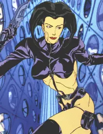
Definitely been posted before but it bears repeating
No. 457157
File: 1738737054407.jpg (44.8 KB, 739x415, 1000027508.jpg)
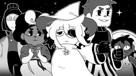
As expected from a thembie that won't shut up about her "struggles as an asexual queer". The tumblr noses trigger me so bad.
No. 457167
File: 1738740069871.gif (891.83 KB, 245x184, aeon flux.gif)
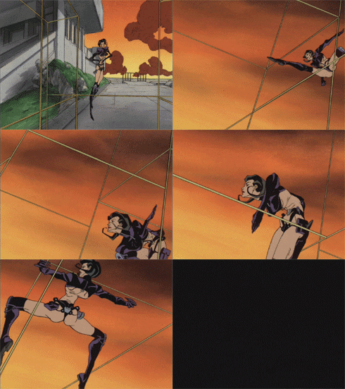
>>457165NTA, but that's Aeon Flux from the MTV cartoon of the same name. It ran in the early 90s and even got a shitty live action adaptation.
No. 457380
File: 1738809065776.png (197.1 KB, 360x744, LooeyModel.png)
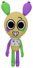
I don't understand why the designers didn't make him a balloon dog instead of whatever ugly abomination he turned out to be.
No. 457382
>>455669As in
Avatar: The Last Airbender??? I thought these were Pokémon designs!
No. 457383
File: 1738810078246.webp (71.72 KB, 1200x1439, IMG_4376.webp)
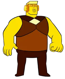
I’ve always hated her tiny legs and lackluster armor.I cannot believe YD brought these creatures in to guard her,they don’t even look like they can run and can be easily toppled over by a thin wire.
>>457380I know,no idea why he’s a rabbit? when ballon dogs are iconic and easy to make characters out of.They can just flip the ears around,it’s not hard.One thing I also just generally don’t like about the characters is that none of them look like they came out the time period they’re supposed to.No one was giving charcters bean faces please.
No. 457455
File: 1738832306984.jpg (2.42 MB, 3000x4000, Rebecca.(Cyberpunk_.Edgerunner…)
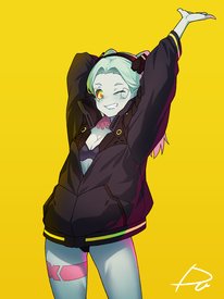
>>457032She looks fine to me.
No. 457476
File: 1738840798990.webp (240.92 KB, 3000x1747, Amazoness Quartet.webp)
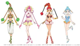
>>457467Answer my question.
I legit don't see how including underwear in a character design is any derision-worthy.
No. 457477
File: 1738842740569.jpg (101.55 KB, 720x923, 1000054894.jpg)
>>457476Nta but "clothed male naked female" is an actual pornographic trope and moids undressing their female characters to titillate the target male audience while keeping their male characters fully clothed reinforces a misogynist power fantasy. Picrel provides questions you can ask yourself to better understand what you are consuming so you're not just consooming.
No. 457478
>>457466it's gross coomer bait
>>457476these are also terrible so thanks for proving my point kek
No. 457483
File: 1738846345721.png (59.77 KB, 149x360, RMika.png)

Fighting game coom designs are low hanging fruit but this one is uniquely bad
No. 457513
File: 1738858300937.jpg (119.44 KB, 808x1390, a-kyrgyz-circus-acrobat-with-h…)
>>457509I'm not saying their outfits are totally realistic and not coomified but in context they fit, I don't think they look stupid or out of place
No. 457514
File: 1738858457174.jpg (Spoiler Image,50.21 KB, 686x386, hq720.jpg)

>>457509Unlike the cyberpunk loli who just happens to enjoy walking around in underwear and a jacket
No. 457515
>>457513we'll agree to disagree then, because I think
>>457476 looks like hot garbage.
>>457514did you mean to reply to me? This design is disgusting and I said so up thread
No. 457521
File: 1738859414751.jpg (303.85 KB, 1300x1820, Amazoness.Quartet.full.824022 …)
>>457515I think the new anime style is garbage and they look much better in the original art, but I'm also biased because I think Sailor Moon's designs in general are very cute and the author is a woman lol
No. 457626
File: 1738892422226.jpg (Spoiler Image,69.89 KB, 715x1000, 7226842578536.JPG)

>>457483Don’t be mean. She was worthy enough for the Queen to cosplay.
No. 457741
File: 1738919561537.png (575.79 KB, 849x1200, ci53QYp.png)
No. 457797
File: 1738937643213.jpg (29.13 KB, 426x600, OIP (3).jpg)
>>457741how can someone fuck up a iconic design as cutie honeys? he couldnt even take inspo from the real life version of it?
No. 457812
File: 1738944877960.webp (81.77 KB, 619x1289, Re_cutie_honey.webp)
>>457741Still somehow not quite as coomery as Re: Cutie Honey's design (asscrack window not shown in picrel). Close though.
No. 457814
File: 1738945544584.webp (189.48 KB, 772x1800, IMG_6478.webp)
>>457741Her best redesign continues to be flash. Everything since has gone downhill.
No. 457941
File: 1738970845414.png (1.66 MB, 832x855, why.PNG)
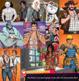
Just saw Date Everything on steam, the design choices are so baffling. There are 100 characters in the game and these are like 80% of the males they've shown so far. Who do they think is the main audience for dating games
No. 458033
File: 1738990806019.png (69.69 KB, 229x436, Tinker_Bell_(Disney_character)…)
I know she's iconic but whatever
No. 458059
File: 1738998521900.jpeg (191.32 KB, 1000x1499, FF43BEF2-94A8-43E1-92EC-29B8D6…)

>>457812KEKK the asscrack window is so ugly
No. 458133
File: 1739017013505.png (520.84 KB, 671x673, kXcP26y.png)
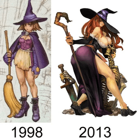
No. 458207
File: 1739028082445.jpg (530.74 KB, 1920x1080, ss_6480a7498f7fd63060c371fe134…)
>>458197My thoughts exactly. It reminds me of the Office Type which is about dating office supplies. No one gives a fuck about these games because they're ugly, soulless and ultimately nothing more than a joke.
No. 458210
>>458208Nta but I think it has to do with the sincerity towards the object's history? I think in a manga
>>458207 description would, instead of her personality, be a fun fact about pencils, who invented them and where they're used, and using that to "color" the character's personality and actions.
No. 458243
File: 1739037736346.jpg (48.26 KB, 483x308, dateeverything_4323823.jpg)
>>458208It's honestly difficult because items in general don't have many widely recognizable traits the way animals for example have but imo it won't come across as a parody if you can find a way to take it seriously. I just know none of these characters are going to have deep or interesting storylines beyond what certain stereotypes allow (like the trash guy being insecure about being trash) and that the devs can't keep a straight face when they talk about the game because actually, unironically making something like that would simply be too weird so it has to be a huge joke. Relying on puns and fourth wall breaks doesn't help either
No. 458267
File: 1739047520319.jpg (54.96 KB, 640x640, d43hj2exeus91.jpg)
Could have been a cute design but too bad it's wasted since its too oversexualized.
No. 458268
>>458267>rashguard>bikini guardsure, it is water related
>thigh highs sigh
No. 458354
File: 1739062824450.mp4 (4.63 MB, 720x720, gkXbD5i.mp4)
No. 458370
File: 1739063897775.webp (293.24 KB, 1613x1080, dragon-age-veilguard-companion…)
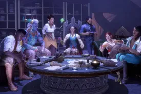
>>458354ngl, veilguard's character creator is actually really good. miles beyond dragon age inquisition. anyway, basically all of their companions suck when it comes to character design. the only one i actually like is Emmerick, the old man necromancer. everyone else reeks of "oooh i'm so special pls look at how special and unique i am"
No. 458468
File: 1739085494487.png (671.28 KB, 1342x1520, HM5pi92.png)
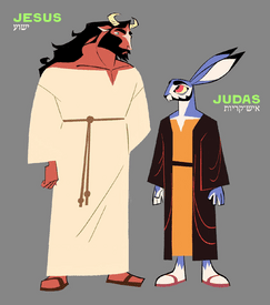
No. 458589
File: 1739131707990.jpg (129.92 KB, 600x904, cf49df9b5d1fb640b9187f1ad0f046…)
>>458208By taking the project seriously and having a genuine passion for the subject, no matter how autistic. Anime like Girls Und Panzer and Uma Musume are objectively retarded idea-wise. If you brought the idea of making a show about girls riding tanks as a sport or anime girls with the soul of irl race horses to any western producer, you would get laughed at. The distinction is that its a legit project, not a one-off joke meant to be gifted as a joke game to your steam friends or milked by streamers and youtubers for views. There are legit horse racing enthusiasts working for Uma musume, and genuine war and panzer autists on GUP. I also think they rely too much on the gijinka looking funny rather than having a good design. Textbox-chan could have been a girl with a dress with a text pattern, but they are creatively bankrupt so they just slapped the literal textbox on her like the creatively bankrupt morons they are. This design is pretty coomery but it at least tries to do something creative with the concept, like the tie and the pattern of the pencil. I would like to see more genuinely autistic concept done in the west, but everything feels so irony poisoned nowadays.
No. 458615
>>456327oh no, cursed post
>>458468I switched the names in my mind somehow and thought it looked ok. Jesus would not be a fucking bull, he'd be a lanky donkey or some shit at best
No. 459087
File: 1739257590567.webp (23.14 KB, 360x305, Green_tea_mousse_default.webp)

on a surface level her design is fine i guess, i enjoy most of the cookie designs but i literally cannot stand how they gave her these hips. it reeks of coombait and just reminds me of those horny twittard artists and furries who give every character lymphedema.
No. 459440
File: 1739348577604.jpg (75.76 KB, 736x736, 1000001693.jpg)

>>459087This reminds me about how much I hate this over cluttered abomination. A weird and uncanny bastard child of Nights, Fizzaroli, and the whitewashed magician from that awful game…
No. 459456
File: 1739351397204.jpg (229.54 KB, 934x996, 81YjG5uYElL._AC_UF894,1000_QL8…)

I'm not kidding, this was drawn by a female author for a shoujo manga.
Did Yomi Sarachi (the author name) want to be "ironic"?
No. 459524
>>459087as someone who has no idea what this is from or what you're comparing it to this looks so cute and not coomery at all, i'm so confused what's wrong with it
>>459266>I hated how the crew design the homeworld gems(and later fusion gems)I think part of the problem was that they went troonery as fuck after a while. In the beginning it was as show about cool, strong and funny female characters, sure they were aliens in theory, but we all knew they were really female. Then Rebecca Sugar decided to go ham in on nonbinary bullshit and talked about how important it was to her "as a nonbinary person" that they are NOT women, but genderless beings. So the previous message of "female characters can be any shape too" was kind of replaced by "not stereotypically female shaped = not female" and the show then no longer had strong female characters - because they're all "nonbinary non-women" instead.
No. 459628
File: 1739387857850.jpg (225.64 KB, 1640x1128, uhdv347q8o74qw389qhjwa.jpg)
>>459524Did you forget that these two fusions are classified as "non-binary" characters?
No. 460237
>>459772Is like if Toriyama said all Namek were asexual born by an egg, but suddenly he gave to Piccoro a penis because he has "sexual desires".
IIRC Rebecca even compared the gems to Nameks for the same reason.
No. 460434
>>460240you got that right. Sorry but pretty much every Steven fusions are half-assed or in the case of Stevonnie, just creepy.
Speaking of Stevonnie design, love how it just 99% Steven and 1% Connie no matter what outfit its' wearing instead of 50/50 like the show tries to push; don't get me started when the crew randomly gave it beard hairs in that one episode
No. 460474
File: 1739569958199.jpg (79.84 KB, 733x741, RQ_2.0_concept_art_by_colin.jp…)
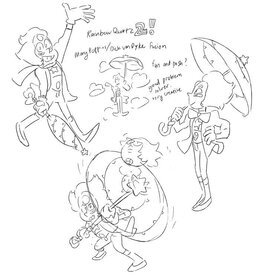
>>460465I don't know whose idea it was to make his legs that ugly. He has normal legs in this concept art.
No. 460480
>>458468>>458615>>460468>>460472Probably is my furry shit talking, but he would be a lion, like the Androcles and the lion story.
>>460264Moids being moids.
No. 460534
File: 1739586760801.png (702.21 KB, 1080x608, raiqiii.png)
>>460237>>460264tbf, many of the earlier decisions probably weren’t made by yoriyama himself, he was notoriously known for having frequent conflicts with his editors, who consistently pushed for his stories to be more action-oriented and to tone down his humor and "pervy" tendencies. this is a common case for many famous mangakas, their early work is often the best because they had editorial oversight, which kept them from overindulging in personal fetishes and encouraged them to focus on crafting a good story, but when a series becomes too popular, that editorial oversight often disappears, allowing creators to indulge in all their fetishes and shitty humor.
No. 460548
File: 1739593462925.png (176.98 KB, 922x2000, 1000012797.png)
>>460534>added content that appealed to girl readers, such as VegetaAbsolutely based editor, the only moid who deserves to die a painless death
No. 460679
>>460548It's likely not out of genuine compassion; rather, an editor's role is to ensure that a story remains coherent and appeals to a broader audience without offending anyone. japanese moid creators basically need tard wranglers guidance to help them focus on crafting a compelling narrative instead of indulging in their personal fetishes
>>460566funnily enough, super is basically toriyama with full creative control, it's what toriyama always wanted dbz to be like and what it would have turned into if it weren't for his editors
No. 460693
>>460679It's more that editors have to sometimes force manga artists to change or add things not only for the reasons you listed, but also to make their manga sell more in general and to make these manga fit more with each magazine's editorial line. This is why we have recent manga copying some aspects of Naruto. Naruto as a story is shit, it's first editors saved it from being a furry disaster from the start but it got worse later, only the art saves it, but you have things like JJK being forced to copy some of its aspects at first to make it sell well too. On the other hand, the shonen jump editorial line changed with time, we have less adult protagonists in it and it's way less vulgar. I can't imagine anything like Bastard or City Hunter being published in it again today. I'm not into MHA but I assume that's why it has teenage protagonists? I heard the author wanted an adult cast at first. That also means some manga from the magazine could have been better written if they were either published a few decades later or if they were moves to seinen magazines instead, because the authors would have had a bit more freedom. I'm thinking of JJK and how the main character is supposed to be an underaged gambling addict and the editors were against it until the author made it plot relevant in a very weird way, and editors couldn't have made it not canon without contradicting a plot point.
Speaking of Bastard and editors. I remember reading the manga and sometimes there were empty panels or half assed panels with just speech bubbles and notes from the authors next to them saying funny shit like "my wrist hurts I can't draw that!" or "my editor is gonna kill me lol". Meanwhile when things like this happen in more recent series, it's only in the magazine and the panels look better in the volumes.
tldr; most editors think about sales first, especially the ones for the shonen jump magazine.
No. 460694
File: 1739649604882.png (447.98 KB, 1000x1000, sovl.png)
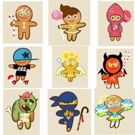
>>459087Incredibly autistic but I've played Cookie Run Ovenbreak since it first came out in 2009 and I hate how overdesigned the characters are now. They don't even look like gingerbread men anymore, just humanized versions of whatever their flavor is supposed to be.
No. 460703
>>460679>super is basically toriyama with full creative controlToriyama AND Toyotaro, and we can tell they sucked and were extremely autistic when left by themselves. A series like GT which was shat on by the moid weebs for decades managed to come up with better ideas, comedy and characterization than Super. The character designs also fucking suck so hard since Super (everything is so saturated and just… ugly) not to mention they keep recycling old villains (the next arc in Super is going to be about Frieza… again!) while the new ones are forgettable. I could sperg for hours about the downfall of DB kek
>>460696What are these flavors even? Electric eel cookie??
No. 460709
>>460534>but when a series becomes too popular, that editorial oversight often disappearsProbably unpopular opinion, but a good example of this is the latter parts of the Sailor Moon manga - it suffers from a lot of pacing issues, a lot of "tell, don't show" moments and ideas being introduced but not expanded upon
it's especially noticeable in the reboot movies, since they practically used the manga panels as storyboards. It was clear that they realized Naoko was producing gold so they went from helping her with pacing and holding back some of her nonsensical ideas to just letting her do whatever she wants.
though tbh I'm still a little bit sad that Sailor Moon didn't get to keep the gun she was posing with in some late stage concept art kek No. 460801
>>460694>>460696oh nona this is something i like to talk about but my friends, that have played cr before me and longer than me, aren't interested to keep the conversation, they just wanna consoom and buy more gacha to get the new super special epic rare legendary cookie. a big difference between old vs new is that they're not just silly cookies anymore, they have to fit a trope trait or even worse… look attractive? i wonder if other gacha games taking their userbase like genshinslop have to do with their change in direction, like they're not in their own niche lane but they wanna compete with that category too.
that and every other third character being nb are such big turn offs for me.
No. 460855
File: 1739691322288.jpg (3.15 MB, 3732x3056, 1657448743687.jpg)
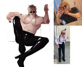
No. 460871
>>460801how can a cookie have a gender
>>460855i thought this was supposed to be 80s himbo johnny bravo. what character is this
No. 461045
File: 1739744031941.png (208.9 KB, 1000x1075, 7E906F31-CCF3-4FD0-A874-F03946…)

>The first official black PPG
>Gives her wide hips
Other than that she will always look like a shitty Mary-Sue.before she was revealed I've literally seen PPG OCS that look like her.
No. 461063
File: 1739746765651.jpg (110.35 KB, 736x1076, cc3696e92ee5920fe4dd1742c85542…)
>>460923someone liked greed from FMA way too much. actually i knew this really annoying girl who pretended to be male online (idk if she was a full TIF) who roleplayed greed and tried to act like him irl. so cringe
No. 461070
File: 1739748343836.webp (160.27 KB, 1280x586, GiantMusicMan.webp)
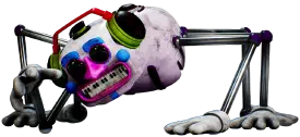
>>461063kek it's worse than that. If you went on her pages you'd see that her persona is based off a humanized version of this thing from fnaf security breach
No. 461130
File: 1739768839070.jpg (550.55 KB, 1500x2000, bafkreifyrgsztbb7sgr46qrklncul…)
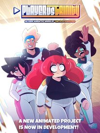
>An indie animation series
This looks like garbage lmao
No. 461242
File: 1739803024750.jpg (246.53 KB, 1365x2048, 1000003815.jpg)
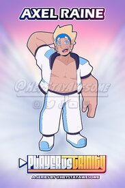
>>461130I did a little digging into the creator and yeah, titchop scars on this blonde character
No. 461284
File: 1739816736802.png (367.32 KB, 606x752, 82e8d7a4fefa5b2fb79da17d486929…)
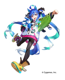
I almost admire the balls of the creators to put this vivziepop sparkle dog tier monstrosity in an anime/game
No. 461300
File: 1739820403634.jpg (92.05 KB, 640x430, ツイン ターボ.jpg)
>>461284I'm pretty sure I posted Turbo way back in a previous thread kek, sucks she got such an eyesore design while most of the other characters look more subdued and coherent. Granted her horse counterpart had pretty bright and garish tack so she was always going to be colorful, but she just has so many unnecessary elements.
No. 461301
File: 1739820494501.jpg (506.72 KB, 2000x1142, bafkreiaoj3sl3czmqxizezxxylgvn…)
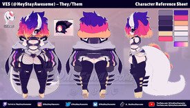
>>461130>>461242Why am I not surprised the creator of this shit is a fucking troon kek.he even has his very own fugly overdesigned V-tuber avatar.
No. 461471
File: 1739854759397.jpg (464.56 KB, 1095x806, Iono_concept_art.jpg)
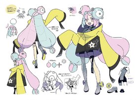
>>461284Reminds me of this other eyesore
No. 461496
File: 1739869223193.jpg (109.27 KB, 1920x1920, flying-black-powerpuff-girls-y…)
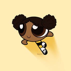
>>461045>>461486she could have been so cute, what the fuck is wrong with them? the proportions are even worse than the terrible weird hair choice. the hips are really creepy.
No. 461497
File: 1739869372500.png (87.18 KB, 385x415, Untitled.png)
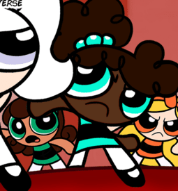
there are a lot of cute fan designs
No. 461599
File: 1739907120931.jpg (90.86 KB, 640x960, MV5BMWE1MGU5MjctMTFiOC00NjQyLW…)
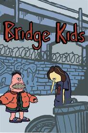
Why does everyone seem to like this shit? It's so ugly and not in a good way either.
No. 461611
File: 1739910194028.jpg (47.19 KB, 546x858, 6Rkf2G4R3YKbIZvDs2wByS.jpg)
hurrp durrf female robot
No. 461619
File: 1739911920586.jpeg (60.28 KB, 735x935, F9DB0AD4-AE0B-4BD5-A6F4-75C5C4…)
>>461611I still think Loba is the worst thing to come out of this game, her thicc bisexual latina thief schtick is so embarrassing too. The fact they made the stunt woman for motion capture wear those retarded heels (risking unnecessary injury) makes me mad too.
No. 461631
File: 1739914100072.jpg (463.07 KB, 1200x670, banner_1200670_tetotexconnect0…)

>>456476Still not the worst character design out of all the Tetote cast
No. 461647
>>461631So from left to right, we've got:
>Rejected Pokémon character>First draft Hoyoslop waifu>Emo love live girl??>Severely deformed loli vocaloid, what the FUCK is happening to her arm>Lolifag scrote's first Blender project>Based gorilla kun (save him)>The tragic aftermath of the Persona robot girl meeting a trash compactor>Especially boring VTuberSuch a winning cast, I'm sure this franchise will be remembered for years to come
No. 461658
File: 1739919806435.png (9.67 MB, 2735x3518, Red_Shadow_Cape_Costume.png)
I love Cardcaptor Sakura but Ive always hated this design. Why the leotard and thigh highs? They could have given her tights instead or a tutu at least.
No. 461908
File: 1740011728651.png (195.46 KB, 500x500, 500px-1017Ogerpon-Teal_Mask.pn…)
I fail to see how this ugly thing is supposed to be a Pokemon.
No. 461915
File: 1740014601582.jpg (31.57 KB, 442x297, rellor.jpg)
>>461908pokemon started to really lose the "pokemon" feel to the designs around unova and then in galar i feel like it REALLY tanked off the deep end and now everything is overdesigned like a digimon. But honestly i dont mind ogrepon. if were talking ugly ass paldea pokemon then lets talk about rellor. literally a shit bug with a dumb face
No. 461980
File: 1740042598968.webp (182.26 KB, 834x1049, Blue_Water_Jester_Costume.png)
>>461658Fellow CardCaptor Sakura fan and I totally see what you mean with this one. I used to love the look you posted as a kid but as an adult, I just cannot unsee the coomerbait of it. I have similar feelings about her Jester-inspired look as well. I really liked this look as a kid but with a maturer mind, I just cannot unsee the commerbait with this one also and it would've been better if they at least gave he some full-tights to wear underneath the skirt.
I'm just grateful that CardCaptor Sakura hasn't been overrun and taken over by coomerbrained moids, at least that I'm aware of anyway.
No. 461987
File: 1740043398429.jpg (149.68 KB, 1367x875, 3.jpg)
>>461497All of them are ugly. I hated the style from the moment I laid my eyes on it. This is Tumblr uglification before Tumblr even existed.
No. 461992
>>461991You're too easily
triggered to use image boards. Consider removing yourself from the premises.
No. 461994
File: 1740045161745.gif (419.97 KB, 220x231, green-tea-mousse-cookie-green-…)

>>459087noo shes one of my favorite designs in the game. im saving up for her costume its so perfect
>>459440this however is total dogshit god i hate his design so bad
No. 461997
>>461992How is anything you replied to “
triggered”. You just have bad taste.
No. 462125
File: 1740075768551.png (800.82 KB, 603x708, varesa.png)
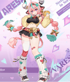
Not even a genshin fan but this is one of the ugliest designs I've seen recently. The way I've seen men eat up this slop and say it's a great design reminds me of how terrible their aesthetic tastes are
No. 462182
File: 1740087753001.png (341.91 KB, 700x866, 586bdb0fd5328563fd64214c55d67b…)

>>461980I cannot unsee Sakura cosplaying Jack Frost.
No. 462193
>>421143from left to right (sage for non contribution)
>Malik: Looks cool and normal, even attractive. Plus, he ain't got a fetishistic pastiche of nationalities and ethnicities, he's just Ghanaian dude. Nice.>Emhari: I like the scarf and blouse, his hair ain't it>Inaya: Just awful, i'm sorry, hate the glasses and eyebrows>Isabelle: she's very cute, the color palette is not bad and her hair is kinda pretty. I'm not sold on the plus size thing though>Yolanda: She could be pretty too but her yellow lips are ruining it>Arihi: He looks very gay but that's the point ig. Besides that, he looks very basic>Rocky: I actually like this guy a lot, but he doesn't fit this game. I like his outfit, that yellow looks hella good on him>Bigs: hell nah>Anoki: Also hell nah>Alonzo: I've seen gay dudes looking like him, so yeah he's very realistic. Can't complain>Ashlie: She could be a baddie but she's built kinda weird, her arm is too short and her posture looks stiff>Catherine: I actually fuck a lot with this design, bubblegum pink looks good on her complexion. But the executions is atrocious No. 462196
File: 1740091171781.png (445.85 KB, 549x1176, otomachi spice kuuwanko.png)

still an eyesore
No. 462202
File: 1740091772571.png (690.04 KB, 900x1148, Nezha.png)
I am the only one who hates this design? It's too cartoonish and ugly in comparison to the rest of the designs in the sequel, he looks out of place imo.
No. 462204
File: 1740092324657.jpg (56.99 KB, 387x512, unnamed.jpg)
No. 462254
File: 1740103153153.png (4.34 MB, 4786x2693, 1000000674.png)
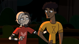
two "fun" facts
1. one of them is a TIF
2. one of their names is aiden
can you guess which? ;)(emoticon)
No. 462258
>>462254 >>462255oh I forgot to mention the 3rd "fun" fact
3. they're a canon "mlm" couple in the show
(classic trans gaybaiting)
and no they're from a different series called disventure camp
No. 462260
File: 1740104792769.jpg (174.45 KB, 1280x720, maxresdefault.jpg)
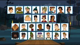
>>462254i know this is a fanmade show and not the actual thing but jesus fucking christ this franchise has one of the ugliest male designs in all western animation
No. 462298
File: 1740129483401.webp (340.1 KB, 3000x1500, DC4_Tristan_Swimsuit_Rotations…)
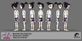
>>462254Also this show have their own enby.
TIM or TIF? I don't know…
No. 462308
>>461980This was one of my favorite costumes as a kid, I loved the jester theme so I can't hate it. To me it would read as if the white overlay is a tutu and the bottom suit a ballerina suit, so even if it shows all the leg it didn't feel weird to me.
>>461658This one though reads more fetishy to me, idk if it's the thigh highs but it's so imbalanced, the covered up top and thigh highs drive your attention to the crotch area, it's so wrong.
I never saw any Sakura outfit as sexual because she's just a child with a stick figure but I'm not surprised about scrotes being disgusting about them
No. 462317
File: 1740139522606.png (1.3 MB, 3000x1500, 1000000680.png)
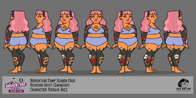
>>462298 >>462304 Actually thats a TIF nb because in an episode "they" said that "their" father still calls "them" a girl
The actual TIM character is "Natalia" and tbh when watching the show I already figured that because the character had a very obvious male voice
No. 462332
>>462173I've already seen people say this about her yeah kek.
>>462242God this looks so fucking awful. It's always crazy to me how you can be an artist that's ok enough to get jobs and can render things but your proportions look like this
No. 462501
File: 1740180004073.jpeg (121.29 KB, 540x810, p_studio_winorlose_poster_date…)
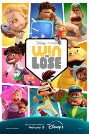
Western animation is dead
No. 462518
File: 1740182843863.jpeg (43.77 KB, 567x541, the beginning of the end.jpeg)
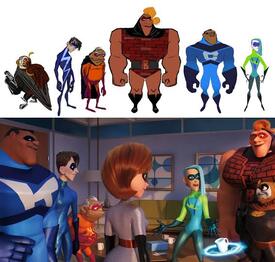
>>462501I swear Pixar has been unable to make appealing human designs since they made those shitty secondary heroes from the Incredibles 2