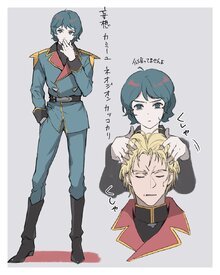
File: 1655210111892.jpg (210.51 KB, 1512x660, editing skillz over 9000.jpg)
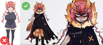
No. 214165
Inspired by awful character design thread
>>189168Either redesigns by other people you find neat or ones you made yourself! "Fixing" bad designs, making them more modern / fit certain AU or what have you.
No. 214262
File: 1655227911505.jpg (941.59 KB, 3000x3000, FFPW7WQVcAYMLSv.jpg)
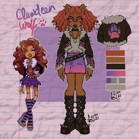
I came across this Clawdeen Wolf design, maybe not technically the most epic masterpiece ever but I love the style of clothes and FURRY LEGS, she's a werewolf for christ's sake! I think it says on her doll box she shaves every day, awful message for kids.
>>214258Glad you like it nonna!
No. 214282
File: 1655233869612.png (4.92 MB, 1900x2350, gloss char redo.png)
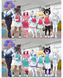
>>214165This painter I follow has some ocs that I've tried to improve.
No. 214288
File: 1655234960880.jpg (323.46 KB, 1440x1441, 277481573_3054975508098905_633…)
>>214282>Character redesign thread>Character recolour thread…What is this. Looks like a pedo hentai visnovel with the only adult being the least offenisve
which is a stretch while the colours look has more harmony I still think it doesn't belog in this thread but more in the
>>>/ot/1177704 or
>>>/ot/243951 No. 214295
>>214288Your second link would've been a better place to put my edit prob
>>214287I changed smaller things like glasses.
No. 214297
File: 1655236768790.jpg (1.02 MB, 3000x3000, FFPXQVuaQAAHtUA.jpg)
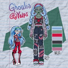
>>214291A gay moid, it was also 2008 when they started making them so the social justice / feminism etc scene was not so mainstream yet. And I don't think Mattel has ever been very progressive. The creator said he wanted to make some characters LGB for example, and Mattel shut him down it every time.
>>214283Yeah that's what I was talking about too, it's weird they included that. I think it was so funny at the time, haha a hairy woman!!
No. 214298
File: 1655236955302.png (1.69 MB, 1820x1728, bnha momo coustume.png)
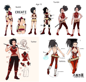
While I was intrigued by BNHA I have soft spot for similar manga all of which I dropped sadly as I physically become sick of it and feel like my eyeballs will detach and roll away from meI always hate her design and every other female design and costume.
No. 214358
File: 1655248957839.jpg (238.07 KB, 725x734, f9a.jpg)
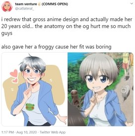
I hate the whole Uzaki-chan fad and her cringey distasteful design but these redesigns are pretty cute and way better than the original. I couldn't find any other acceptable redesigns but those who oppose them are scrotes, coomers, pedos and pickmes.
No. 214376
File: 1655250699599.png (1.39 MB, 894x1492, 11.png)
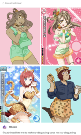
>>214165u can't make this thread and then not post the classics
No. 214382
>>214298I don't follow this shit franchise so I'm not sure which outfit best represents her personality.
The Tumblr one is perhaps too simple, but still a massive improvement both in terms of design and (a lack of) sexualization.
The one that says "Age 15" is awesome. It or the Twitter redesign might be my favorite.
The Korean one is still sexualized but I like how it looks like a superheroine costume you'd see in any American superhero franchise.
While the Reddit one is ridiculous for obvious reasons, I like those black lines on her body, it gives the whole design more cohesion than the original. I think the word I'm looking for is "sleek" (I'm ESL sorry). I feel like redesigning this one though because it's such a waste kek.
I like that all of them give her gloves or arm accessories, her original design was too naked on both the legs and arms.
>>214367At least it looks like a real woman with big boobs and not a shota-looking bug-eyed anime abomination with no fashion sense
No. 214387
File: 1655252612851.jpg (5.19 MB, 7343x5882, 8823423894e32.jpg)
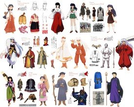
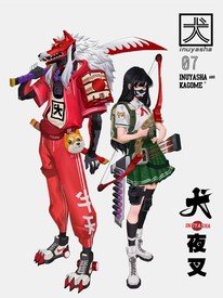
Does this count as a redesign? The artist reimagined how the characters would look like if they were in medieval Russia and near territory along with Kagome from 90s Moscow
>Yasha
No. 214391
>>214387I don't remember anything about Inuyasha but ooh I love this shit so much
>Does this count as a redesign?Read the OP, yes it counts.
No. 214401
File: 1655253771727.jpg (423.55 KB, 2600x2140, Eo8UCL8WEAY-B__.jpg)
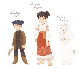
>>214391The last sentence never registered in my brain when I was reading the OP, thank you though.
No. 214402
File: 1655253824584.jpg (321.13 KB, 2048x1433, tumblr_0a58cc5fe2c34422b778cae…)
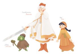
>>214401Rita and Jalibuha
No. 214405
>>214382According to wiki she's innocent yet sexy
man's dream>Momo's Quirk(power?) Create any non-living material/object from her exposed skin by transforming the molecular structure of her fat cells.>Expressing little concern for losing most of her clothing in battle, as she knows how to construct another set, and would have made her costume even more revealing were it not for restrictions on exposed skin in a costume. However, this often makes others think of her as an exhibitionist. Ironically, she is rather innocent and sensitive to vulgarity and rude mannerisms, constantly frustrated by sexual advancements. This innocence shows that she has a somewhat casual, natural, and non-lewd view toward nudity, which explains her lack of modesty in her costume.>>214298Turns out the girl is 15 years old and not a 20 something and I guess has to expose skin to use her powers which probably why reddit hero getup is like that.
No. 214432
File: 1655264375175.jpg (53.75 KB, 400x554, kill_la_kill___ryuko_matoi_rew…)
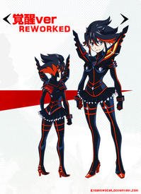
i dont give a fuck about "symbolism" of needing to show teen girls' bodies, every character design in this show is ugly and stupid and needs help
No. 214433
File: 1655264411035.jpg (108.9 KB, 1280x1232, 943.jpg)
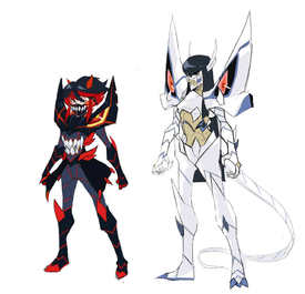
even cooler
No. 214482
File: 1655280955444.jpg (11.04 KB, 443x449, 0e803f7b0e65a5ba.jpg)
>>214405Me reading that description
Fucking coombrains
No. 214483
>>214452I have never watched the anime (an never will lmao), but in her video Lavender Towne apparently based the outfit on a one the character wears on the show. And apparently she's supposed to be an angry strong dragon so imo her's makes much more sense and shows her personality. Though again I have not watched the anime, but hearing what the titty goblin is supposed to be like made me lol, the original design shows none of that lmao.
God I fucking hate the slice of life genre too, every character is a braindead moeblob with two personality types: big tit and small tit.
No. 214487
File: 1655282861338.jpg (1.73 MB, 4000x1670, dragon_effect___progress_shot_…)
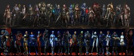
>>214433These are so fucking cool ahhhh
>>214387Of course they do! I love them, thanks for posting. I love that the inspo is also included, lovely.
I actually specifically thought about this image of Mass Effect characters in Dragon Age universe by AndrewRyanArt when I made the thread and mentioned crossovers/AUs. I added the original designs for those not familiar, they are not in order though, sorry! Also kek I noticed he did everyone else but Jacob, fucking rip bro. Idk how relevent the art style of Dragon Age is, but it's pretty generic fantasy stuff.
No. 214488
File: 1655284255020.jpg (375.63 KB, 1256x1038, 83675934659834659346583.jpg)
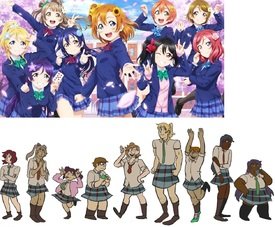
>>214376ily nona thanks for reminding me of these
No. 214491
File: 1655284433935.jpg (1.67 MB, 4089x4112, 1655241076261.jpg)
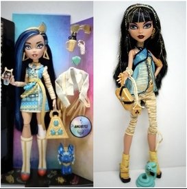
>>214488Yoiu know I'm all for non-sexualized redesigns but KEK
Since Monster High was talked previously, here is a new reboot/redesign. Not sure how I feel about it.
No. 214493
File: 1655284900239.png (70.26 KB, 445x280, 530-5303153_tumblr-chicassuper…)
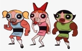
>>214488why is the tall blonde one standing like this kek
No. 214521
File: 1655297439380.png (Spoiler Image,493.39 KB, 585x469, 428720a4716d53941917feb2e1fa5f…)

Imagine being so high on literal copium and redesigning a nonhuman character's true form by making them a literal black person out of spite where it gets up to the point that it looks unrecognizable.
No. 214524
File: 1655297690626.png (51.45 KB, 601x407, unknown (1).png)
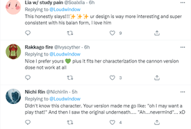
>>214521Also, the comments praising their golden turd.
No. 214540
>>214521I don't hate it though, why couldn't a nonhuman character be black in human form? It already has dreadlocks (?). I understand black people making edits for wanting more representation idk
>>214488I posted this to anime moids they got SO ANGRY lmao, I like it more now
No. 214549
>>214262Why did they make her hair red? They should've just left it dark brown. Also, making all the white parts of her outfit grey makes it look like she's standing in the dark.
>>214297This redesign genuinely sucks. The pale green skin clashes horrifically with her hair. The design was already a little cluttered to begin with, and the redraw makes it even busier.
>>214330This redesign is perfect, except for the obnoxious bucket hat. I like that this artist actually gave her a pose instead of just mirroring half the drawing.
>>214491I like the dark blue hair on the left one, but I like the gold highlights in the right one's hair. I also think the one on the right has better shoes for the mummy theme. Also, the right one looks more gothic, which is the whole point of the toy line.
No. 214566
>>214562I like her well enough, she has a soothing voice and nice style
>>214561Oh noooo are they taking the hecking titties away!!
No. 214576
>>214573Fair enough, I still like her and I don't think she could have an audience that big if she was
bad (of course choosing video subjects that are popular helps). Her doll repaint was absolutely awful though lmao.
No. 214580
File: 1655306707128.png (575.5 KB, 1020x1020, tumblr_pdj45s1cGf1wr0b6ho2_128…)
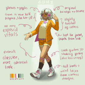
>>214566Not the hecking exposed vitals! Moids could get a boner from seeing a midriff!
No. 214585
>>214582Wot? No. I'm actually one of the anons complaining about that shit and I made this thread lol
>>214580I-is this supposed to be a good or a bad example? Literally the same as every other design here AND it has a tumblr file name lul
No. 214607
>>214598Oh I see. I see your point, I don't mean to be like "if you dress like that you are going to get raped!!!", but some designs, especially in anime, reek like male creepiness. Like those huge tittied lolis lol
>>214600I mean yeah she's mostly focused on youtube shit and her specialty is character design which she does well imo. Isn't that the saying that you have to have a grasp at anatomy before you can simplify it? To me her anatomy and color schemes are very nice
No. 214699
>>214491MH reboot sucks. They took out all personality of the characters. They look like they've had so much plastic surgery that they can't move their facial muscles anymore.
>>214580SJW artists are so self-centered that they are unable of coming up with a character design without inserting their own boring casual clothes in it. Gumi looks nothing like an idol here, and it doesn't fix the main problem with her original design, which is the ugly color scheme.
No. 214709
File: 1655333020923.png (150.25 KB, 640x490, tumblr_2a57440072b5f7db00ba31c…)
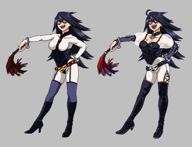
>>214699>>214700yeah like, take OP for instance, the original design is gross and awful but the redesign is just… not good? it doesn't fit a cutesy slice of life anime, nor is it a very interesting design on its own. it might be also in part that i hate the style they drew it in. i think when redesigning a character its a good idea to try and emulate the style of whatever it's from to convey what you're trying to get across better. it works best if it at least still resembles the character's original outfit too.
for instance here's midnight, whose outfit is so ugly in canon its basically unsalvageable, but i think the redesign did a good job making it more practical and pretty but still cute
No. 214747
>>214720yeah but it's not fuck-ugly anymore
>>214725i hate her design too tbh
No. 214757
File: 1655347839566.jpg (51.13 KB, 479x709, Ga8EyFn.jpg)
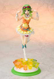
>>214728
i thought this was her design
No. 214758
File: 1655347930261.png (206.18 KB, 435x800, 9fJBta9.png)

>>214728>>214757rly ive never seen that other outfit b4
No. 214759
File: 1655348245227.jpg (40.92 KB, 499x498, oR3xnNA.jpg)
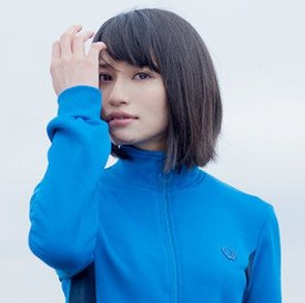
>>214580>gumi is now half filipina like her VAalso somehow 5 shades darker than megumi nakajima actually is… lol
No. 214887
>>214775I agree and it's because all the Tumblr accusations and calling all the redesigns ugly without even pointing out what's wrong with them kek
This thread was made from the bad design thread mainly to fix bad designs or show other artists' attempts at it, but now no one wants to post more redesigns.
No. 215058
File: 1655465036687.jpg (1.56 MB, 2560x3620, moids sexified.jpg)
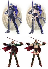
Since there was complaining about covering characters up, here's some moidies skimpified to same standard as the female characters in the game are lol
No. 215059
File: 1655465141502.jpg (179.65 KB, 1031x900, d8kr71z-4c02cd23-0f77-4823-9b3…)
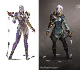
>>215058And a design of a female character
No. 215088
File: 1655473731648.jpg (99.31 KB, 1166x1580, 37016180_10155875651377858_920…)
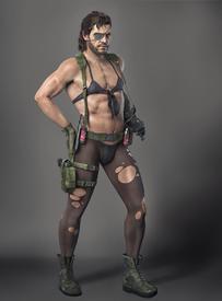
Would have invested a lot more in the franchise if he dressed like this
No. 215095
>>215058I think those are not skimpy enough.
Needs less fabric
No. 215096
File: 1655474716912.jpeg (216.57 KB, 750x858, 25911BDB-C404-49A0-842C-E4A167…)
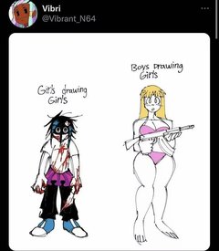
>>215088if they made snake a woman instead of a man
No. 215101
File: 1655475197507.jpg (53.85 KB, 680x733, 1693858193408_n.jpg)
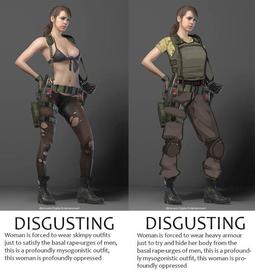
>>215096I remember when the game came out and this pretty much sums up the argument about Quiets outfit when scrotes and handmaidens were involved
No. 215104
File: 1655475417676.png (994.48 KB, 756x625, 140036.png)
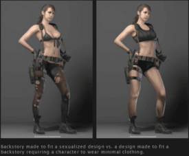
Would have much rather have Quiet wear this with her "skin condition"
No. 215107
File: 1655475951328.png (145.68 KB, 427x479, Odin_Room.png)
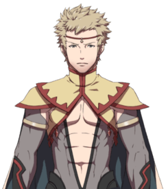
>>215058one of the few things fire emblem got right was allowing men to also have sheer boob outfits
No. 215116
>>215104>Skin conditionIt's the same shit as Momo's outfit in MHA being justified with "h-her powers require that her skin be exposed!1!" Scrote writers have figured out that if you stick a contrived "explanation" for the fetishism, retards online will defend it as being "necessary."
I'm not opposed to skimpy outfits inherently, but they should fit the tone of the story. If you're creating a raunchy comedy, sure, have those designs. But if you're creating an action story where a female character is supposed to be taken seriously, it's idiotic to have her running around in a bikini top. Men have no restraint, they put tits in literally everything regarding of the content or tone of the story.
No. 215122
>>214709I'm glad Midnight
got killed off. What a retarded idea for a teacher character. If you hear the phrase "female superhero teacher" and your first thought for a design is S&M, you need to be thrown in an institution.
The male teachers all have relatively normal, kid-friendly powers, with the exception of maybe Vlad. She's the one female teacher and he made her a fucking dominatrix, unbelievable. Just another reminder that Japan has the worst systemic misogyny of any first world country.
No. 215171
File: 1655492889880.jpg (166.16 KB, 1200x581, Dark_mage_sorcerer_concept.jpg)
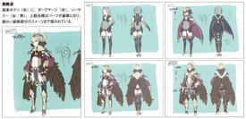
>>215167Ok then here's one of the pics I wanted to post
No. 215172
File: 1655493285177.jpg (358.13 KB, 890x1616, DivinerMale.jpg)
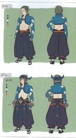
>>215171And here's the default male diviner design.
No. 215190
File: 1655498956216.jpeg (211.51 KB, 1280x948, tumblr_pwq1wbDEgY1qh8t5wo1_128…)
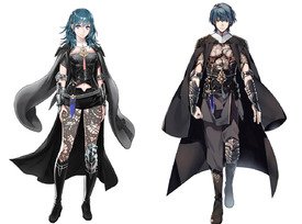
>>215058Yes I want more of this. It's equality. I hate it when the female version wears skimpy clothes and is somehow more sexualized than the male counterpart who is mostly covered up.
No. 215194
File: 1655500037417.png (745.83 KB, 1280x965, tumblr_pwq1wbDEgY1qh8t5wo2_128…)
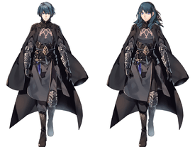
>>215190>>215192I think just her design looks nothing like a professor and is not suited for battle.
No. 215299
>>214521what's the thing in the left meant to be? the only thing i find weird is that the right one doesn't look cartoony and simply looking at the one in the left it seems to be what's intended
Also is the guy that posted the edit the one with a fat fetish or is that someone else?
No. 215331
File: 1655534961543.jpg (73.43 KB, 868x943, Exbfi7QWgAIhclX.jpg)
>>215299It's hard to understand anything of Balan Wonderworld since anything resembling a coherent story or plot only exist in the tie-along novel and not in the actual game, but the left is his Monster form and the right is meant to be his more human one. This is what his unedited human form actually looks like.
No. 215361
>>215352Calm down. Take a deep breath, you'll to be fine.
>>215353There's Robin though. Male and female Robin wear the same baggy clothes in their default class.
No. 215363
File: 1655560870551.jpg (240.04 KB, 806x452, Tumblr_l_104295066268859.jpg)
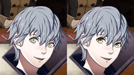
how can you defend this shit and blame it on the art director, it looks like he's sucking out my soul with those eyes
No. 215366
File: 1655563940116.jpg (156.43 KB, 755x821, kurahanadimitri.jpg)
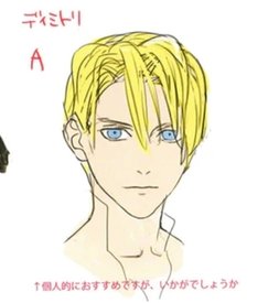
>>215365doesn't change the fact that
1.she is the designer, she chose this horrible spaghetti haircut. have you seen her utapri designs? just as bad, and there's not a single hot guy in 3 houses. don't get me started on byleth, how can that kozaki scrote come up with a better female mc like corrin? HAVE YOU SEEN SHEZ?
2.this is how she draws the face, and her style was used for both the portraits and the 3D models, making the characters look very unattractive. the art director is already a mediocre artist in the first place, copying kurahana's lifeless style made it even worse
I don't like kozaki cause he's a coomer but he had better designs overall. the best artist they used was hidari though
No. 215369
>>215366>>215362>kurahana shitters everyone, I've never played a single game that she worked on. You're just a sperg.
>>215366>have you seen her utapri designs? just as bad, and there's not a single hot guy in 3 housesI have, however, seen the characters in those games, and they're ok.
No. 215379
File: 1655572173190.jpg (21.58 KB, 522x389, Screenshot_20210322-060744_You…)
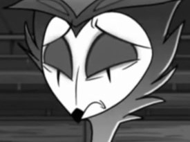
>>215335We can blame it on Square Enix for letting this game crash, burn and die and for kicking Yuji Naka out before he could refurbish the gameplay just six months before it was released.
No. 215380
File: 1655572375986.jpg (90.66 KB, 500x496, 551161.jpg)

>>215366> have you seen her utapri designs? just as bad, and there's not a single hot guy in 3 houses.I guess you've never seen Haruka Nanami and her Hypnotoad lookin' ass eyes before.
No. 215381
>>215366>have you seen her utapri designs? just as badThe designs in utapri are ok imo except for a few guys, like Ai and Ranmary look out of place compared to the other characters. I only watched the anime because I found it hilarious and I played the rhythm game on my phone long ago but the art isn't by her at all, I don't know if they characters look really weird in the actual games. I do agree that her style doesn't translate well to 3D, unlike Kozaki's. IS being cheap and retarded doesn't help because the cutscenes are animated by the retards who did the cutscenes with 3fps at most for Echoes, instead of the competent ones who did the cutscenes for Awakening, Fates and Heroes. And they were cheap as fuck when developing 3H in general, it's clear the story is just based on how Japanese fans reacted to Fates instead of trying to tell its own story, and again, they were too cheap to make Kurahana do in-game illustrations and portraits.
>there's not a single hot guy in 3 housesIt's not an otome game so whatever. Some of the guys are cute imo after the timeskip but that's subjective.
Dedue is hot, he's 100% my type and if he were real I'd marry him whether he like it or not.
>how can that kozaki scrote come up with a better female mc like corrin? HAVE YOU SEEN SHEZ?Kozaki is very talented, regardless of whether he's a scrote or not, and the only thing that I truly disliked with Shez is the haircolor. I haven't payed attention to that Muso game at all though so I need to check that again to refresh my memory.
>the best artist they used was hidari thoughI don't care that much for Hidari for the mere fact that his designs were wasted on that fucking abomination called Echoes.
No. 215398
File: 1655578987604.jpg (222.64 KB, 1188x948, 4.jpg)
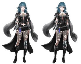
>>215190i hate the random midriff cuts to focus the bellybutton and wonder why so many anime designs have it but then i remember japan is full of autistic males who fetishize bellybuttons
No. 215403
>>215397Seriously. She's just wearing a generic soldier's outfit. Are soldier moids also "profoundly oppressed" (fucking kek) for not being allowed to have their asses fully hanging out?
>>215194She looks sooo much better in m!Byleth's outfit. Why couldn't they have given us the option…
No. 215406
>>215397Of course it doesn't make any sense, it's a strawman argument.
I've never heard a single woman complain about female characters wearing a normal-ass soldier uniform like every soldier should.
And I think that's similar to what Quiet wears before she's turned into a weird invisible plant woman?
No. 215419
File: 1655590930219.jpg (13.14 KB, 288x288, Haruka Nanami, but I fixed her…)

I fixed Haruka's eyes. Ain't she better?
No. 215460
File: 1655612171933.jpg (46.84 KB, 1280x720, maxresdefault (1).jpg)
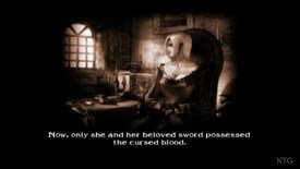
>>215058>no Astarothbut to be fair they covered his ass in the newer games.
>>215059In the 2nd game, there was an alt for Ivy just like that. I never played beyond 2 so I'm not sure what they did later.
And I have a soft spot for Ivy because short haired women in general are my weakness. And her credit art is gorgeous. I know moids and coomers see her as 'le sexy bdsm big booby woman' (and its kind of enabled by the devs) but she I will always see Ivy more as pic related.
No. 216142
File: 1655864143971.png (630.79 KB, 1280x1895, tumblr_p520lcuRmK1s25mzvo1_128…)
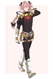
I want Astolfo handsome with a boy voice.
No. 216146
File: 1655866457710.jpg (98.78 KB, 906x915, __astolfo_fate_and_1_more_draw…)
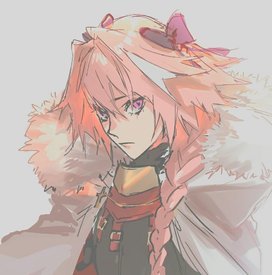
>>216145Ok how about have him look less like a generic moe anime girl.
No. 216153
>>216142I think you'd have to redesign him almost entirely (keep the color palette if you want).
I'd give remove the two hair bows and spiky hair, to keep only one bow and give him a more elegant look. Perhaps with a face like this
>>216146 No. 216157
>>216146That's much better. Astolfo's normal design isn't that bad but the way scrotes draw him definitely is.
>>216154They are relevant to him as a character. He's GNC, likes feminine things.
No. 216161
File: 1655872142896.png (230.71 KB, 670x800, EQf3_YFUEAERF4f.png)
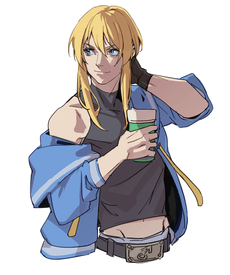
Since they've ruined and yassified Testament, give us handsome Bridget!
No. 216174
File: 1655876705933.jpg (554.04 KB, 1600x1984, dark_souls__ornstein_and_smoug…)
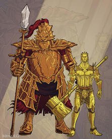
Skinny Smough is blessed
No. 219393
File: 1657041096208.jpg (106.83 KB, 1080x1296, 6edaf4f449b36f342cdee47629e5ad…)
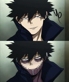
There's no need for redesigning Dabi but I think he's looks hot without those purple skin patches.
No. 219485
>>219393I guess it's supposed to be a " what if ", but why did the person who edited it also decided to get rid of his piercings? Dabi's style is the only interesting thing about him
>>219422Those are burn scars
No. 220386
File: 1657388670213.png (637.93 KB, 1366x768, lavender.png)
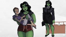
>>220376i really liked these designs, you should have posted pics instead of the whole vid tho, didn't like the raya one so much because i wish the whole thing was blue/gold but that's personal preference
No. 220389
File: 1657388818536.png (985.58 KB, 1344x744, towne.png)
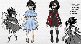
>>220386>>220386the momo redesign
i like the zippers
No. 220390
File: 1657388917897.png (1.09 MB, 1328x736, redesign.png)
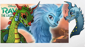
>>220386>>220389and redesigned raya
No. 220419
File: 1657402501552.png (1.4 MB, 972x1500, 1.png)
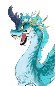
>>220415The shape design looks like shit, are you trying to imply shape design/language is something they only teach at Calarts lol. The earlier concept sketches from Disney are much stronger takes on a dragon closer to the inspirations.
No. 220466
File: 1657425020966.png (360.73 KB, 353x639, Untitled.png)
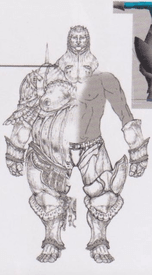
>>216174ok this is hot, i wish smough actually had sexy armor
No. 220468
File: 1657425374823.jpg (101.86 KB, 2048x693, Esxfxy0XIAQvG-7.jpg)

>>220390small changes to the existing design could go a long way. im still really disturbed by how much this dragon looks like elsa
No. 220563
>>220466I hate his og armor, I can’t believe Miyazaki said it was his favorite but whatever. I will say that twink Smough in
>>216174 is freaking me out a little though lmao.
No. 220589
>>220420That's her style, she's a cartoonist. Sure they are simple and that will make some nonnas seethe, but I don't think they are TERRIBLY drawn (well, maybe the clow nose dragon is a bit unfortunate).
>>220468The edit is so much better, and with such little changes!
>>220585Does she? I have not watched the anime (and never will), the zipper dress seems to be in line with the original style and the fluffy dress version she mentioned is out of character but just an experiment on the "has to have access to skin at all times" concept.
No. 221173
>>221171As long as it is not like
>>214282 as anon just changed colours and outfit a bit
Artist clearly draws pornographic drawings and obliviously a coomerartist and keep your signature out of it
No. 221225
File: 1657657906181.jpeg (603.77 KB, 2480x3508, 5F20E544-E7D0-4BEA-935D-200FD3…)
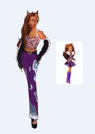
>>214262I decided to not really redesign her but change her outfit a bit, this one’s more of my version of an older clawdeen and I just looked at that design right now and I really like that they made her look like a wolf kek
No. 221929
File: 1657835453251.jpg (204.67 KB, 1920x2004, yana-anadenko-finished-color.j…)
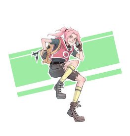
Haruno Sakura redesign
No. 221973
>>216167NTA but I like this idea too! He doesn't have to be obnoxiously "girly" to dress GNC. There's already a lot of characters in media for women that are GNC with long hair, androgynous features, feminine clothes, etc. but they're not coomer bishoujo traps either, so that kind of look might work really well. It depends on who the target audience is though
>>221225idk
nonnie, personally I like it, but don't have much to add
No. 224066
>>221929This pose is a bit awkard but I think the designs here
>>221930 look nice. My favorite is the one in the very bottom, right corner.
No. 224078
File: 1658596229562.jpeg (57.74 KB, 721x721, images (4).jpeg)
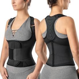
>>215104This should be her outfit
No. 224306
File: 1658676776340.png (910.56 KB, 652x990, akarimai.png)
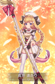
Original
No. 229282
File: 1660192417970.png (818.97 KB, 923x1038, Isekai_redesign.png)
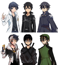
>>229280They honestly look way better than the generic bland self-insert designs
No. 243749
File: 1664567603884.png (496.51 KB, 1802x1120, magiredesign.png)
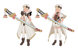
>>224306home you don't mind I gave it a shot,
Nonnie.
I kept the swimsuit look in one version because it reminded me a lot of the one Sakura wore.
No. 243844
>>243749Your art is really cute
nonny! I think I like the one on the right more because of the poofy shorts, but the leotard sort of thing she's wearing in the other one kinda makes her look like a mix between a superhero and a ballerina
No. 264880
File: 1671495984193.png (367.66 KB, 625x800, 74176997_p0.png)
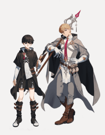
Fantasy AU
No. 264881
File: 1671496076029.jpg (621.35 KB, 1920x1080, 75575334_p0.jpg)
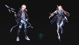
Sci-Fi AU
No. 264884
File: 1671496453270.jpg (559.03 KB, 1920x2559, syrena-li-copy(1).jpg)
Sci-Fi
No. 264886
File: 1671496550909.jpg (530.5 KB, 1352x2154, cristina-morillas-garcia-princ…)
>>264885>>264883I found some sexy pics of him, will post him soon for you
No. 265155
>>214298>>214405I like Momo and her abilities enough that I can look past the "she conveniently needs exposed skin use her powers" thing but even with that in mind her original outfit is just poorly designed for her powers and how she uses them.
When she has to create something big she always uses her back skin. I don't recall her ever creating something out of her boobs. So why a boob window instead of a back window? Her winter outfit actually has a cape that covers some skin for warmth - so why not a cape with the summer one too to help hide what she's making until it's too late for the enemy to counter it?
No. 285692
File: 1679789432967.jpg (127.73 KB, 800x1000, d7zd2lf-d19dc2cb-3df9-40bc-9d8…)
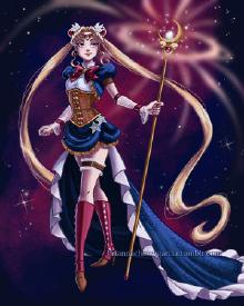
steampunk
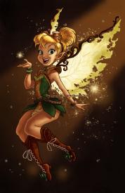
No. 285693
File: 1679789459985.jpg (114.21 KB, 776x1200, d8ptnha-7e9b5e77-c9d4-4018-adf…)
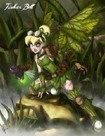
No. 285694
File: 1679789497070.jpg (236.47 KB, 1024x1326, twisted_fairies__tinker_bell_b…)
No. 285695
File: 1679789563840.jpg (272.05 KB, 1600x1214, adventure_time_redesigns_i_by_…)
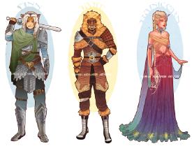
Ignoring the ginijikas it's a medieval fantasy au
No. 285696
File: 1679789616181.jpg (193.04 KB, 1600x745, sailor_moon__art_nouveau_costu…)
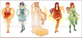
Art nouveau redesign dump
No. 285697
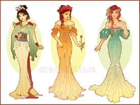
File: 1679789639985.jpg (262.53 KB, 1600x1203, art_nouveau_costume_designs_i_…)
No. 285698
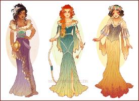
File: 1679789674606.jpg (284.48 KB, 1599x1164, art_nouveau_costume_designs_ii…)
No. 285699
File: 1679789703231.jpg (266.21 KB, 1600x1131, art_nouveau_costume_designs_ii…)
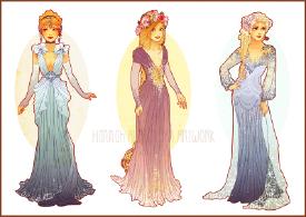
No. 285700
File: 1679789740320.jpg (266.78 KB, 1600x1124, art_nouveau_costume_designs_v_…)
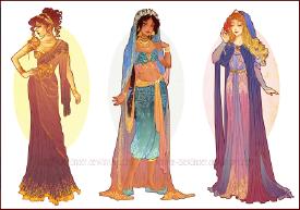
No. 285701
File: 1679789766303.jpg (269.42 KB, 1600x1206, art_nouveau_costume_designs_iv…)
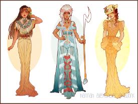
No. 285702
File: 1679789851901.jpg (251 KB, 1599x1131, art_nouveau_costume_designs_vi…)
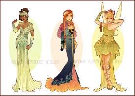
Fun fact someone made cross stitch patterns from the images of the art nouveau disney princesses
No. 285703
File: 1679789882741.jpg (225.02 KB, 1600x1274, quickdesigns__korra__asami_and…)
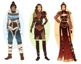
No. 285704
File: 1679789959765.jpg (181.88 KB, 1600x732, updated__avatar_art_nouveau_co…)
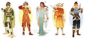
I dislike the boob window on Toph outfit other then that i like it
No. 301882
File: 1686579818046.jpg (126.83 KB, 886x2048, Squidward.jpg)
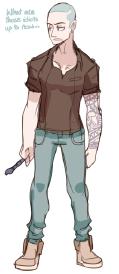
No. 351686
>>301882lmao
but he looks way too hot
No. 351762
>>351737idk the art is super stylized but he looks kinda ripped and i think squidward would be lanky
also i doubt he'd willingly shave his head, he just bald
No. 367613
File: 1712181630402.png (3.63 MB, 1520x2048, Untitled283_20240403145750.png)
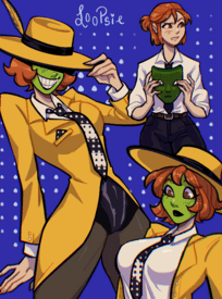
I tried editing this for fun. I'm not good at art so sorry for sloppy lines.
No. 367855
File: 1712259655535.png (283.06 KB, 907x1312, 2786528ffcde0e56.png)
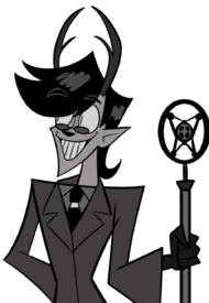
I don't know how I feel about the nose and teeth on this one, but I yearn for a more period appropriate, less Deviantart OC Alastor
No. 367940
>>367855> a more period appropriateNona your picrel isn't period appropriate either.
This thread allows redesigns from anons so I might take a crack at it with my American 20's to Great Depression autism.
No. 367957
File: 1712291961770.png (337.55 KB, 810x823, GGzXtiaXcAAP7fm.png)
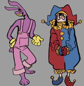
Not sure about the Jax one but these would look awesome in 3d such a shame these aren't the actual designs especially Pomnis,her canon outfit is so ugly I like that her eyes aren't overly designed and giving her heterochromia is actually cool.
No. 367961
File: 1712292485586.webp (59.88 KB, 828x820, 1_tCFHlD1t4XJUIwEK4dmu8Q.webp)
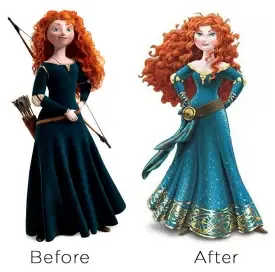
Does anyone remember that old infamous bad Merida redesign?
No. 367989
File: 1712315472671.jpg (2.3 MB, 2048x1328, Tumblr_l_13490951712003.jpg)
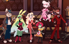
Thoughts? I think alastor look way too kid-friendly.
No. 367993
>>367989drawn by one of those welcome home (?) tifs undoubtably. alastor looks like tumblr sexyman rudolph kek
though goat charlie is cute
No. 368014
File: 1712327899847.jpg (383.01 KB, 2050x2100, GItzf_kXoAEC2_d.jpg)
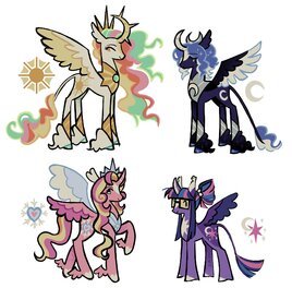
I wanna know if this is an unpopular opinion, but all mlp redesigns I've seen tend to be kinda bad. They always overdesign the characters and it doesn't understand the simplicity of the originals. Pic related, even if the art style is simple the designs feel too much, but idk if you agree.
No. 368056
File: 1712340680707.jpg (580.43 KB, 1535x2048, Tumblr_l_15522482834088.jpg)
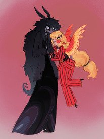
Another hazbin hotel redesign. I think this one looks cute.
No. 368084
>>368014They don't look that bad, the issue is that almost every artist does the same things with their redesigns. You could make a whole bingo chart.
>weird jerboa tails >overweight Pinkie>Fluttershy is a different species (bat or deer)>Twilight's horn is shaped weirdly>Rarity is covered in gems>Rainbow Dash has that one choppy short haircut>Applejack is a Shire horse>Twilight has glassesNothing wrong with most of those but seeing it done and done again is tiring
No. 368445
File: 1712432658162.png (213.32 KB, 500x700, tumblr_1a1d6dce41de280f49281e3…)
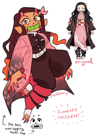
Both are shit
No. 368448
File: 1712433219560.png (368.19 KB, 2888x1688, j7fq5uarq5851.png)
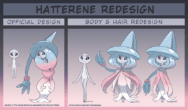
I don't like Pokemon but I have to admit the redesign is wayyy better than what we actually got,is there a reason why Hatterene's original form is shaped like a woman's curvy body?it looks so damn goofy and not in a good way either.
No. 369102
File: 1712608867096.jpeg (117.78 KB, 900x593, GCpbVx9WoAIqCtY.jpeg)
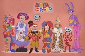
Got this from Twitter the artist even said that they're not a fan of the original designs.This has a charm to it and successfully captures the retro aesthetic better then what TADC was going for. I definitely like Pomni, Jax & Ragatha in this version more.
No. 369107
File: 1712610296554.jpg (303.97 KB, 595x1000, Tumblr_l_257414056503735.jpg)
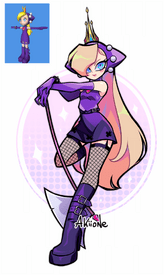
They made her look worse
No. 369562
File: 1712757960013.jpg (962.47 KB, 4096x4034, EkdbwH2XYAE-OH2.jpg)
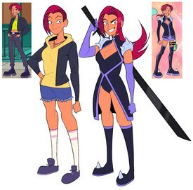
The cartoon is shit and irrelevant but I always wanted to seethe at how this gendie lesbian artist somehow designed the lesbian character to look more boring and coomery
No. 369859
File: 1712897443678.jpeg (200.26 KB, 1900x1700, FLXLfbGX0AA0z9t.jpeg)
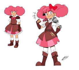
He made her design wayyy worse and possibly even difficult to animate.the hair bow placement on the redesign doesn't even make sense also why the thigh highs?
No. 369944
>>369859Super ot but I still kind of seethe over High Guardian Spice for its wasted potential. It should've never been on Crunchyroll, I honestly think it would've worked at as Disney/Cartoon Network/or even Netflix original.
The premise was genuinely cute—lackluster animation and gendie shit aside, it could've been such a great addition to the Western magical girl canon. Ugghhh.
No. 372199
File: 1713588968768.png (782.49 KB, 969x542, image_2024-04-20_145525020.png)
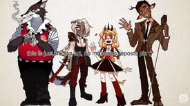
Bland as fuck and muddy redesign kek
No. 372255
File: 1713599937979.png (163.6 KB, 700x1000, alastor2.png)
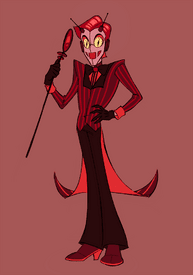
>>372236Yeah, I think when people change him from red to brown, they're misidentifying the problem. Sure, there's a case to be made that the red makes him blend into the backgrounds too much, but the real problem is that he doesn't look like he's from the time period he died in. I'm too lazy to look it up, but iirc he died in the 40s, right? He shouldn't have tinted glasses or a scene kid haircut if that's the period he's from. I think if the design in your picrel was changed back to red (or maybe have a mix of brown and red) it would be pretty good.
And I know people like the deer motif, but it has fuckall to do with his character traits and seems like an arbitrary decision. Like, maybe instead of having him be a deer, they can have him be a human(oid?) with a speaker for a mouth, and maybe tuning displays for eyes. Also this is neither here nor there, but I feel like it would have been slightly more appropriate to have him be from the early 60s (right before the AM/FM split) when radio experienced a sort of "peak."
Picrel is an edit of an old drawing I did attempting to redesign him. There are other anons who could probably do this concept way more justice, pls no booly.
No. 372296
>>372199i kind of like sepia alastors tbh. the weird deer pupils on this one rock. the others pictured are total ass though, i didnt think you could make husks hideous design worse lol
>>372255interesting take on his design anon. i like the deer thing for the ooky spooky voodoo cult human sacrifice angle though personally
No. 400133
File: 1720658514351.png (317.38 KB, 600x315, u.png)
No. 426592
File: 1729729935238.jpg (776.58 KB, 2000x2000, tumblr_0279b711a8c9898c4067c47…)
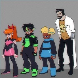
This redesign is a absolutely awful in my opinion and I still have no idea why it almost has 50k notes on Tumblr.
No. 426597
File: 1729730547202.jpg (113.84 KB, 640x640, tumblr_adaf76149b3c0b1ce975b8e…)
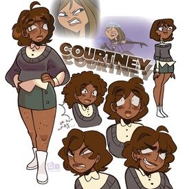
Doesn't even look like Courtney anymore plus her outfit doesn't even match at all.
No. 426632
>>426597I like the hair, but why did they give the athletic camp counsellor a short skirt and
white boots kek
No. 427977
File: 1730205460553.jpg (244.88 KB, 810x781, 20241029_143543.jpg)
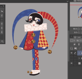
redesign from amazing digital circus that I found on xitter, tbh I'd tolerate it way more if the show looked like this
No. 428137
File: 1730240945782.jpeg (278.66 KB, 1819x2048, IMG_6639.jpeg)
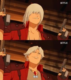
the americans that ruined castlevania got their hands on dmc. top is an east asian redesign, bottom is ugly american dante.
No. 428140
File: 1730241732067.jpeg (455.88 KB, 1125x639, IMG_6640.jpeg)
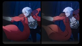
another dante redesign vs actual netflix design
No. 435047
File: 1732475735336.jpg (94.88 KB, 640x640, tumblr_ac19c2cad0101a0ae46a823…)
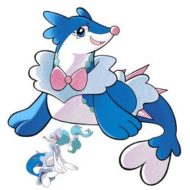
I've always hated Primarina's original design and how it looked nothing like a seal anymore with it's weird body shape almost resembling a humans.also the lame mermaid gimmick.This redesign is how Primarina's final Evo should have looked liked.
No. 437932
File: 1733256454648.jpg (156.71 KB, 1006x1500, GdwZCOzWsAAam93.jpg)
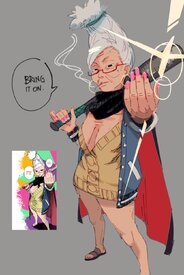
Massive improvement
No. 437944
File: 1733258578718.png (469.53 KB, 1280x1477, tumblr_orm1ppiZYJ1rm12f6o1_128…)
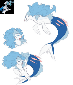
>>435047I very strongly hate both, I'd prefer something like this without a literal bow
No. 437947
File: 1733258652242.jpg (65.43 KB, 708x956, j6b4lwjwphz51.jpg)
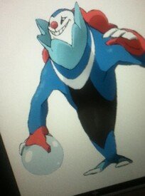
>>437944i still want the creepy clown seal
No. 437960
File: 1733261861384.jpg (138.93 KB, 1280x786, F1nWNU6WwAExgEZ.jpg)
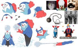
>>435056imo i actually like that its really girly and that the boys are girly too. i like girly pokemon in general and idc if theyre technically male or female
>>437947holy crap i adored this design but its definitely too creepy to have ever been real sadly
No. 438274
>>437960>>437947Holy shit I fucking love Ballio/Pinnister. I posted it in the Pokémon thread a while ago and somebody said it was ugly, lol. Well yeah, it is ugly (other starter final evos, like Venusaur or Feraligatr, are also ugly and nobody bats an eye) but it's also cool and scary, which is fitting for a Dark-type based on creepy clowns. I'm still so fucking sad that it turned out to be fake.
>>438083It's not bad, I think the problem is just the artist not being very good.
No. 438285
File: 1733380581965.jpg (205.38 KB, 1913x1437, 4a66762b989acf0bbf810e44478264…)
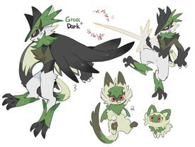
I wished these were Sprigatito's evolutions. A bigger cat similar to Torracat and a Puss in Boots sort of Pokemon.
No. 438301
File: 1733388028179.jpeg (73.33 KB, 595x425, IMG_4276.jpeg)
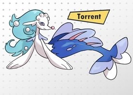
>>438274No, the design itself is bad. I’ve seen much nicer and more elegant redesigns of Primarina, like picrel. Although I don’t like any of them as much as the original design.
No. 438306
File: 1733392695845.jpg (130.68 KB, 1500x1500, 1733337857983295.jpg)
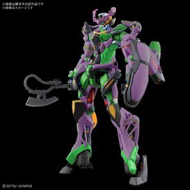
No. 438399
>>438083Not as hideous as the original Primarina who looks rat-like instead of a seal.
>>438274I disagree,I think the artist did a great job(especially the colors)
No. 438441
File: 1733436297372.jpeg (1.39 MB, 4096x4096, Fyl6ue1XoAA2iov.jpeg)
I don't get how this artist's redesigns get so much praise when she just keeps making them more over designed and adding more unnecessary things to them.how exactly is this a redesign??? It's basically the same just with more crap added.I do like her Moxie redesign though.
No. 443886
File: 1735512849730.jpeg (161.24 KB, 2048x2048, GH504LSWAAATkN2.jpeg)
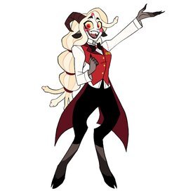
I absolutely love this Charlie redesign so much I wish it was canon.its creative and she actually looks like a demon instead of some bland blonde girl.
No. 449161
File: 1737056801969.jpg (2.2 MB, 4096x2562, 20250116_204504.jpg)
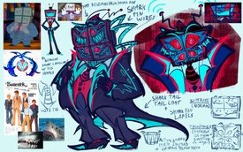
I don't think I've seen a Hazbin Hotel redesign this terrible before, and I understand what they're going for but it's not good looking at all.
No. 456352
File: 1738543353136.jpg (78.89 KB, 975x693, 0wbi24d85xs51.jpg)
No. 462139
File: 1740078293004.png (652.97 KB, 866x1298, redesign_1.png)
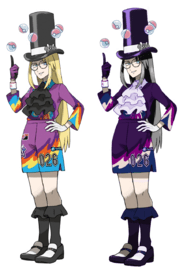
This design is ass to begin with, I tried my best with my shitty editing skills kek
No. 462141
File: 1740078541211.png (1.56 MB, 898x898, Untitled 1.png)
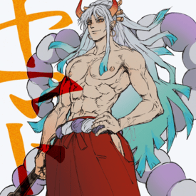
Idk if this belongs here, but I edited out retarded tit chop scars for a cute genderbend.
No. 462465
File: 1740172933586.jpg (83.68 KB, 500x667, tumblr_f31d97892b407a70050ebf1…)
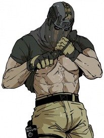
>>462206don't you dare put the chad mask fetishists in the same league as cartoon ballhead likers
No. 463129
File: 1740341987668.jpg (488.52 KB, 1950x1462, re1.jpg)
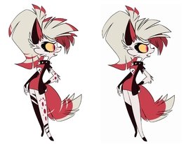
Not really redesigns, I was simply decluttering from all the extra details
No. 463150
File: 1740343057383.jpg (387.78 KB, 1632x1224, r5.jpg)
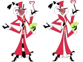
>>463133.
>>463140Yeah I think the ripped socks actually suit her as well, her style is more punk after all
No. 463162
File: 1740344477131.jpg (796.34 KB, 2718x2038, r2.jpg)
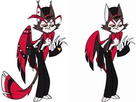
I took some liberties with this one, mainly because there was so much going on
>>463155Thanks! For the record, I do like her style it's just that the excess in details makes it hard to focus on anything
No. 467277
File: 1741295854472.jpg (172.01 KB, 682x828, killpedos.jpg)
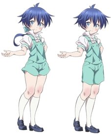
This shit disturbed me a bit so I did a quick edit. Far from perfect but aight
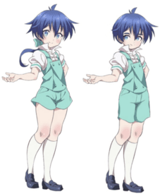
No. 467284
File: 1741297138210.png (403.1 KB, 682x828, edit1.png)
>>467277I wanted to give it a try myself.
No. 467286
>>467277I have no idea why but the roundness of the calves in the original is so disturbing. Slimming them down (along with all the other changes you made) makes it so much better. That's kind of odd to me though because it's not like calves are particularly sexualized.
>>467284The eyebrows and getting rid of the obnoxious blushing definitely help, his face actually looks cute now
No. 467294
File: 1741297701594.png (88.96 KB, 200x471, Albert-FullArt-Anime.png)

>>467284Just make this other character blue tbh.
No. 467300
>>467282>That shit disturbed you yet you still chose to edit this obvious pedobait characterUh, yeah? That's the point? It's not fanart, I edited it because the og design is icky. Very equivalent to thread pic, for example
>>467284This looks quite nice
No. 469148
File: 1741656374899.jpeg (291.32 KB, 1080x1079, htp8mj76fwne1.jpeg)
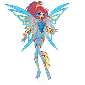
Fans who are arrogant enough to think they can do better than the official designs always crack me up. Like wtf is this. Could anyone even tell the theme of this transformation if I don't spell it out?
No. 469155
File: 1741657662516.png (869.36 KB, 803x803, Untitled47_20230723042529.png)
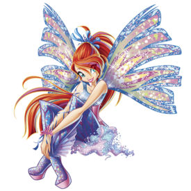
>>469149KEK, you're right that it's aquatic though.
>>469153>>469154It's supposed to be a redesign of an already existing transformations, and the official one already did the new take on water transformations that aren't generic mermaid ones. But fans aren't happy with it and some want generic mermaid shit. The official one uses scene queen aesthetics for a darker edgier look, and diver suits with skirts, heeless heels, fin wings. I prefer the 3D version but the 2D is a more fair comparison to the redesign.
No. 469173
File: 1741661471485.png (1.07 MB, 1030x1296, anyrgb.com (1).png)
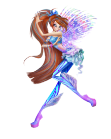
>>469170The fan redesign is just too loud. The official one has fins on the legs, seaweed skirt, sea creatures as hair accessories, and the diving bodysuit. There's an alternative design with fin wings as well.
No. 472103
File: 1742413896213.png (190.86 KB, 488x808, poppy_1.png)
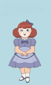
Time period accurate Poppy Playtime
No. 480348
File: 1744147910275.jpg (458.02 KB, 2000x1799, bafkreicrodnheaj4rau4bocokjb3i…)
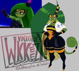
How do you make a design even worse? I'm not too familiar with Sonic or that green chameleon looking girl but I know that this redesign is truly awful. like? She doesn't wear clothes at all and yet for some reason this artist gave her clothes anyway, now she looks more boring, even the colors clash, so much wrong with this.
No. 482196
File: 1744541177162.jpg (445.57 KB, 2500x1406, Samus_ReDesign_ZeroSuit_poses_…)
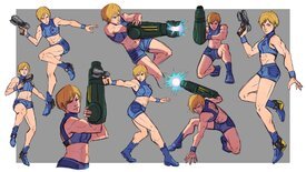
I would've liked Samus if she looked like this
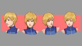
No. 482197
File: 1744541220260.jpg (187.68 KB, 2500x1406, Samus_ReDesign_Expressions_1.j…)
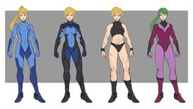
No. 482198
File: 1744541251957.jpg (279.28 KB, 2500x1406, Samus_ReDesign_ZeroSuitAlts_Fi…)
No. 482203
File: 1744541777977.jpg (334.62 KB, 2500x1406, 0_Samus_ReDesign_ZeroSuitSketc…)
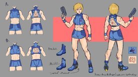
No. 482205
File: 1744542037578.jpg (536.31 KB, 2500x1406, Samus_ReDesign_Final.jpg)
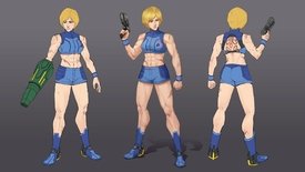
No. 482253
File: 1744553386589.jpg (137 KB, 613x896, samusa.jpg)
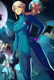
>>482198Her appearance varies a bit between games, but doesn't she already look like this, just with less defined muscles?
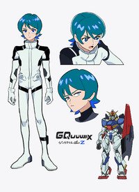
No. 483962
File: 1744888278267.jpg (441.33 KB, 1600x2200, tumblr_9d1f053e7d8b870458514fa…)
No. 483964
File: 1744888430476.jpg (270.12 KB, 1423x1600, tumblr_60a12cc808c2d7f3459b26b…)

No. 483965
File: 1744888574796.jpg (300.13 KB, 1423x1600, tumblr_904ddb4038fa162f9a4308f…)
No. 483967
File: 1744888646493.jpg (320.73 KB, 1423x1600, tumblr_da5e75cf8c5569fc414878d…)
No. 483968
File: 1744888768717.jpg (258 KB, 1423x1600, tumblr_f3587d0ee2535fb73ed4fbb…)
No. 499555
File: 1748081745352.jpg (124.87 KB, 973x1216, GqwKOtVXwAEWyZi.jpg)
